Dell Latitude 7285 2-in-1 review
A great tablet experience is undermined by poor design choices
While the Latitude offers a great tablet experience with one of the best screens available, it ultimately breaks the fundamental rule of 2-in-1s: it's simply too awkward and heavy to use as a complete package. At this price, there's simply more compelling alternatives on the market, that are not only prettier, but offer better value for money.
-
+
Excellent screen; Decent keyboard; Sturdy
-
-
Unappealing design; Restrictive hinge design; Pricey
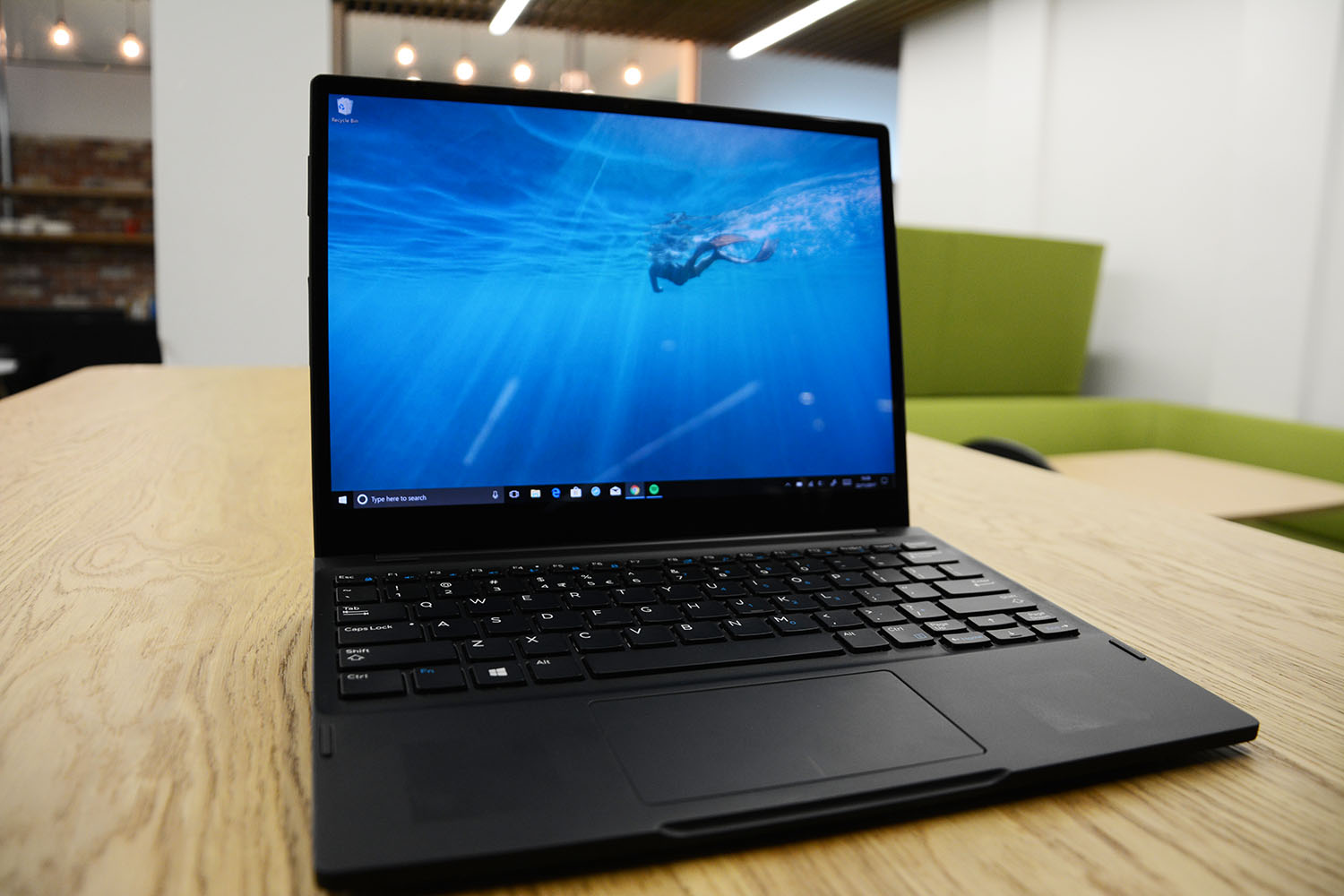
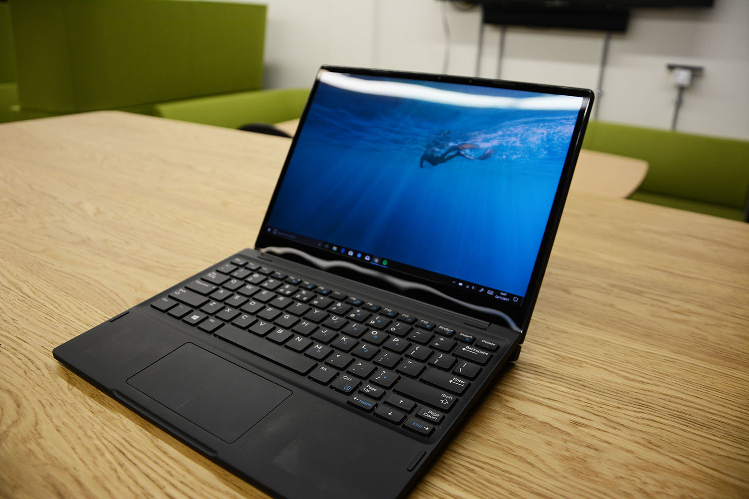

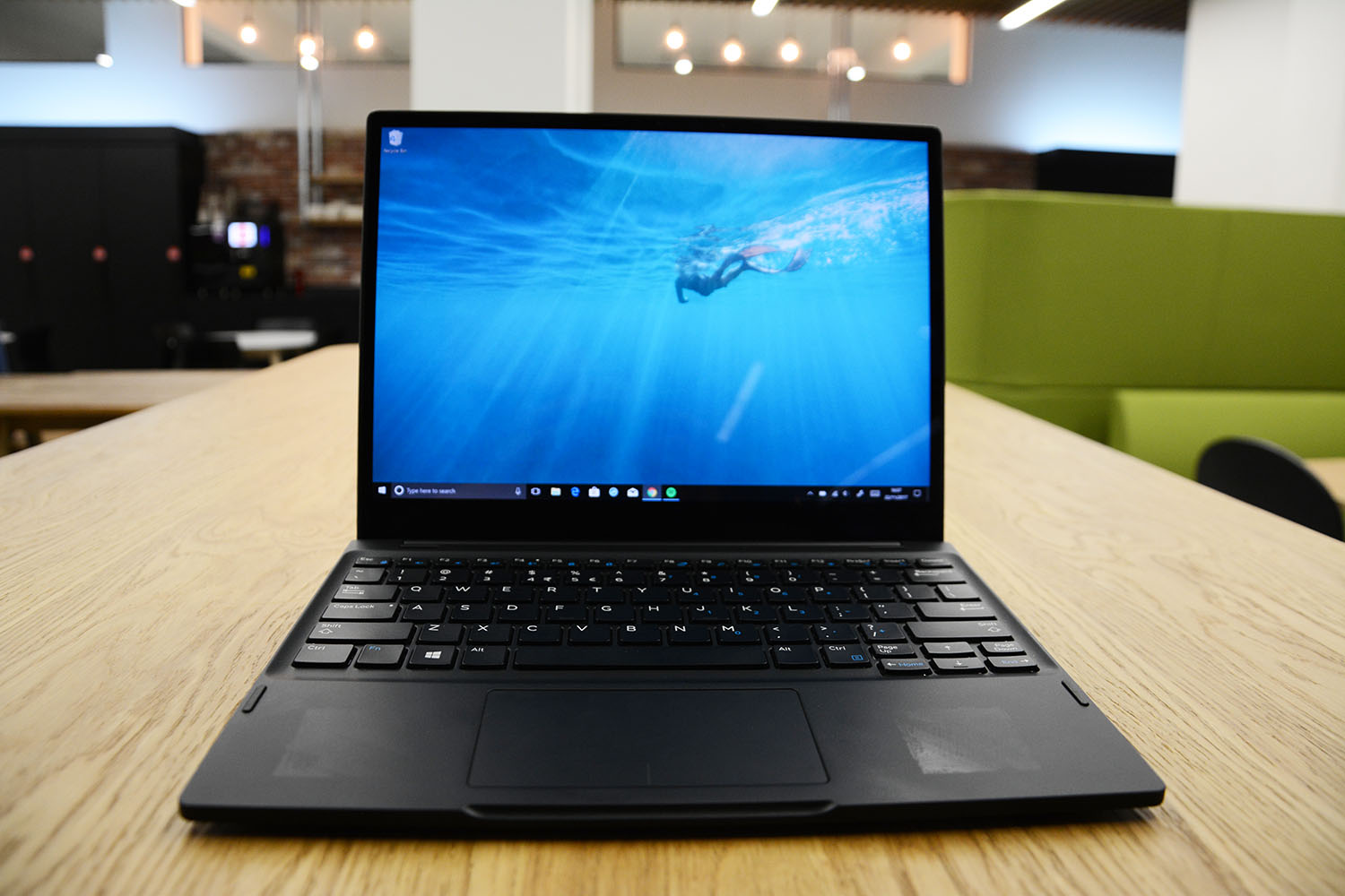
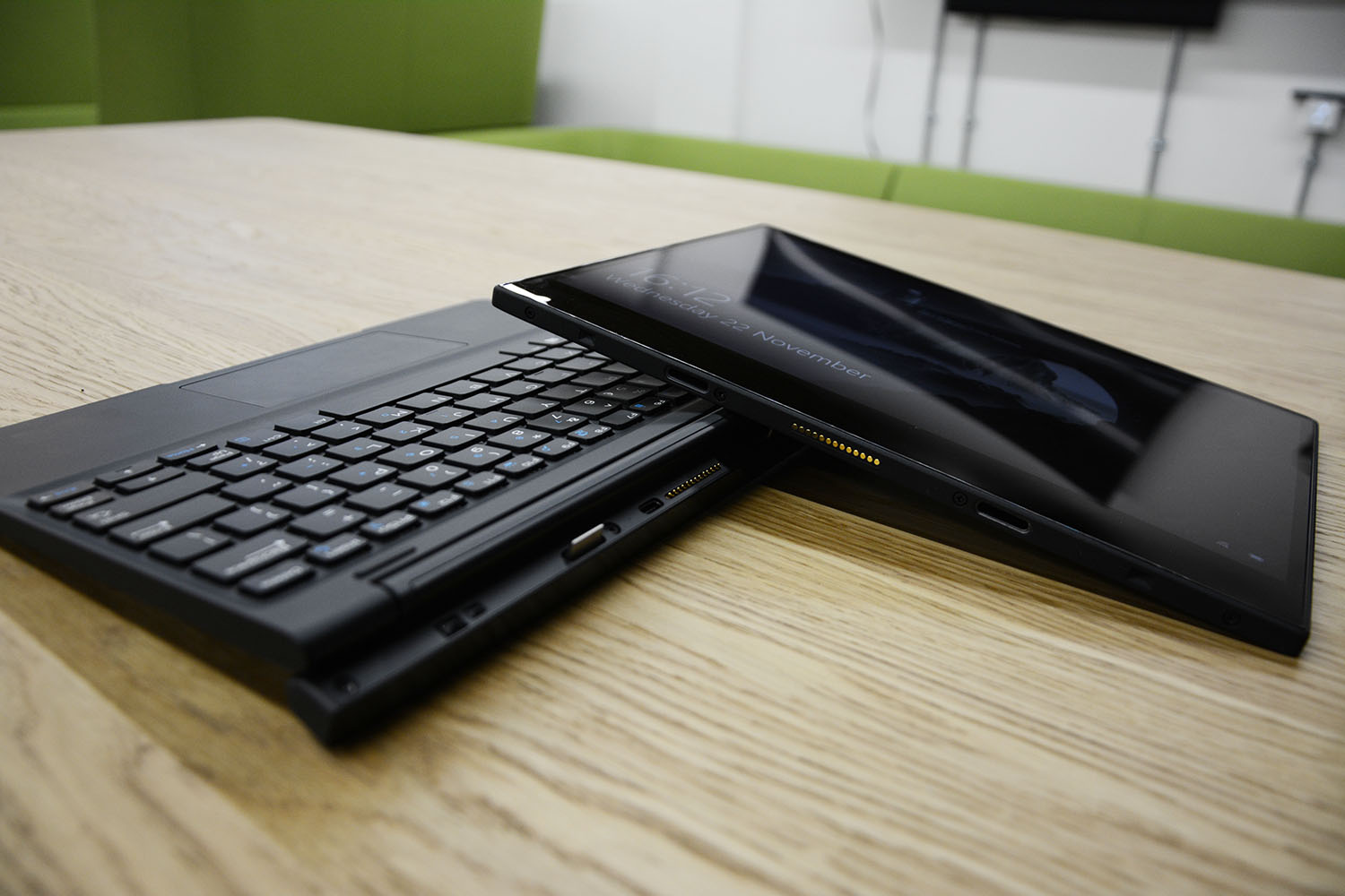
The Latitude 7285 represents an uncompromising view of what a 2-in-1 can be. Dell has clearly taken inspiration from the 'form follows function' principle, concerning itself more with creating a solid, well-made device rather than something with flashy looks. That's quite the deviation from the 2-in-1 norm, as the market is full of devices that attempt to be as slim and light as possible, which as a result afford some truly beautiful designs.
In contrast, the Latitude 7285 isn't exactly beautiful, yet what it lacks in looks it more than makes up in function, including a near-brilliant keyboard and an excellent screen. However, the device feels half finished, as while we admire Dell's attempt to incorporate some of the best aspects of a laptop onto a 2-in-1, some questionable design choices hold it back.
Design & connectivity

The Latitude 7285 is one solid machine. The screen is framed by a magnesium shell, while the keyboard is built using an incredibly rigid plastic, both of which are finished in a black rubberised coating. It creates a reassuringly robust chassis that, while not the most attractive design, will cope well with being knocked around or thrown into a bag every day.
Things get a little more unusual when it comes to the screen. Even though the machine opts for some super-slim bezels at the top and sides, the bottom bezel is larger, most likely to reduce the amount of pressure exerted on the screen from the hinge. However, this means that although the Latitude shares the same 12.3in screen as the Surface Pro, the frame is taller, giving it more of a square look than a rectangle - a fairly old-fashioned and, arguably, unappealing design.
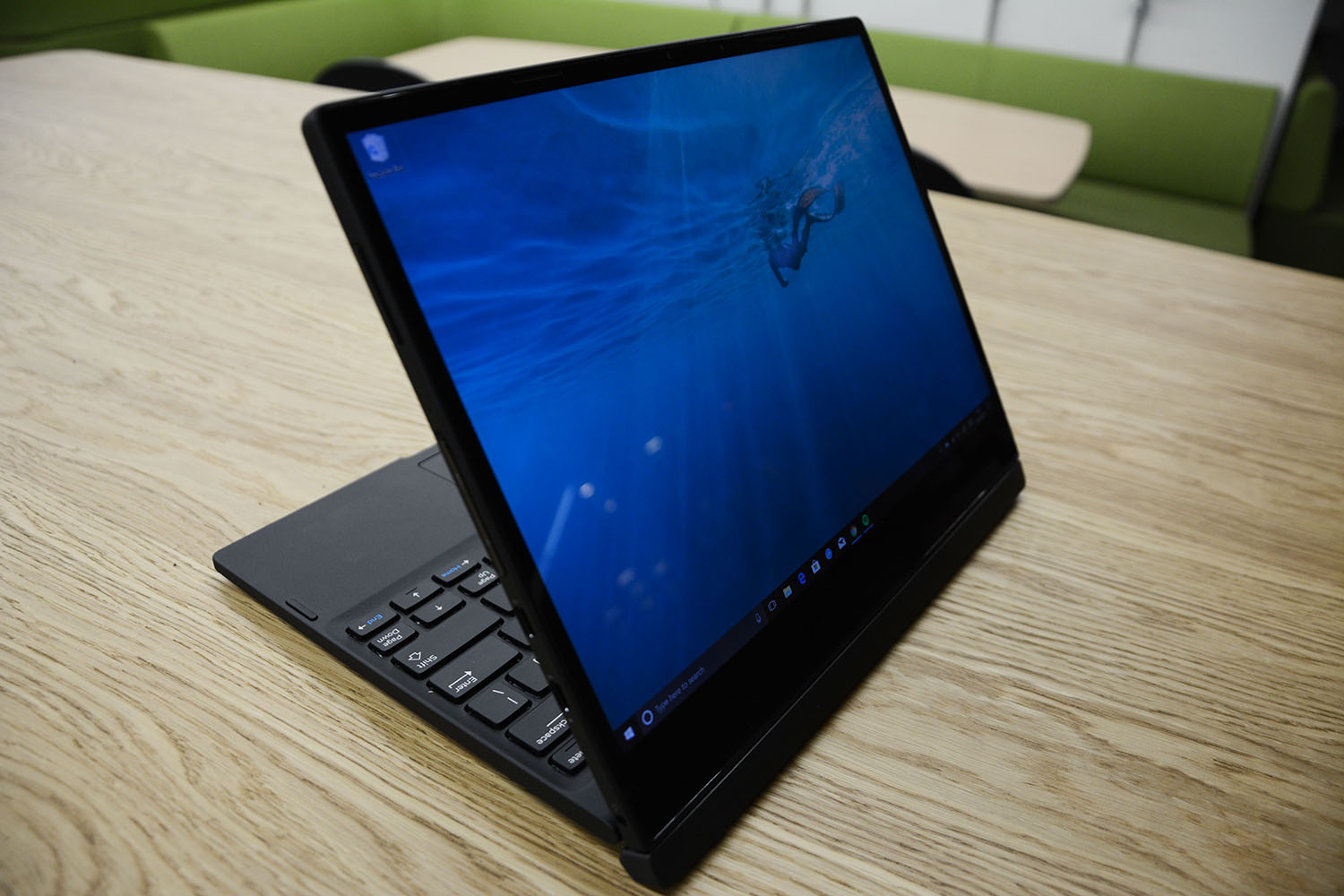
What's stranger still is how the tablet connects to the keyboard, which is by far the biggest problem with the Latitude. Instead of using a built-in stand like the Surface Pro, the Latitude's tablet is supported by a set of teeth-like connectors on a thick hinge, which is attached to the keyboard. In fact, the connection is so discrete, you'd be forgiven for mistaking the device for a traditional laptop. The design also means that back of the hinge pushes down on the table-top when open, elevating the keyboard up at an angle, which makes it significantly more comfortable to type on.
However, this style of hinge means that the keyboard, in order to act as a counterweight, needs to be much heavier than those found in rival devices. Although the tablet is beautifully light at 0.68kg, with the keyboard attached it doubles to 1.35kg, which is just a tad too heavy to carry comfortably. This is in stark contrast to other devices on the market, where the keyboard is typically the lightest part of the device.
That added weight essentially makes the ability to reverse the screen redundant, as the reason that is so useful on the Surface Pro and similar devices is that you barely notice the added bulk of the keyboard lying behind the screen. We found that it was far easier just to leave the keyboard behind when you move around, which undermines the purpose of a 2-in-1.
Sign up today and you will receive a free copy of our Future Focus 2025 report - the leading guidance on AI, cybersecurity and other IT challenges as per 700+ senior executives

In order to support its tablet screen, the Latitude's hinge connection is also incredibly strong, meaning it will have you awkwardly grabbing the tablet at the side to give it a firm pull, only for it to suddenly snap away from the connector - not exactly the seamless transition you expect from a 2-in-1.
Another annoying by-product of that connector is that you're only able to angle the screen to around 120 degrees, which means you can't open it any further to suit, say, using it on your lap. While the restriction makes sense, given that angling it any further back would risk the tablet snapping away from the hinge, the design payoff is nowhere near worth the sacrificed functionality.
The design choice achieves more or less the same effect as the angled keyboards of the Surface Pro or Acer Switch 5, but with none of the flexibility that those devices afford. What's more, much like the 12in Samsung Galaxy Book and Apple iPad Pro, there's no way to prop the tablet up if you want to use it without the keyboard.
Dell has made some better choices when it comes to connectivity. The Latitude comes with two USB-C ports, both of which support Thunderbolt 3, offering potential speeds of up to 40GB/s, although you will need to use one of these for charging. While a USB 3.0 would've been nice, two USB-C ports on a 2-in-1 is a welcome sight, particularly as Microsoft refused to put the newer technology on its latest Surface Pro.
You also get a microSD and a SIM slot, as well as a Windows Home button, which is useful for opening the Start menu while using the device as a tablet. Windows Hello support is included too, vie a depth-sensing facial recognition camera for facial recognition.
Keyboard & trackpad

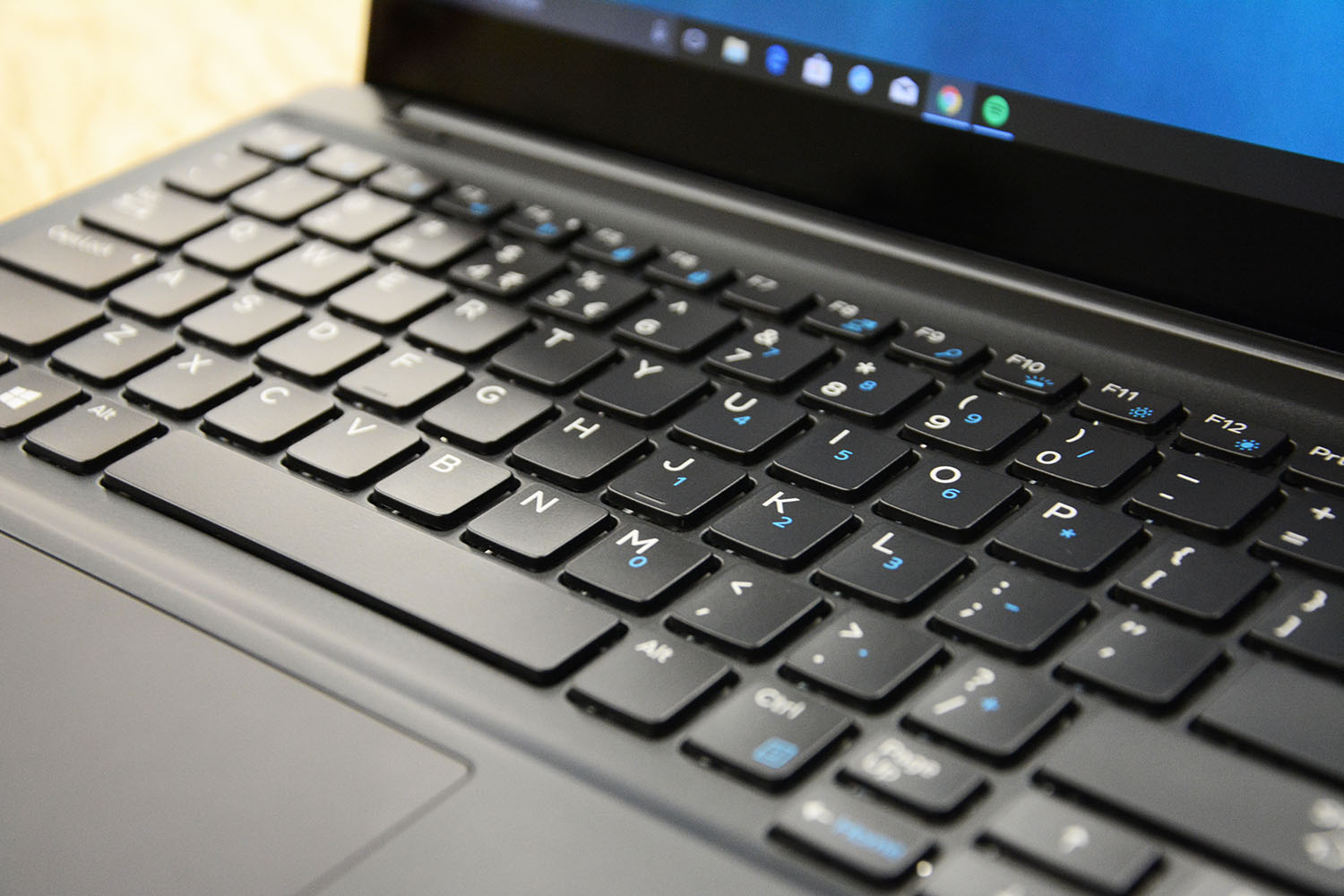
Aside from the many issues we had with the design choices of the machine, the keyboard is one its redeeming features. The same rubberised material from the frame coats the keys, which, along with the palm rests, creates a wonderfully comfortable typing experience. Keys also have a relatively long travel time, offering fantastic feedback on each keystroke, while some vibrant white backlighting aids typing in the dark. In fact, the keyboard is almost identical to the one found on the Lenovo ThinkPad Carbon X1, which we found to be one of the best typing experiences available on an ultrabook.
The only issue is that the slightly odd shape of the machine translates to the keyboard, which leaves some of the keys feeling uncomfortably cramped. The enter key is perhaps the worst affected, which is far too small to be used accurately, while the arrow keys are too close to the page-up and page-down keys. This can at times make touch typing a frustrating experience.
Unfortunately, the trackpad is mediocre at best. Its surface is non-sticky and pleasant to use, and its left and right keys offer satisfying clicks, however, we found it would occasionally become unresponsive, or fail to recognise commands. There's a chance this is simply a problem with the machine we reviewed, but regardless, it's a very average touchpad.
Dale Walker is a contributor specializing in cybersecurity, data protection, and IT regulations. He was the former managing editor at ITPro, as well as its sibling sites CloudPro and ChannelPro. He spent a number of years reporting for ITPro from numerous domestic and international events, including IBM, Red Hat, Google, and has been a regular reporter for Microsoft's various yearly showcases, including Ignite.
-
 Trump's AI executive order could leave US in a 'regulatory vacuum'
News Citing a "patchwork of 50 different regulatory regimes" and "ideological bias", President Trump wants rules to be set at a federal level
By Emma Woollacott Published
-
 Microsoft Excel is still alive and kicking at 40 – and it's surging in popularity as 82% of finance professionals report ‘emotional attachment’ to the spreadsheet software
News A recent survey found Gen Z and Millennial finance professionals have a strong “emotional attachment” to Microsoft Excel
By Emma Woollacott Published
-
 LastPass hit with ICO fine after 2022 data breach exposed 1.6 million users – here’s how the incident unfolded
News The impact of the LastPass breach was felt by customers as late as December 2024
By Emma Woollacott Published