Five top tips for optimising your web forms
Web form best practices for business growth and great customer experience

How often do you find yourself completing a time-consuming form in order to sign up for a newsletter, or register for a webinar or online training, only to get an error message about a missing field when you then hit submit? After all that effort, it might put you off submitting the form altogether. Or, when you see a subscription you want to sign up to but the web form is so long, you might decide not to bother enrolling at all.
With businesses often having their own web forms to complete in order to access content, if you don’t want your customers to feel the same way when it comes to filling in their information, you really need to think about how your online questionnaires and forms are designed.
RELATED RESOURCE

Three-step guide to modern customer experience
Support the critical role CX plays in your business
It’s difficult to strike a balance between gathering customer data and making sure online forms are simple enough to avoid unnecessary barriers for customers trying to access information. A bad customer experience could really mean a loss to your business in more ways than one.
Even when your organisation feels that the content is worth the lengthy form, why risk assuming your audience feels the same way? Your customers would have a much better experience if they can sign up via a less complicated, short questionnaire and reach the content you’re engaging them with. Plus they’ll have a better opinion of your organisation altogether and more likely come back.
Giving customers a great experience and helping them get through forms faster is vital for building relationships and for business growth. So how do you create this frictionless experience, without sacrificing the information that you do need from your customers?
1. Make your forms accessible on all devices
With only 4% of UK households lacking a mobile phone, and 50.81% of global web traffic generated through mobile phones, you can’t afford to disregard the compatibility of your forms on mobile devices. If your forms are only user friendly for big screens, you’re going to frustrate a lot of people who constantly have to zoom in and out to fill out fields on a tiny screen - and will likely just abandon your form.
2. Reduce the amount of clicks and keystrokes
By enabling autofill or smart default technology, businesses can save their customers time and effort. Research shows that customers using web forms with autofill complete the forms 30% faster than without.
Get the ITPro daily newsletter
Sign up today and you will receive a free copy of our Future Focus 2025 report - the leading guidance on AI, cybersecurity and other IT challenges as per 700+ senior executives
Developers can control the form’s HTML to ensure that browsers input the correct information, i.e. a street address goes into the street address field rather than the postcode field, which delivers a smooth experience with little need for typing on the customer’s part.
3. Use e-signature technology
Hopefully, in this digital age, you’re not still asking customers to download, print, sign, and scan or physically return forms. But even if you use online forms, asking for a signature from a customer can create a boatload of stress if the customer isn’t particularly tech-savvy or doesn’t have the right software already downloaded.
Incorporating e-signature technology into your forms, such as DocuSign or Adobe Sign, makes signing important documents like business contracts a breeze and prevents clients from choosing a company with more streamlined systems the next time around.
4. Reduce the number of fields
Steps two and three are important for cutting down the work your customers do for each field, but if you have too many fields to begin with, you’re still likely to put them off.
Imagine a customer seeing a post about a great webinar you’re hosting or a newsletter that they want to sign up to. Your headline has conveyed what benefit they’ll get from it and your landing page copy has enticed them. They eagerly click through and are then met with a monstrous page of fields to fill out.
If you want to convert customers, it’s important to only ask for the most important information. Question whether the information you’re asking for is relevant to what the customer is trying to access, or whether you could ask for the information at another time.
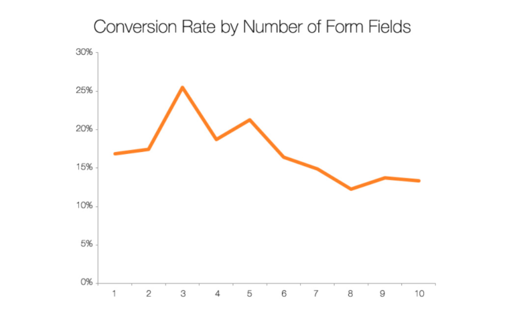
A study by HubSpot of over 40,000 of their own landing pages found that three fields is the sweet spot for conversion in most cases.

However, there are exceptions to this rule. If your form is gating a coveted or expensive service, customers will actually expect to give you more information. Filling out more fields conveys to them subconsciously that what they’re about to receive is of high value, and you don’t want to diminish that value or appear untrustworthy by asking for so little in return.
5. Try a multi-page format
The previous steps have focused on reducing the amount of friction customers encounter, but in cases of high-stakes forms where you do need to collect a lot of information, it can be useful to just reduce the perception of friction
At some point in your life, you’ve likely given or received that handy piece of advice for managing large projects: break it down into smaller, bite-sized tasks. This makes the project seem less intimidating, and it also makes you feel like you’re making headway.
The idea behind multi-page web forms is similar. If you spread the fields of your form across several pages, you create a feeling of progression and achievement for users, without actually reducing the information they give you.
Multi-step forms can achieve 300% more conversions than your traditional web form. Show customers their progress with a progress bar or number of steps completed out of the number left to complete in order to dissuade them from abandoning it.
Key takeaways
The exact number of fields and the format of your web forms will depend on what product or service you offer, but the general best practice is to present a clean form with a clear purpose that the customer can fill out without perceiving too much friction. This type of form is much more likely to convey professionalism, get conversions, and encourage the growth of your business.
-
 AI is helping bad bots take over the internet
News Automated bot traffic has surpassed human activity for the first time in a decade, according to Imperva
By Bobby Hellard
-
 Two years on from its Series B round, Hack the Box is targeting further growth
News Hack the Box has grown significantly in the last two years, and it shows no signs of slowing down
By Ross Kelly
-
 Optimise CX and accelerate business growth through your voice network
whitepaper Protecting the human experience in a digital world
By ITPro
-
 Enterprises are doubling down on IT optimization strategies – and it’s delivering huge financial returns
News Organizations that have cracked IT cost optimization and innovation reap the rewards both financially and in terms of time to market.
By Emma Woollacott
-
 IDC InfoBrief: Sustainability doesn’t need to be all stick and no carrot
whitepaper CIOs are facing two conflicting strategic imperatives
By ITPro
-
 How to empower employees to accelerate emissions reduction
in depth With ICT accounting for as much as 3% of global carbon emissions, the same as aviation, the industry needs to increase emissions reduction
By Fleur Doidge
-
 The Forrester Wave™: API management solutions
Whitepaper The 15 providers that matter the most and how they stack up
By ITPro
-
 The case for an accelerated device refresh cycle
Whitepaper Achieving a more cost-effective device lifecycle overall
By ITPro
-
 Four data challenges holding back your video business
whitepaper Data-driven insights are key to making strategic business decisions that chart a winning route
By ITPro
-
 Former TSB CIO fined £81,000 for botched IT migration
News It’s the first penalty imposed on an individual involved in the infamous migration project
By Ross Kelly