HTC One review
Updated: HTC unleashes its first 1080p smartphone. Can this revive the firm’s fortunes and fight off the forthcoming Samsung Galaxy S4?


The HTC One is currently the world’s best smartphone. It’s got the best design, specification and screen so, if you’re in the market for a high-end handset, this is the phone to buy.
-
+
Exceptional hardware; Record-breaking speed; Stunning 1080p screen; Slick Sense 5 software
-
-
Camera could be better; BlinkFeed needs work

HTC was the first company to embrace Android, but it's had a tough couple of years: its handsets have fallen behind competition from Samsung and Apple, and revenues have slipped to levels not seen since before the Android boom.
With its back against the wall, HTC has never needed a hit like it does right now and the HTC One does deliver. It's a barnstormer in virtually every respect, and it kicks off with the best industrial design we've ever seen.
Leading by design
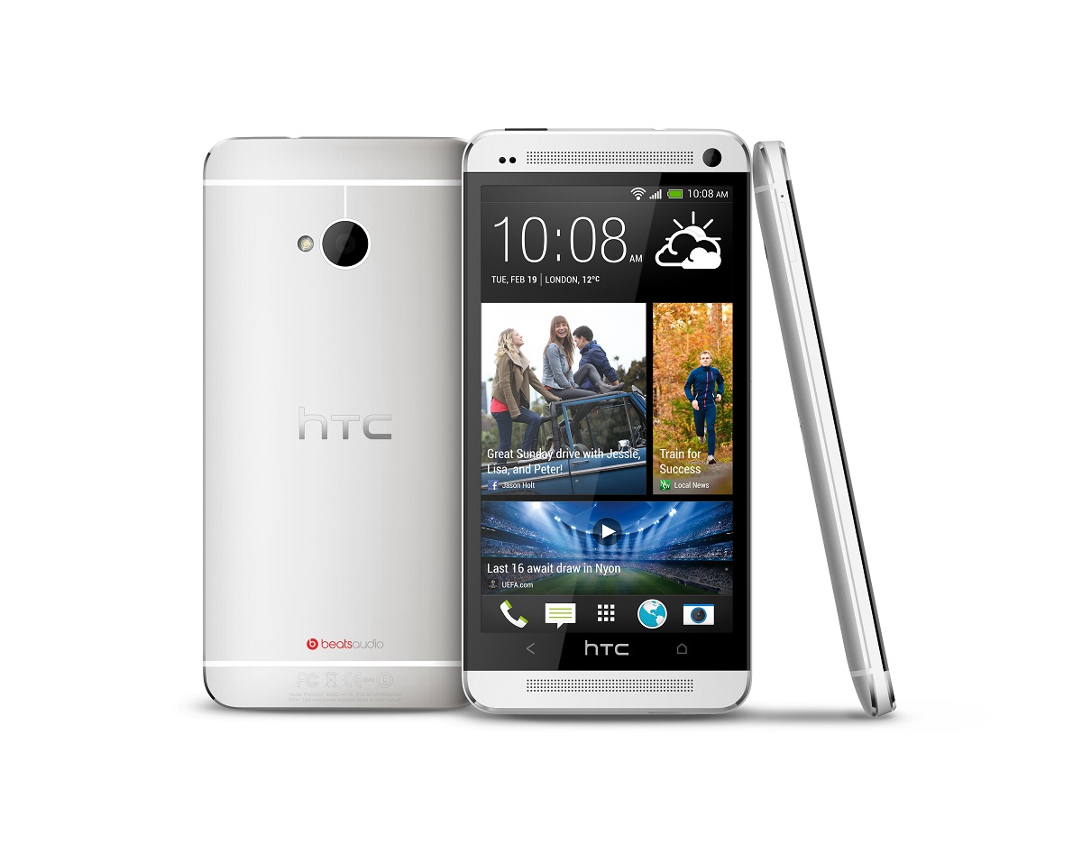
HTC has spent the past couple of years making phones from hard-wearing polycarbonate shells, but it's ditched the plastic in favour of anodised aluminium. HTC spends 200 minutes machining each phone into existence, and we love the finished article: a gently curved rear, chamfered edges that angle towards the Gorilla Glass front, and bands on the edges and rear that are filled with off-white polycarbonate.
The One looks gorgeous, and it's stronger than the Samsung Galaxy S3 and Sony Xperia Z. Its 143g weight is reasonable, and its 9.3mm thickness is fine.

HTC hasn't forgotten the little details, either. There are speaker grilles above and below the 4.7in screen, and each hole has been individually milled from the metal and one of them is filled with a tiny notification LED. The screen cuts a black swathe across the metal body, and it's decorated by an HTC logo and home and back buttons, with the menu key deemed surplus to requirements.
The two sensors and front-facing camera sit above the screen and peek out from precision-milled holes, and the camera on the rear panel is ringed by polycarbonate and is recessed so the lens isn't scratched. The metallic HTC logo is demure, and the only sign of colour across the One's rear panel is the red Beats Audio logo.
Problems are few and far between: there's no dedicated camera button, and the closed shell means there's no battery access or microSD slot. We don't really mind, though: this is the world's best-looking phone.
Sign up today and you will receive a free copy of our Future Focus 2025 report - the leading guidance on AI, cybersecurity and other IT challenges as per 700+ senior executives
Making Sense?
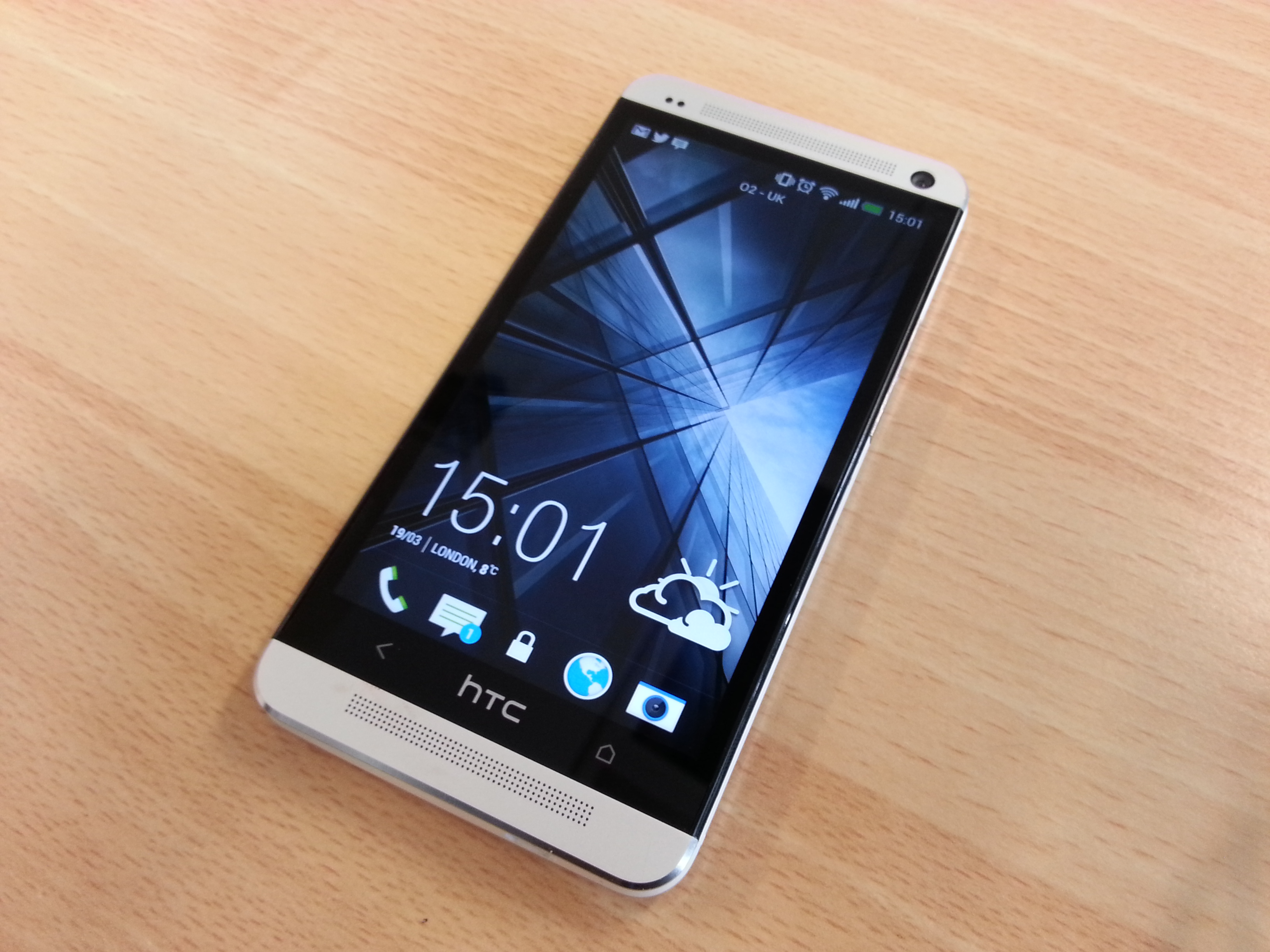
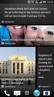
HTC hasn't just made radical changes to its industrial design the One is the first phone to feature Sense 5. The big inclusion in this version of HTC's Android overlay is BlinkFeed, which replaces the traditional homescreen. The new version is covered with tiles that are updated with news stories and updates from Facebook, Twitter, Flickr and LinkedIn. There's a clock and a weather graphic at the top of the screen, as well as an option to post directly to Facebook or Twitter.
It looks fantastic and tiles scroll smoothly. It's great for finding news stories, but we're not convinced that it works for social networks we'd rather delve into the apps themselves rather than see snippets of larger conversations.

A menu at the top of the BlinkFeed can be used to choose which stories show up featured sources can be chosen alongside topics, and these can be ticked or unticked to customise what content appears. And, if you don't like BlinkFeed at all, it's possible to opt for a traditional homescreen although the BlinkFeed can't be disabled entirely.
We wish the BlinkFeed was more versatile; the SDK to create BlinkFeed-compatible sites hasn't yet been released, so the only sources available at the moment have to be approved by HTC.
BlinkFeed is the biggest change, but it's not the only addition to Sense 5. The lockscreen ring has been replaced by the clock we love dragging it upwards to unlock the phone and watching the timepiece seamlessly drop to the top of the BlinkFeed. The gallery, like BlinkFeed, draws in pictures from social networks, and it's made from large tiles.
The app drawer now uses a 3x4 layout, which looks juvenile, but the more familiar 4x5 option can still be used. There's the new TV app, too, which works as a remote control. We told the phone which companies manufactured our television and Sky+ box and, within seconds, we turned on the TV and begun to change channels and navigate the EPG. The app also keeps track of your favourite shows, letting you know when they're on and changing the channel with a single tap.
Underneath it all is Android 4.1.2, which isn't the latest version of the OS. HTC has compensated for missing features with its own tweaks: we'd rather see stock Android's notification bar settings, but the One includes a link to the full settings screen, and HTC's own gesture typing works as well as Android's own keyboard.
It's largely a clean bill of health for Sense 5. BlinkFeed is a slick addition even if its social networking tools fall flat, and the rest of HTC's software is fine at worst unobtrusive, at best clever.
Mike Jennings has worked as a technology journalist for more than a decade and has been fascinated by computers since childhood, when he spent far too long building terrible websites. He loves desktop PCs, components, laptops and anything to do with the latest hardware.
Mike worked as a staff writer at PC Pro magazine in London for seven years, and during that time wrote for a variety of other tech titles, including Custom PC, Micro Mart and Computer Shopper. Since 2013, he’s been a freelance tech writer, and writes regularly for titles like Wired, TechRadar, Stuff, TechSpot, IT Pro, TrustedReviews and TechAdvisor. He still loves tech and covers everything from the latest business hardware and software to high-end gaming gear, and you’ll find him on plenty of sites writing reviews, features and guides on a vast range of topics.
You can email Mike at mike@mike-jennings.net, or find him on Twitter at @mikejjennings
-
 Trump's AI executive order could leave US in a 'regulatory vacuum'
News Citing a "patchwork of 50 different regulatory regimes" and "ideological bias", President Trump wants rules to be set at a federal level
By Emma Woollacott Published
-
 Microsoft Excel is still alive and kicking at 40 – and it's surging in popularity as 82% of finance professionals report ‘emotional attachment’ to the spreadsheet software
News A recent survey found Gen Z and Millennial finance professionals have a strong “emotional attachment” to Microsoft Excel
By Emma Woollacott Published
-
 LastPass hit with ICO fine after 2022 data breach exposed 1.6 million users – here’s how the incident unfolded
News The impact of the LastPass breach was felt by customers as late as December 2024
By Emma Woollacott Published
