Android KitKat 4.4 vs Apple iOS 7 head-to-head review
We put core apps including email, maps & browsers to the test to see which OS is the top dog
Android KitKat 4.4 and iOS 7 have been doing battle for close to a year - and the next iterations rolling out starting in September.
Currently used by 21 per cent of the Google userbase, KitKat 4.4 is the second most popular version of Android behind Jelly Bean, which is still found on over 50 per cent of Android devices. This is because upgrade cycles are carrier and manufacturer dependant. On the other hand, iOS 7 is active on 91 per cent of Apple devices as the firm pushes out the latest software update directly to devices.
We tested the popular mobile operating systems on flagship phones - theiPhone 5sandNexus 5- to see which is best.
There were 10 categories which we compared in total. So read on or jump to the relevant categories on the right to find out which OS is best for business.
Android KitKat vs iOS 7
User interface Email/calendarApplicationsWeb browsersSecurity & manageabilityMultitasking & battery life MapsSiri vs Google NowCustomisationsUpgradeabilityOverall winner
User Interface
Apple redesigned the interface for iOS 7. The glossy icons, skeuomorphic textures and cluttered looking built-in apps have been replaced with simple, colourful vector-based icons and minimalist designs.
For example, the Notes app no longer looks like a virtual notepad with lined paper - it's just black text on white, although the notes do have a subtle paper-like look to them. This doesn't mean there's no visual flourish - iOS 7 uses more translucency and animations.
Most changes to iOS 7 are cosmetic and the OS is as easy to use as ever. If you find animations too distracting, they can be switched off. There are some downsides. The font is thinner and lighter than before which some will find hard to read. An option to bold text in the Settings app compensates for this, and we recommend activating this.
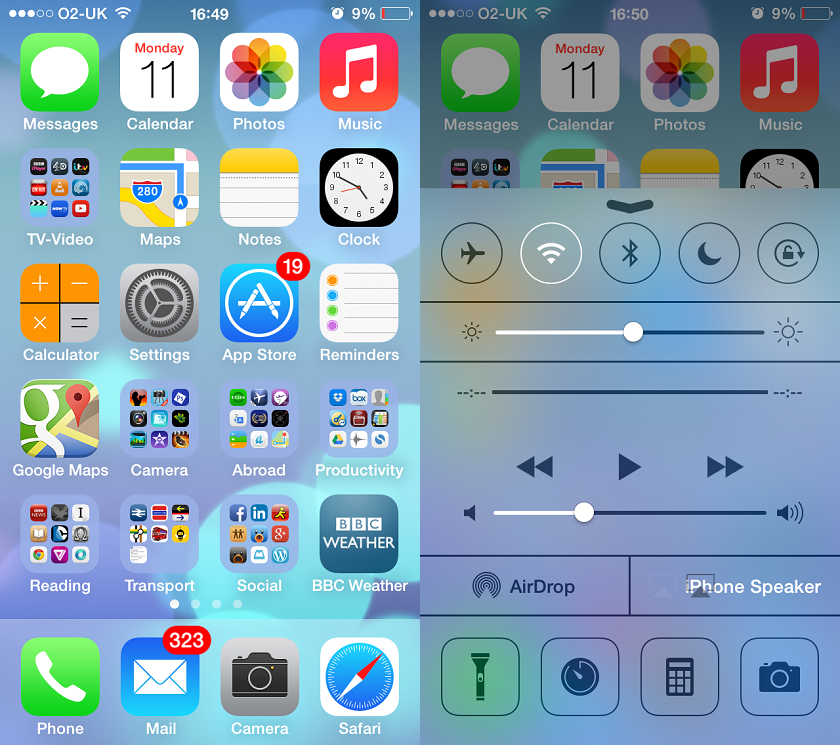
Apple's redesign brings a minimalist style and adds in core features such as the Control Centre (right)
Apple has added a 'Control Centre', which contains shortcuts to commonly used features such as Wi-Fi, volume and the camera app. This is brought up by swiping upwards from the bottom of the screen.
Some features are now hidden away. For example, the shortcut key for typing domain names appears to be missing from the keyboard, but has been merged with the full stop key. You need to press and hold it to access the domain name shortcuts. The Spotlight search feature is no longer accessed by swiping left from the first home screen. Instead you can swipe down from the middle of any home screen.
Although there have been some interface changes in Android 4.4, KitKat looks like its predecessors (without any manufacturer interface overlays). The interface has a lighter colour scheme due to a toning down of the black and blue debuted in 3.0 Honeycomb and 4.0 Ice Cream Sandwich and due to a greater use of transparency. The status bar at the top of the home screen and the button bar at the bottom are transparent, for example.
Android's drop down notification/settings menus remain merged in KitKat and it's easy to switch between them.
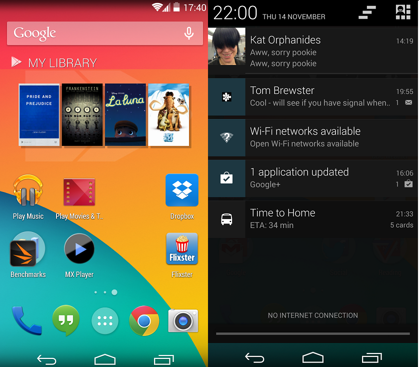
Android's homescreens are customisable and the drop down menus can switch between notifications and settings
KitKat marks the debut of a handful of features. The new Hangouts app replaces the old Messaging text app, but it feels rushed. The cluttered interface can be confusing and the app doesn't thread SMS and Google Hangout messages from the same contact together. It can be replaced with an SMS app of your own choice.
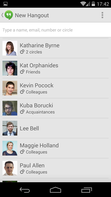
We're not fans of Google's Hangouts app
You can do a Google search for business numbers within the phone app, but it's not too smart - searching for curry' lists nearby electronic stores rather than Indian restaurants. The phone app also attempts to fetch the name of businesses that ring you and display their name as the caller ID with varying degrees of success.
A feature tailored for the larger phablets from Samsung and HTC is one-handed zoom. Tapping the screen, holding down on the tap and then swiping up or down zooms in or out in both Google Maps and Chrome.
KitKat's autocorrect feature is more convenient to use than iOS'. Placing the text caret in a word brings up a bar just above the keyboard with autocorrect suggestions. This is easier to reach than the bubbles that pop up above the word in iOS.
Scrolling and zooming in both operating systems is smooth. Google has made a number of modifications to Android and the flagship Nexus 5 uses a quad-core Snapdragon 800 processor. Performance of KitKat on mid-range devices remain to be seen. iOS is buttery smooth on flagship devices, but there are widespread reports of iPhone 4 and 4S devices struggling to run the redesigned operating system. This has been attributed to the use of animations, which can be switched off - but for the best experience you're going to want at least an iPhone 5.
There are plenty of differences between iOS and Android remaining from previous versions. Android still keeps all its apps in a separate apps drawer, with only your chosen apps showing up on the home screens. Copy and paste is less fiddly in iOS than Android but neither is perfect. One iOS feature we miss in Android is the ability to tap the status bar to jump back to the top of a webpage or document.
WINNER:Tie. It's a tight call. Apple's redesign means iOS looks great and the OS has added feature such as the Control Centre. Even though some of the new KitKat features are rough-around-the-edges, its notifications system is ahead and you have the option to use widgets.
Get the ITPro daily newsletter
Sign up today and you will receive a free copy of our Future Focus 2025 report - the leading guidance on AI, cybersecurity and other IT challenges as per 700+ senior executives
-
 Bigger salaries, more burnout: Is the CISO role in crisis?
In-depth CISOs are more stressed than ever before – but why is this and what can be done?
By Kate O'Flaherty Published
-
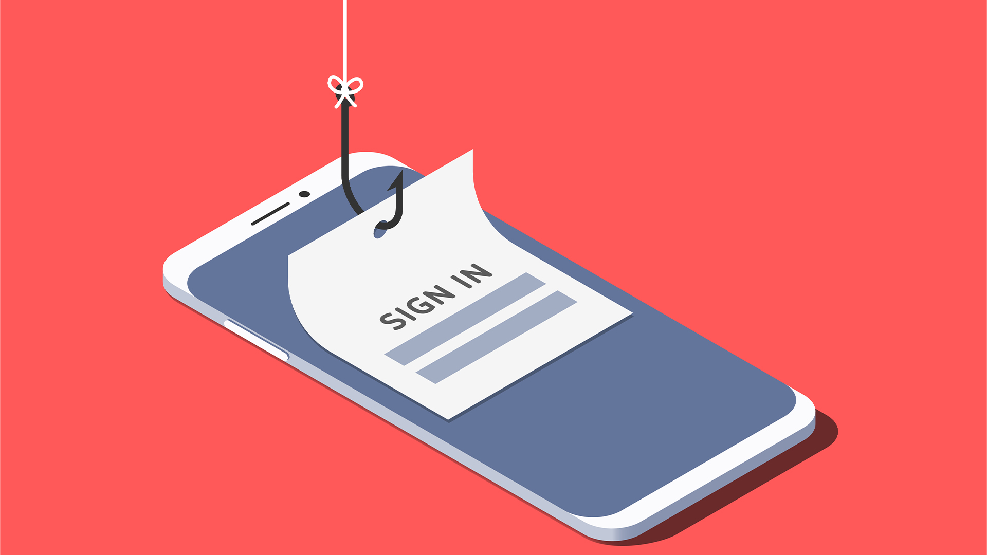 Cheap cyber crime kits can be bought on the dark web for less than $25
News Research from NordVPN shows phishing kits are now widely available on the dark web and via messaging apps like Telegram, and are often selling for less than $25.
By Emma Woollacott Published