Android 5.0 Lollipop review: Google's sweetest mobile OS?
Google starts rolling out Android Lollipop - but be warned if you're thinking about upgrading older devices

The best version of Android to-date - Lollipop is superb on newer hardware but not suited to 2012 devices.
-
+
Material Design is attractive; Better battery life; Notifications improved; Smart unlock
-
-
Some apps aren’t compatible yet; Problems with older devices Nexus 7 (2012)
Android 5.0 Lollipop debuted with the Nexus 9 tablet and is rolling out to other high-end devices.
The mobile operating system has been redesigned with Google has improving everything from notifications, security to battery life. Here's what you can expect from pure Android 5.0 Lollipop.
Design overhaul
The first thing you'll notice about Lollipop is the switch from the blue and white scheme to vibrant pastel colours. It makes the OS a lot more attractive to look at.
Google has extended its cards-based interface from the Google Now app throughout Android. New animations including touch feedback, ripples and shadow effects help to give the illusion of layers and depth.
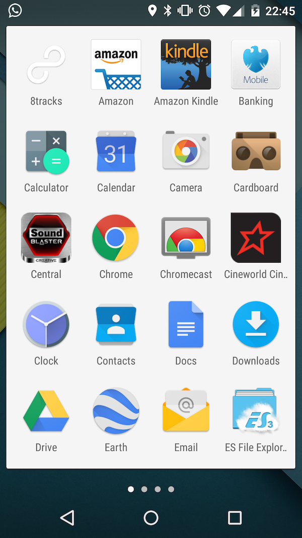
Android's navigation icons have been changed too. Gone is the house-shaped home' icon, which is replaced by a circle. Back is now triangle and the Overview menu (formerly multitasking') is a square.
This simple iconography looks great and allows for nifty little animations. When the on-screen keyboard pops up, the triangle rotates into a downward facing arrow, so you know pressing it will hide the keyboard.
The app drawer now expands out of the icon when touched in a slick and delightful way. It should be noted that while new Nexus devices will come with Google Now Launcher as standard, older devices upgraded to Android 5.0 will include their original launchers out-of-the-box. Of course, you're free to install the Google Now Launcher manually.
More notification options
One of the biggest updates has been to the notifications system, with many more ways to interact.
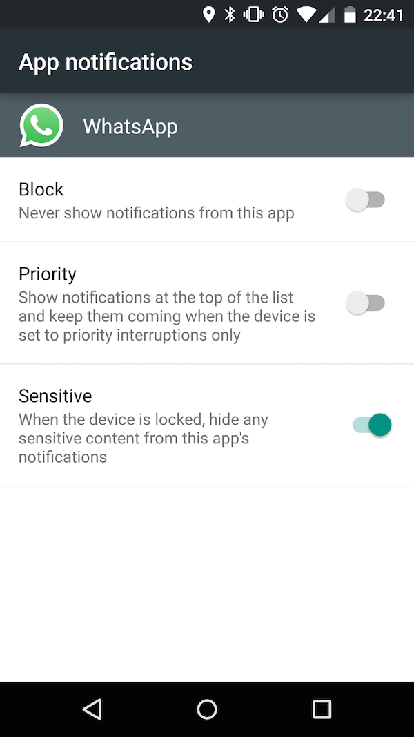
You can now press and hold notifications - which will take you to settings and give you the option to turn it off, set it as priority or mark the app as sensitive. Choosing the sensitive option, will mean notifications will not appear on the lock screen as they do with Lollipop by default.
Swiping down from the cards on the lock screen will bring up more information on all of the cards as well as show any that were hidden. Typically Google Now cards aren't display unless you bring up the hidden notifications.
You can quickly open the corresponding app for each notification with a double-press, which is a massive time saver. From the lock screen there are the usual shortcuts for the phone (if on a smartphone) and camera by swiping right or left. The corresponding app will then expand out from the icon in the lower corners.
Nexus 7 (2012) issues
Many users have flocked to the Google's product forums to warn about compatibility issues with between Lollipop and the Nexus 7 (2012).
Installing the update on the tablet appears to render the device "unusable". Works arounds to improve performance include switching off Google Now, reducing animations and limiting background processes to two. But these aren't ideal.
Many users have reported downgrading back to KitKat 4.4, so if you've got a Nexus 2012 device, it's worth holding off until Google releases a version better suited to older hardware.
New in Lollipop is Priority Notifications', which acts in a similar manner to Do Not Disturb' in iOS. You're able to dictate what notifications are important to you, and setting the phone to priority only will only allow these notifications through. It's also possible to set down time', that automatically puts only priority notifications through at pre-determined times. So you can set this during your sleeping hours so you're not disturbed.
Actions like incoming phone calls are also handled in a far less disruptive way. Rather than appearing full screen and interrupting whatever app you're in, these now pop in as a card from the top of the screen that you can accept or decline without taking yourself out of your current app.
Quick settings
The Quick settings menu is tweaked to make it more intuitive.
Icons for features such as Bluetooth and Wi-Fi and now split into two. The top icon acts as the toggle and the text label below takes you to the corresponding menu.
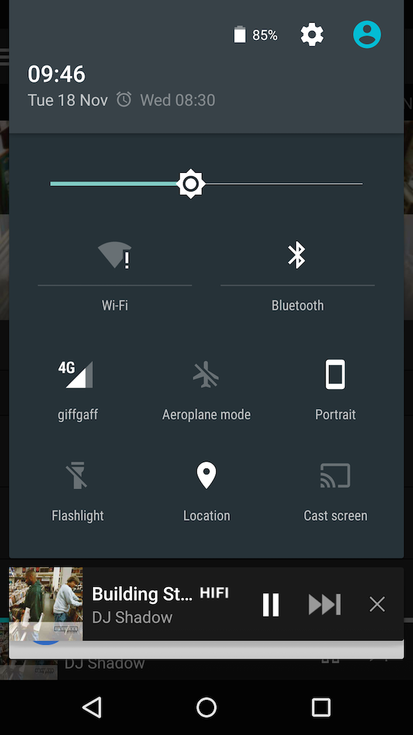
Pressing the mobile operator reception icon takes you to the Mobile Data settings page where you can see how much data you've used or switch it off. This is useful for anyone on a limited bandwidth tariff. In the status bar you can select the battery icon to be taken to the new battery usage menu and next to that is a settings icon to take you quickly to Android's full settings menu.
Quick settings are also now available direct from the lock screen with a pulldown from the top. New for smartphones is portrait lock from the quick settings, which was previously only in the Display menu unless you were using a tablet. There's also a flashlight toggle if you have a rear camera flash. At the moment there's no way of changing what appears in quick settings, so it will be interesting to see if vendors change this in their Android customisations.
Get the ITPro daily newsletter
Sign up today and you will receive a free copy of our Future Focus 2025 report - the leading guidance on AI, cybersecurity and other IT challenges as per 700+ senior executives
-
 ‘Phishing kits are a force multiplier': Cheap cyber crime kits can be bought on the dark web for less than $25 – and experts warn it’s lowering the barrier of entry for amateur hackers
News Research from NordVPN shows phishing kits are now widely available on the dark web and via messaging apps like Telegram, and are often selling for less than $25.
By Emma Woollacott Published
-
 Redis unveils new tools for developers working on AI applications
News Redis has announced new tools aimed at making it easier for AI developers to build applications and optimize large language model (LLM) outputs.
By Ross Kelly Published
-
 Google layoffs continue with "hundreds" cut from Chrome, Android, and Pixel teams
News The tech giant's efficiency drive enters a third year with devices teams the latest target
By Bobby Hellard Published