Enterprise smartwatch roundup - the top 5 business wearables
We test the top business smartwatches that you can buy today - that AREN'T the Apple Watch
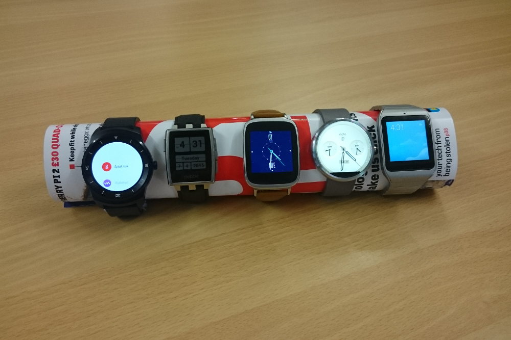

LG G Watch R
LG has been in the smartwatch game for a while. The original G watch was a solid entry to the market, going up primarily against Samsung's Gear range. However, LG has now stepped up its game, eschewing the common square design in favour of a more traditional round construction. In doing so, they've produced one of the most desirable watches on the market.
LG G Watch R -Design
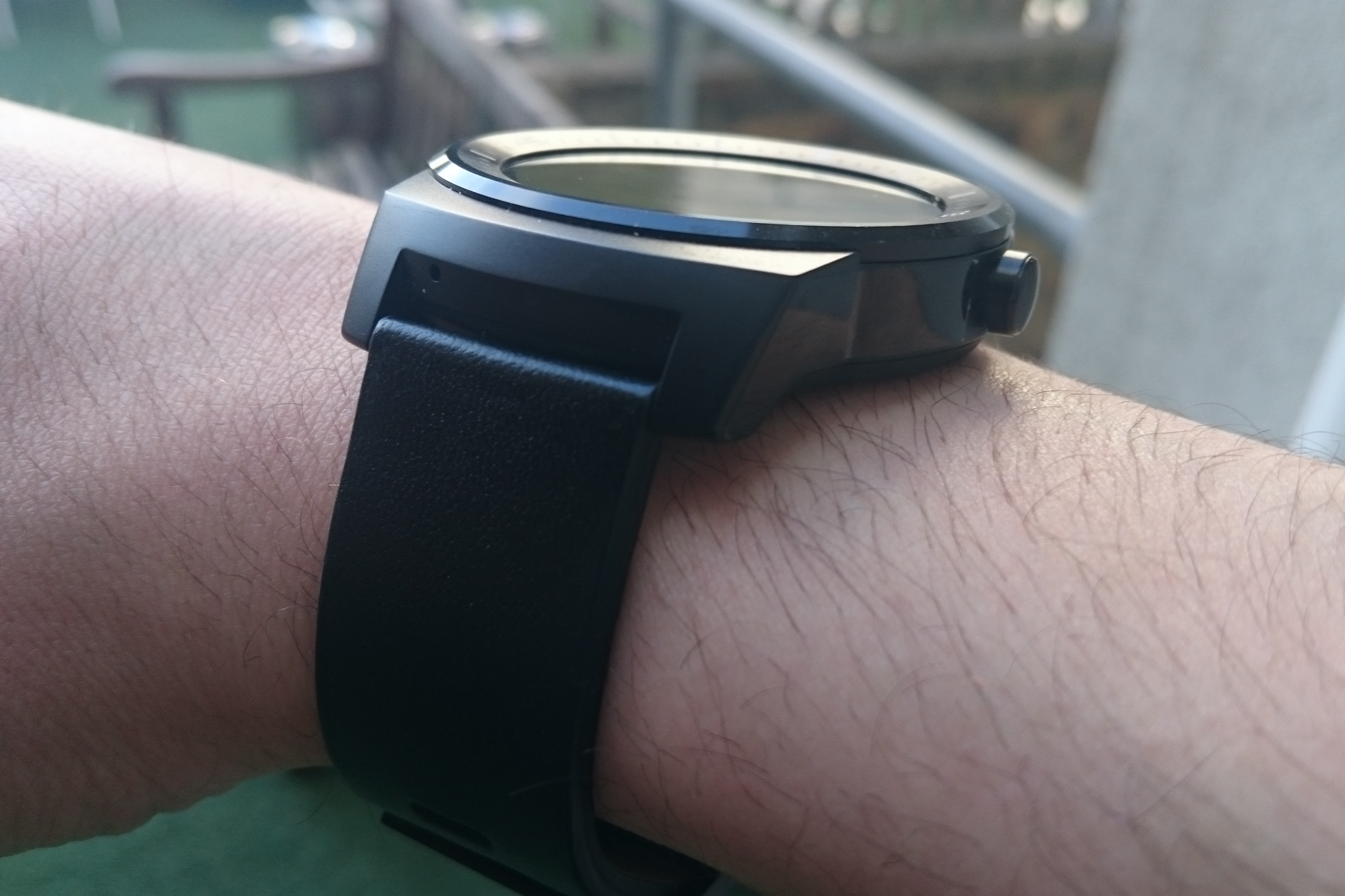
The design of the G Watch R is really rather attractive. For a start, it's one of the few smartwatches with a round, rather than square, face, and it's built to look remarkably similar to a traditional diver's watch. It's got big, bezeled edges, with dial markings going around the inside, and what would be a winding knob now serves as a button for turning the screen on and off.
The build quality is also pretty excellent, despite its plastic construction. The body sports a brushed-aluminium effect which gives it a nice touch of class, and definitely puts it on the upper end of the wearable quality spectrum.
LG G Watch R - Battery
The G Watch R charges through a magnetic USB dock. It's not the most stable method in the world, but it's also a lot more convenient than a standard cable. In terms of battery life, it's up there with the best of them a little over two days of mixed use from a full charge.
LG G Watch R -Smoothness and usability
The G Watch R is, on the whole, very quick indeed, but occasionally has a very slight lag when performing tasks or swiping between cards. It's not overly problematic, but it's a little frustrating when in a hurry. What's a bit more of a pain in that the raised bezels around the face of the watch can often make the swipe-based controls tricky and imprecise, especially with larger fingers. Dictation, however, makes up for that. If you can get over feeling the tiniest bit daft, Google Now's voice command functionality will perform perfectly well.
LG G Watch R -Weight and feel
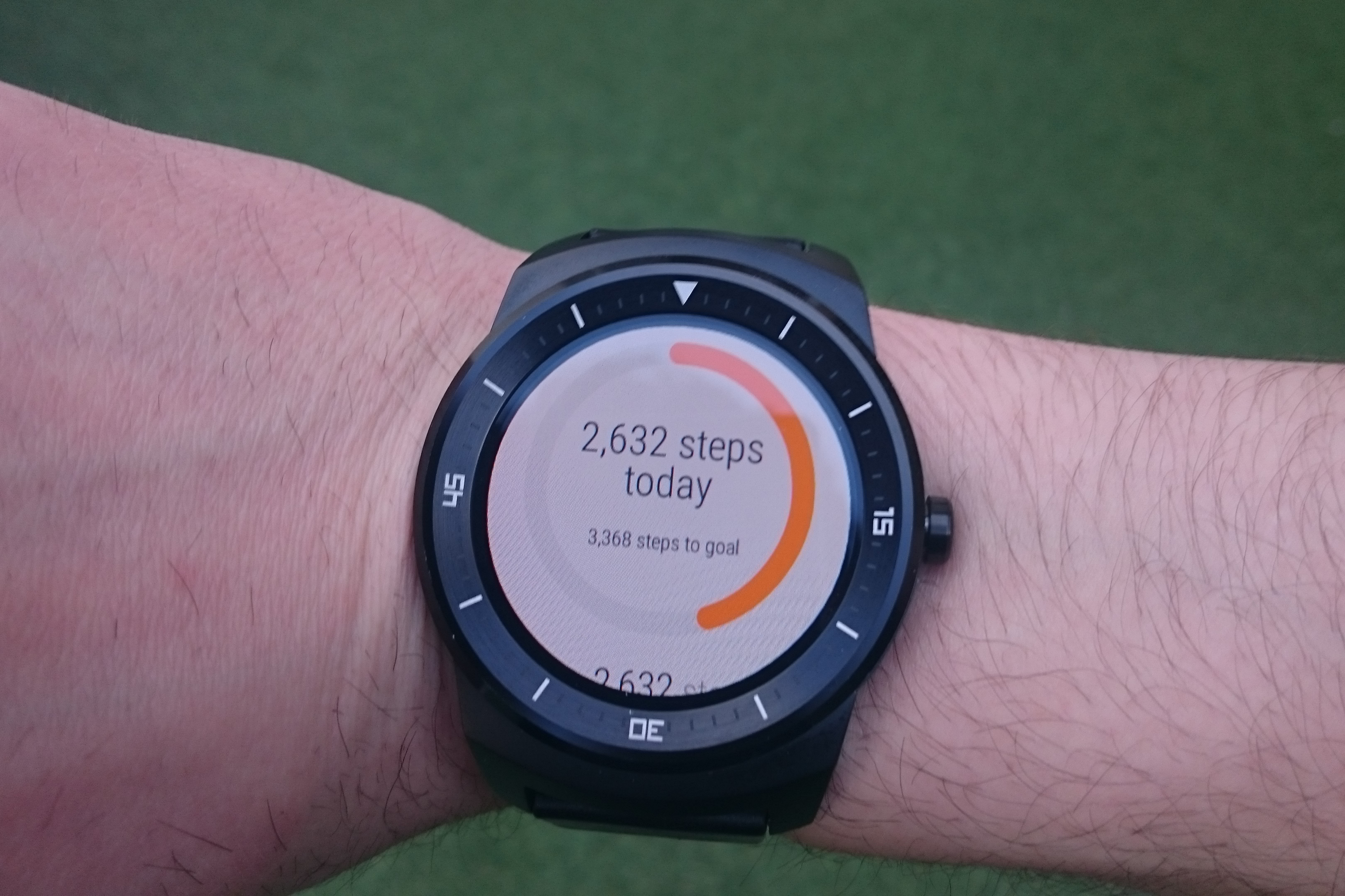
The G Watch R is definitely one of the bulkiest smartwatches around, and the 1.1cm height may see it snagging on sleeves and the like. Considering the chunkier style it's going for, it's not a huge problem, but we'd have preferred a few millimetres shaved off it regardless. Weight-wise, the G Watch R is definitely noticeable on your wrist, but not tediously so - It's actually a little lighter than many normal watches.
LG G Watch R -Price
At a little over 200, it's not pocket change, but it's also not far off what you'll be paying for rivals. It's also leagues cheaper than a mid-range Tag Hueur or Omega.
Get the ITPro daily newsletter
Sign up today and you will receive a free copy of our Future Focus 2025 report - the leading guidance on AI, cybersecurity and other IT challenges as per 700+ senior executives
LG G Watch R -Display
The G Watch R's 1.3in P-OLED display is nice and bright, with good contrast and a colour gamut that really pops. It's also easily readable at a glance, even in direct sunlight. The circular face, while gorgeous, truncates notifications and text a little, but that's a trade between form and function that in this case, we're happy to make.
LG G Watch R -Features
One of the killer features for fitness buffs is likely to be the G Watch R's in-built heart-rate monitor, although we found that it could be a little selective about whether or not it would actually read our pulse. A few times, we were worried that we might be having a Sixth Sense-style crisis.
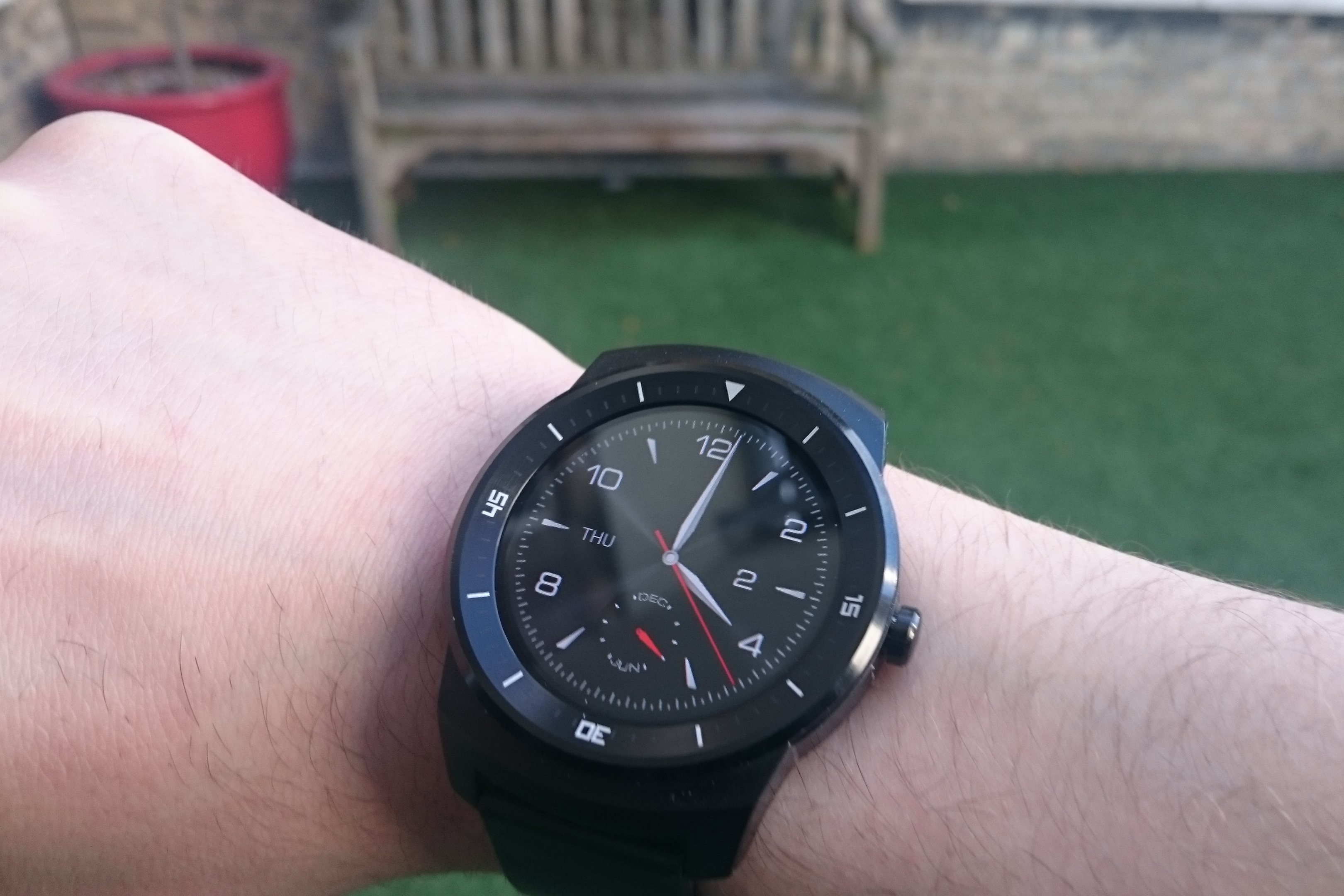
Its IP67 rating also means that the G Watch R is water resistant to a depth of 1m, which is a good selling point for anything, but pretty crucial for wearables. The vibration is a little weak, however - we wouldn't advise relying on the vibrating alarm if you're a heavy sleeper, and sufferers of phantom vibration are going to find themselves compulsively checking for missed notifications.
LG G Watch R -Verdict
Along with the Moto 360, the G Watch R marks the current pinnacle of smartwatch technology. It's mightily impressive, both from a design standpoint and in terms of pure functionality.
Granted, it's slightly more expensive than its stablemates, but it's honestly worth the extra. The display is gorgeous, the build quality equally so, and the design is sophisticated enough that it doesn't immediately scream overly expensive gimmick'.
Sony SmartWatch 3
Sony has been something of a dark horse in the smartwatch race. Its first two smartwatches were really rather good, but flew under the radar for most people, and the Smartband Talk, launched alongside the Smartwatch 3, is equally nifty. With its latest wearable, the company has proved that its ready to enter the big leagues. It's got some issues, and we couldn't honestly say that we're burning to own one, but we like it an awful lot.
Sony Smartwatch 3 -Design
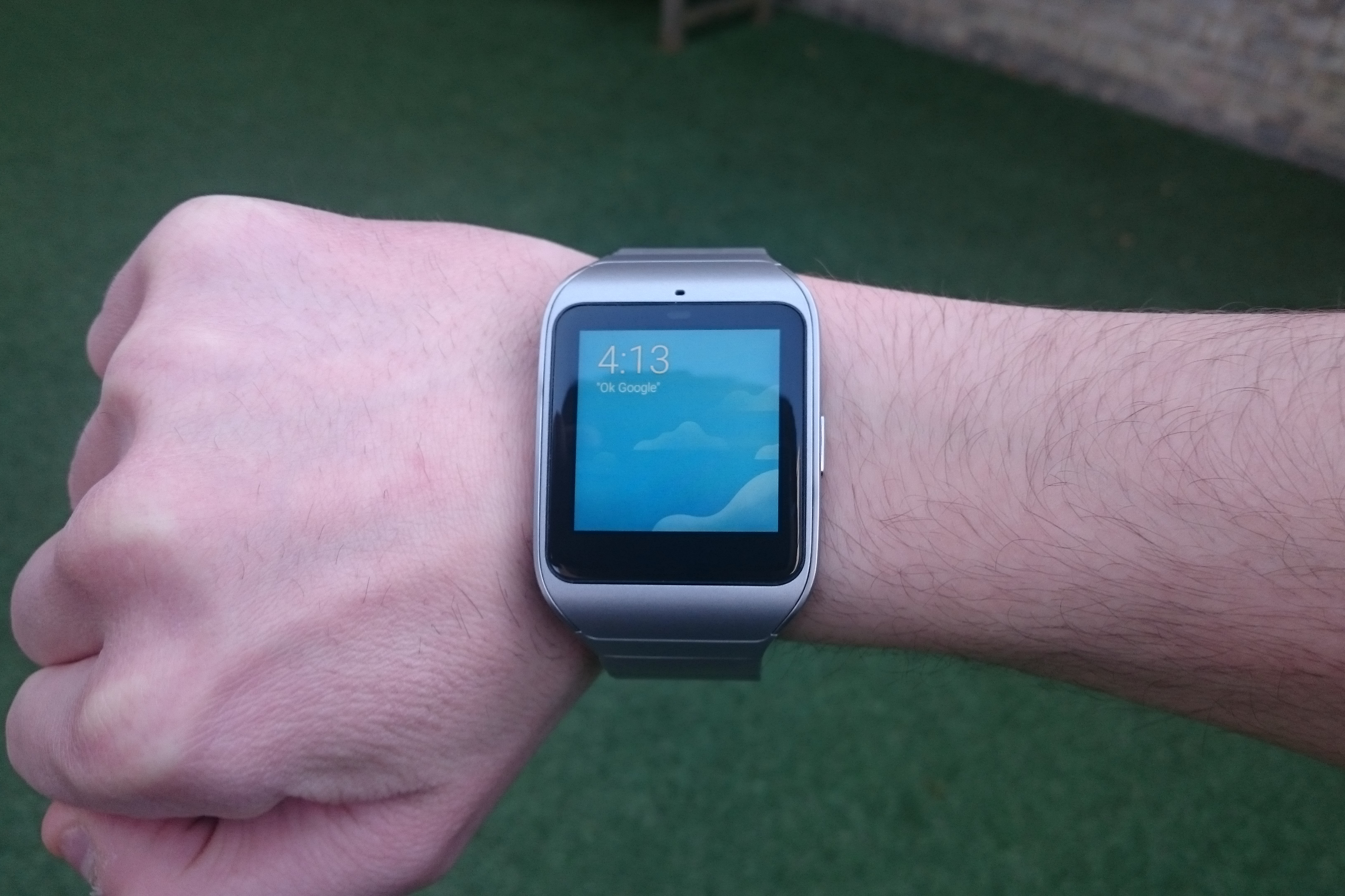
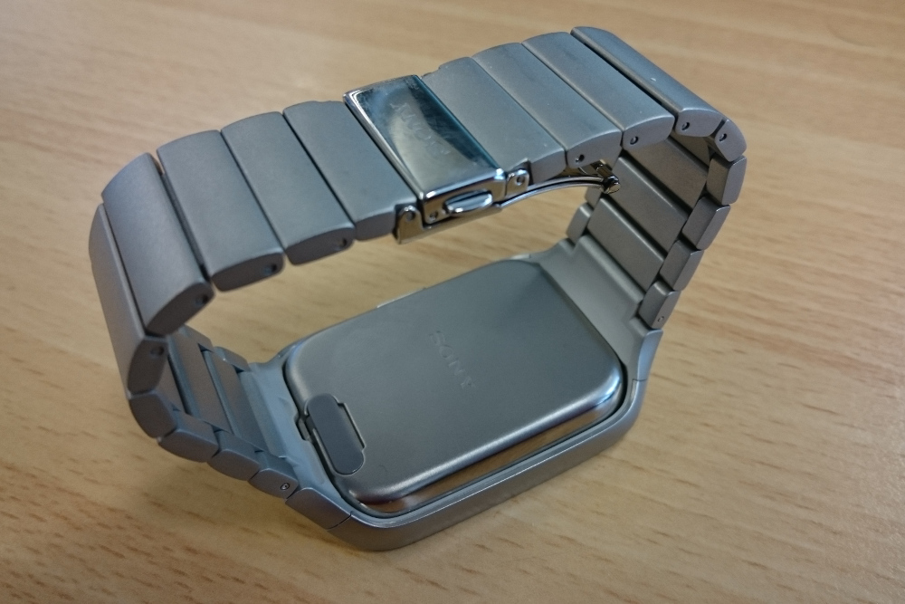
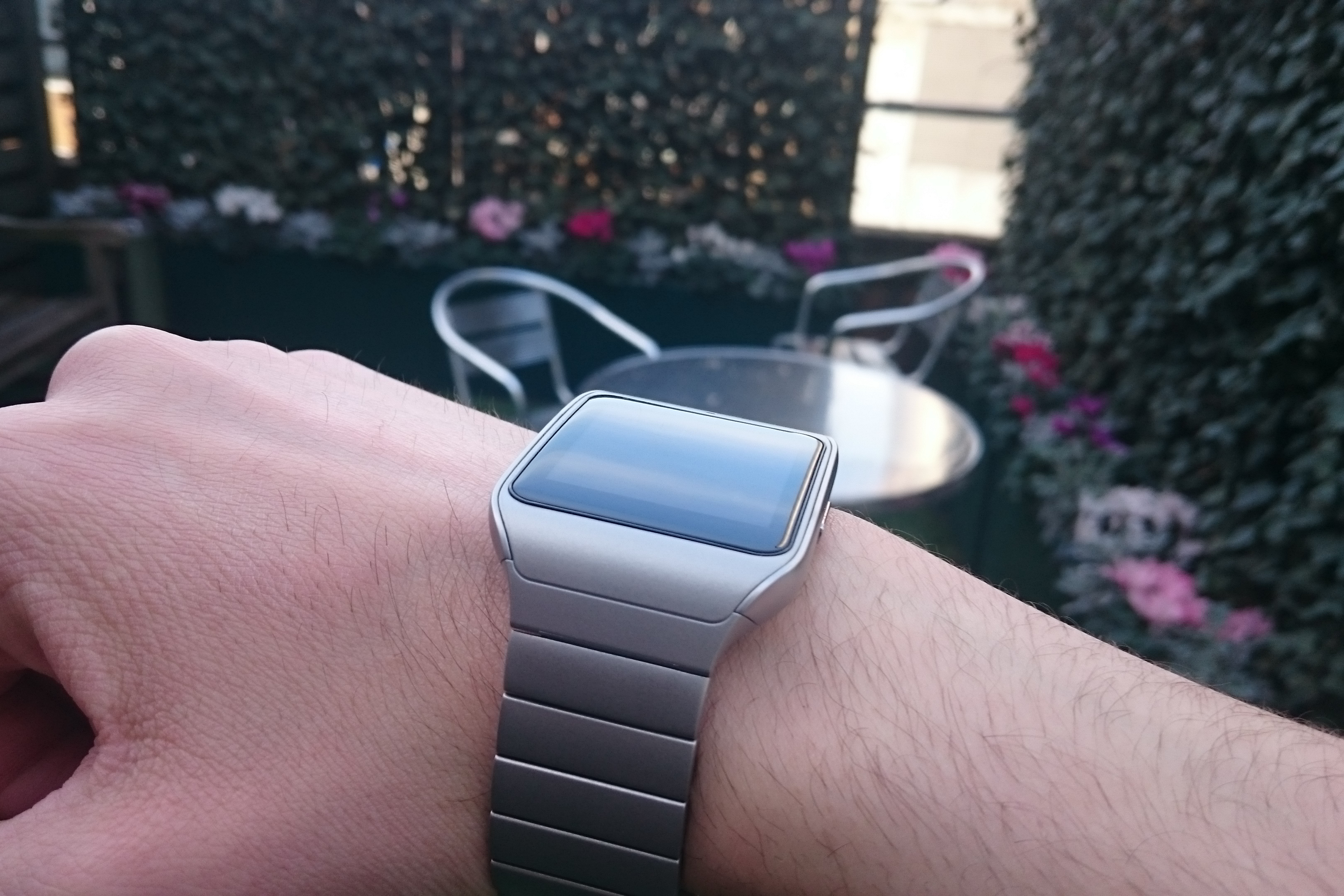
The Smartwatch 3 uses a modular design, with a standalone, pop-out core and swappable bands. While the black plastic strap it launched with was pretty cheap-looking, The Smartwatch 3's new metal band is a huge improvement, and looks sleek and professional. The only downside is that you may have to get a few links taken out or put in for it to properly fit.
However, if you get tired of your current watch band, the pop-out system means that you can switch bands at will with maximum ease. One major bugbear we had with it is that the steel-link version absolutely refused to lie flat, which makes it awkward to check when it's not physically on your wrist.
Sony Smartwatch 3 - Battery
One thing that immediately annoyed us about the Smartwatch 3 is that charging is incredibly finicky. The MicroUSB port is located underneath a fiddly flap on the back, which is very difficult to access in the steel-band edition without popping out the core. It's also difficult to get the cable all the way in securely, due to the flap getting in the way.
Mixed use yielded over two days of battery life, which is a good result for a current-gen smartwatch, and largely due to the transflective screen. It's also got an ambient light sensor to adjust the backlight based on the user's surrounding, which should help more demanding users eke out a bit more juice.
Sony Smartwatch 3 -Smoothness and usability
Navigation on the Smartwatch 3 is pretty slick, but the small screen means it's occasionally a little tricky to be precise. It also means a lot of scrolling when dealing with long lists or notifications, which can be tedious.
Sony Smartwatch 3 -Weight and feel
The pop-out core design means it's bulkier than it could otherwise be, and the depth feels a little out of place compared to the sleekness of the design. It's not overly heavy, but a plastic strap will feel lighter than metal if it becomes a problem. It feels a lot like wearing an old-school Timex or Casio, except significantly larger.
Sony Smartwatch 3 - Price
The basic version of the Smartwatch 3 can be found for around 130, which gives it a significant price advantage over competitors. Opt for the metal-banded version, however, and you're looking at a hair under 200, which is a bit of a steep jump purely for a different strap.
The basic version of the Smartwatch 3 can be found for around 130, which gives it a significant price advantage over competitors. Opt for the metal-banded version, however, and you're looking at a hair under 200, which is a bit of a steep jump purely for a different strap.
Sony Smartwatch 3 -Display
The square face makes notifications and cards easier to read, but doesn't look quite as nice as round displays, especially when trying to use more traditional watchfaces due to the large amount of dead space. Although brightness is generally good, the resolution means text appears a lot smaller than some we tried.
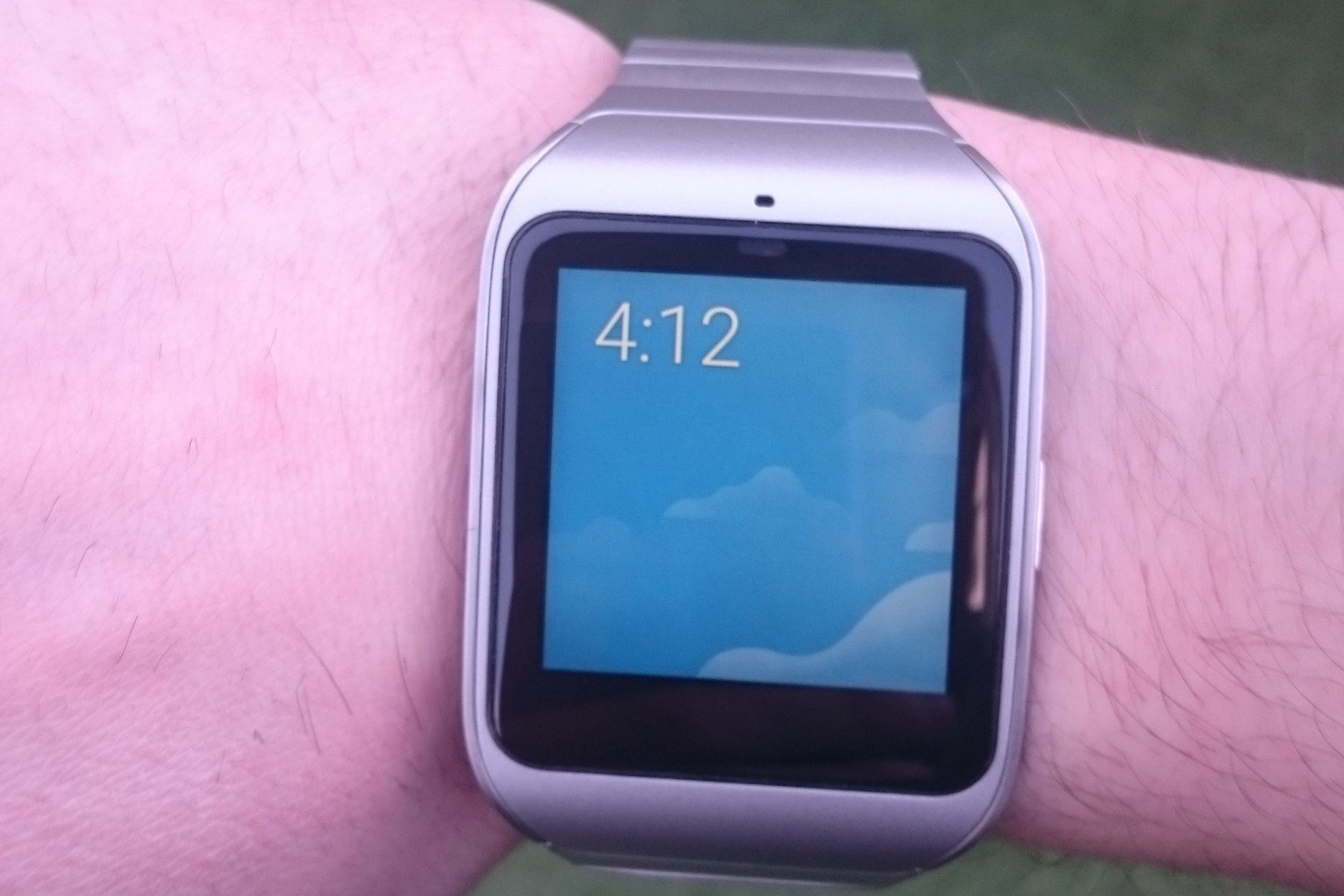
Emails also have a tendency to become a garbled mess on such a small screen, especially when they've got signature or HTML elements included. The transflective LCD screen doesn't really pop in the same way as its P-OLED counterparts either, which makes it feel a little washed-out.
Sony Smartwatch 3 -Features
With the range of real-world use cases for smartwatches still fairly limited, Sony are billing their offering largely as a fitness companion. The watch's GPS tracker means that it can be used in conjunction with apps like Runkeeper or Sony's own Lifelog software to track workouts and bike rides.
However, this application is bafflingly limited by its lack of a heart monitor, which is a fairly egregious oversight. The integration with Lifelog could also be better, considering it's a flagship device you can't set goals via the watch, and the activity data you can view is comparatively basic.
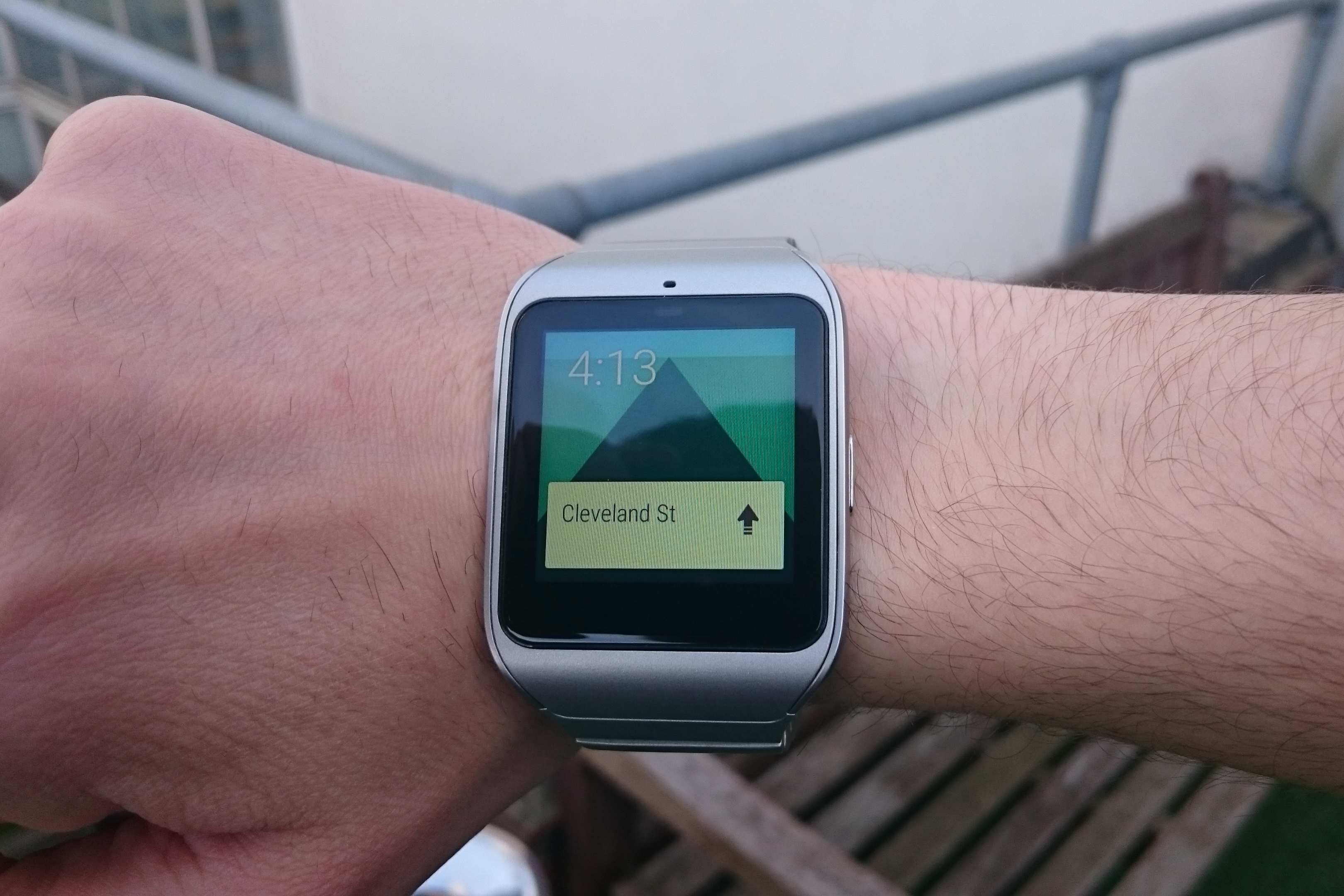
As with Sony's other device lines, it features a better IP rating than most, with the IP68 designation meaning it'll be more than happy when submerged in up to a meter of water for 30 minutes. It's also got NFC capability, meaning it can be used for convenient, wrist-based payments.
Sony Smartwatch 3 -Verdict
The Smartwatch 3 is what we imagine an old person might produce when asked to draw a smartwatch. That's not a bad thing it just lacks a little imagination and out-the-box thinking.
It's still a damn good device, however. The transflective screen works fantastically for outdoor use, it's nicely comfortable, and the NFC is a great touch. The fact that you can pick it up for 130 makes it a steal too, if you don't mind the grotty-looking black rubber strap. Fashionistas, however, are advised to look elsewhere.
Motorola Moto 360
The Moto 360 has gained a lot of attention for its design, and rightly so. Although it's been jokingly dubbed the Moto 270 for its not-quite-circular face, it's a very pretty smartwatch, with a lot of cool features under the hood. If the Moto 360 represents the way smartwatches are heading in the future, we'll be very happy indeed.
Motorola Moto 360 -Design
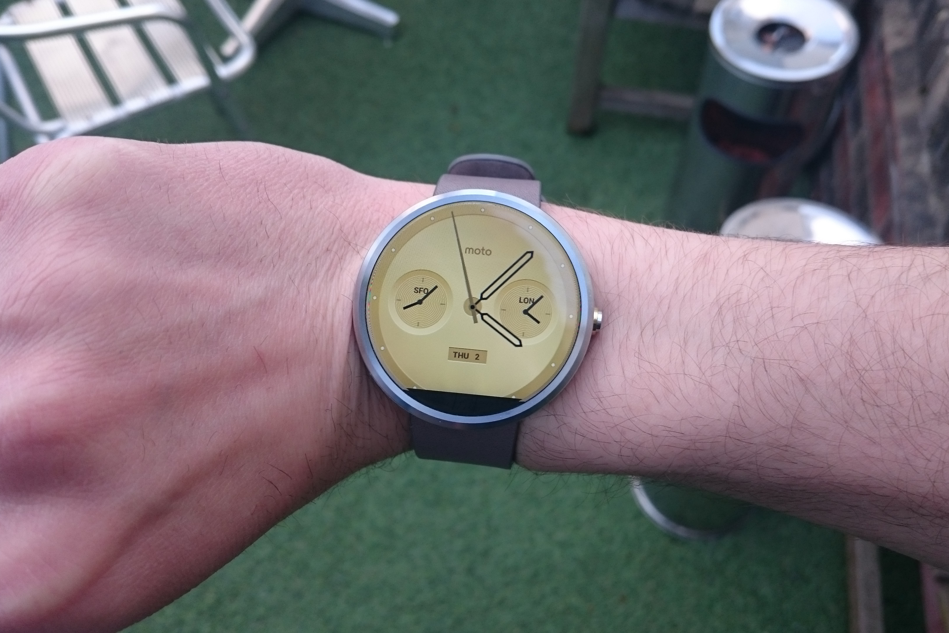
The Moto 360 is gorgeous. With a brushed stainless steel body surrounding the circular face and pleasingly chamfered edges around the very nearly edgeless display, it's a work of uncluttered, minimalist beauty.
Whether you prefer it to the comparatively almost overdesigned G Watch R is likely to be a matter of taste, but either way it's hard to argue that round faces make for the best-looking smartwatches around.
Motorola Moto 360 - Battery
The Moto 360, excitingly, uses the Qi wireless charging standard that many manufacturers are adopting. Charging is fast, easy, and the Qi standard means that if you don't like Motorola's bundled charging dock, you can simply pop it on a third-party charging pad at night. The battery life wasn't as great as its main rival the G Watch R, but it still managed a little over a full 24 hours. Not stellar, then, but not quite as dire as it could be.
Motorola Moto 360 -Smoothness and usability
Swiping is generally crisp and responsive, although we did notice some slightly spotty performance with regard to Bluetooth phone connection. The large, borderless screen also makes it easy to control accurately, unlike the G Watch R.
Motorola Moto 360 -Weight and feel
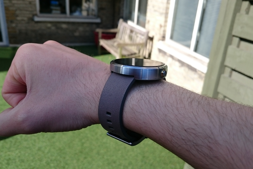
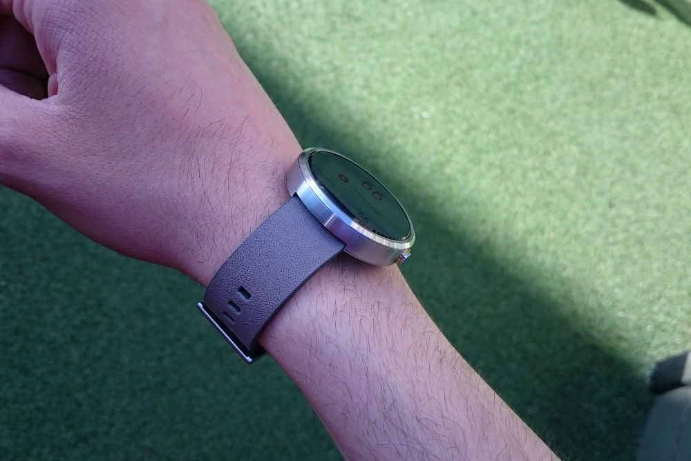
The Moto 360 is astonishingly light, and wearing it feels comfortable and natural. Admittedly, we did notice a very slight tendency toward overheating, but most of the time, users won't even notice it's there.
Oddly, it's almost the same height as the G Watch R, but the latter's protruding bezels make the 360 feel much slimmer by comparison.
Motorola Moto 360 -App integration
Motorola have their own suite of fitness apps and watch faces that allow limited customisation without having to jump through third-party hoops, which is nice. It does lack a little functionality with regard to prioritising which apps perform which commands, however.
Motorola Moto 360 -Price
Again, expect to pay around 200 for the Moto 360. However, careful shoppers will undoubtedly be able to find better deals as the device continues to age.
Motorola Moto 360 -Display
The Moto 360's IPS display is bright, clear and eminently readable, helped to no end by its sizable 1.56in diameter the largest screen we tested. It's a joy to look at, and the colour capacity will make vibrant watch faces really stand out.
Unfortunately, it loses points for the black bar at the bottom of the screen, which houses the device's ambient light sensor, as well as somewhat contradicting its name. It doesn't help the circular face's slight problem with truncating notifications, and it's guaranteed to bug the hell out of some people.
Motorola Moto 360 -Features
As is rapidly becoming standard for smartwatches, the Moto 360 is IP67 rated for 30-minute, 1m water immersion. It's also got a built-in heart monitor, which works in conjunction with Motorola's health and fitness apps, as well as others.
The vibration is also plenty strong you're unlikely to mistake a notification for anything else, which was a slight problem with others.
Motorola Moto 360 -Verdict
The Moto 360 is one of the most appealing smartwatches out there. This could have been achieved purely by dint of its stunning circular design, but thankfully, it's also backed up with some of the most impressive functionality we've seen to date. It's got a few issues, the battery life among them, but overall it's a strong contender for the smartwatch crown.
Adam Shepherd has been a technology journalist since 2015, covering everything from cloud storage and security, to smartphones and servers. Over the course of his career, he’s seen the spread of 5G, the growing ubiquity of wireless devices, and the start of the connected revolution. He’s also been to more trade shows and technology conferences than he cares to count.
Adam is an avid follower of the latest hardware innovations, and he is never happier than when tinkering with complex network configurations, or exploring a new Linux distro. He was also previously a co-host on the ITPro Podcast, where he was often found ranting about his love of strange gadgets, his disdain for Windows Mobile, and everything in between.
You can find Adam tweeting about enterprise technology (or more often bad jokes) @AdamShepherUK.
-
 Should AI PCs be part of your next hardware refresh?
AI PCs are fast becoming a business staple and a surefire way to future-proof your business
By Bobby Hellard Published
-
 Westcon-Comstor and Vectra AI launch brace of new channel initiatives
News Westcon-Comstor and Vectra AI have announced the launch of two new channel growth initiatives focused on the managed security service provider (MSSP) space and AWS Marketplace.
By Daniel Todd Published
-
 Wearables: First Windows 10 smartwatch is on its way, and it means business
News Specs are hard to come by, but we know it will be built on Microsoft's Windows 10 IoT OS
By Dale Walker Published
-
 The best wearable devices for business
Best The best lightweight devices to help you stay productive during a busy workday
By Dale Walker Published
-
 Smartwatch sales slump 52% as hype wanes
News Apple, Lenovo and Pebble all lose out in third quarter
By Dale Walker Published
-
 Apple Watch Series 2 review: First look
First look If you waited for the second generation, you haven't wasted your time
By Jane McCallion Published
-
 Apple watchOS 3 release date and features: watchOS 3 update available on 13 September
Rumours watchOS 3 can be downloaded from Tuesday next week
By Jane McCallion Published
-
 Apple Watch release date, price, features, availability and delivery date: Special edition Apple Watch bands arrive for the Olympics
Rumours But will only be available in Brazil
By Maggie Holland Published
-
 Fitbit patents ruled invalid in Jawbone lawsuit
News ITC judge recommends case be thrown out
By Adam Shepherd Published
-
 Fitbit heart rate monitors are off by 20 BPM, study shows
News Researchers have corroborated claims that the company's PurePulse trackers are "dangerously inaccurate"
By Adam Shepherd Published