The Apple Watch experience - a buyer's perspective
We tried out the Apple Watch, so you don't have to...
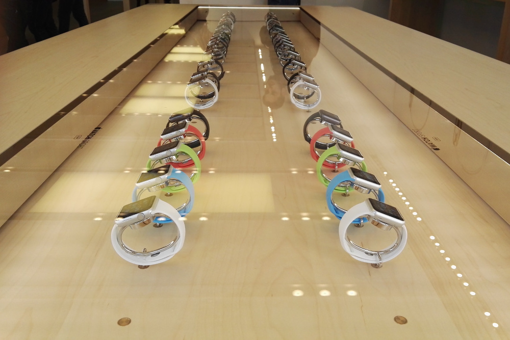

OPINION:The Apple Watch is the biggest tech news of 2015. With the world at large seemingly obsessed with Tim Cook's wearable brainchild, I figured it was about time I got myself down to the Apple Store to try it out. And so, it was with my smartwatch expert' hat on that I embarked upon my quest to the Regent Street branch of the Apple empire.
When I arrived at 9.30am, I was greeted at the door, asked which product I was interested in, and then told they don't open until 10.00am unless you have an appointment. At this point, the store was virtually empty, with just a handful of people in conversation with the staff.
Nevertheless, off I duly trundled to get a cup of coffee and wait for 10.00am to roll round. After I'd killed half-an-hour in Pret, I went back to the store and proceeded to faff around with the demo models for a bit.
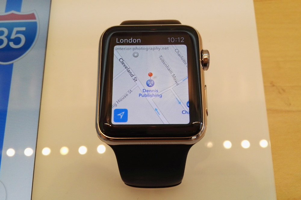
Although it was a weekday morning, the store was by now fairly busy, with various people drifting around, gawping at the Watches. After almost 20 minutes of mucking about with (and taking copious photos of) the watch, an Apple employee materialised at my elbow and asked if I was interested in it.
When I replied that "Yes, I was," I was taken and offered one to try on. Unfortunately, the models you can actually wear are all locked in demonstration mode meaning they'll cycle through a series of functions, but they'll not be taking orders from you, thank you very much.
Apple Watch experience - Design
The actual wearable ones are purely for aesthetic appreciation. For many people, though, that's likely to be a key component, and I overheard several people cooing aver how pretty they were.
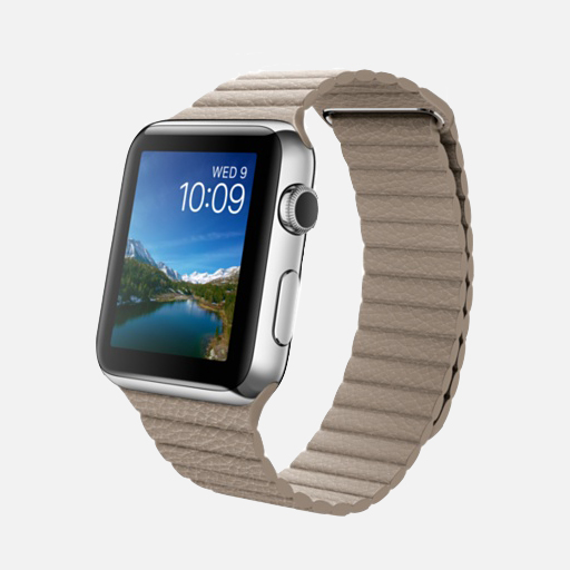
It has to be said that it's a gorgeous bit of kit. The design looks sleek, professional and attractive, and it's got that particular Apple flair to it. The screen's equally stunning. The curved sapphire glass display (used in all but the sport models) is bright, clear and sharp as anything.
Sign up today and you will receive a free copy of our Future Focus 2025 report - the leading guidance on AI, cybersecurity and other IT challenges as per 700+ senior executives
Unfortunately, it's also ridiculously teeny, measuring just 42mm for the larger variant. It's usable, but just barely. The smaller 38mm version is even worse. Sausage-fingered though I am, I'd struggle to see anyone using it effectively.
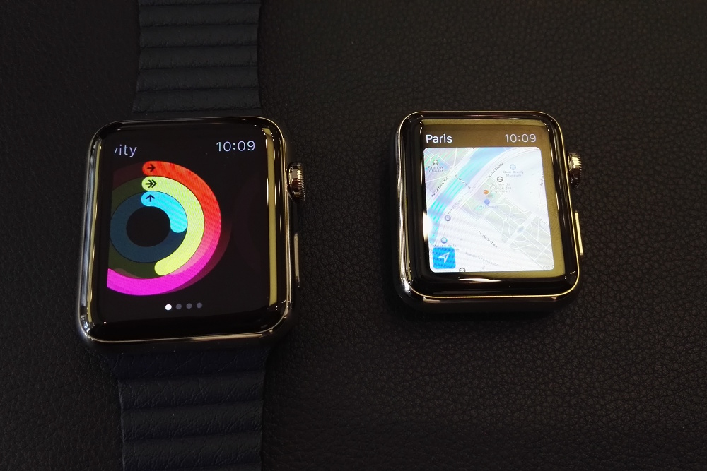
Both versions also have big black borders of dead space round the edges of the watch face. They mar the look of it quite a bit, especially compared to rival devices that are getting closer and closer to totally edgeless displays.
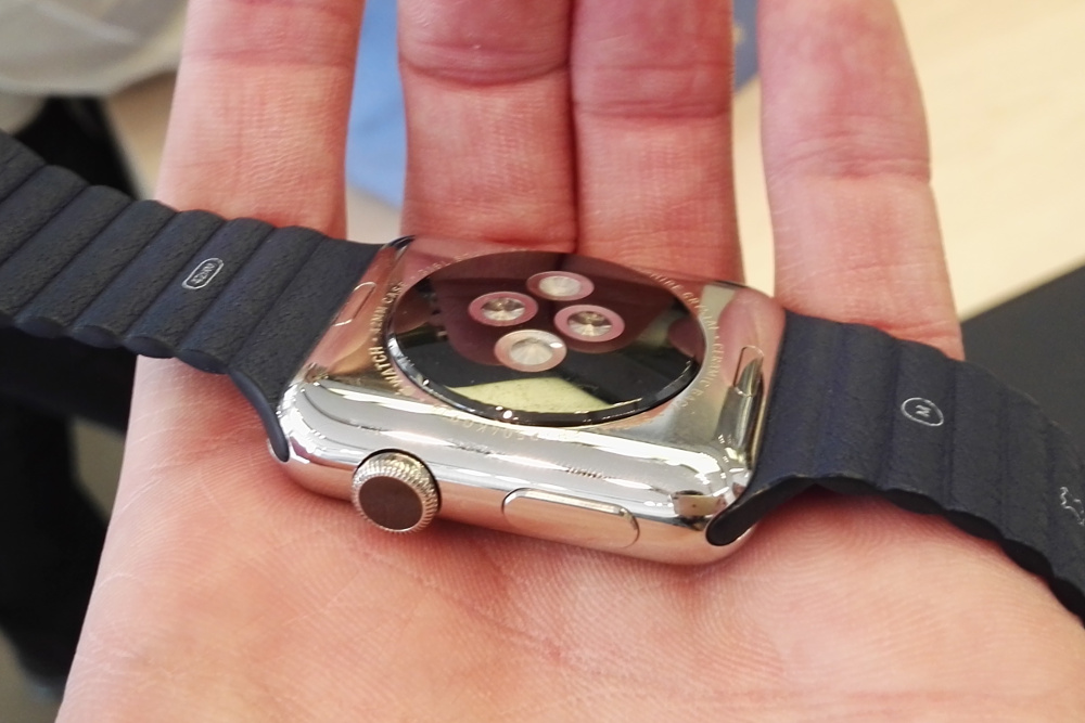
On top of that, it's a lot bulkier than you'd think. This is thanks largely to the optical heart-rate monitor located on the underside of the watch, which bulges out from the main body. The end result is a watch that, while not unreasonably chunky, still doesn't lie as snugly on your wrist as might have hoped.
In terms of straps, there are a wide variety on offer depending on personal taste. There are traditional leather straps for the sensible, plastic sports straps for the tacky, and the Milanese loop' style fasteners for the slightly unhinged.
That last one has caught the most attention, partly because of how unusual it is. Comprised of a link bracelet not unlike chainmail, it feels flimsy and insecure. It's magnetically fastened as well, so the slightest flex of your wrist is liable to annoyingly loosen it.
Thankfully, changing straps is easy, if you don't mind paying Apple an exorbitant premium for the privilege. A button on the underside releases the straps, which then slide out of their groove in the side, ready to be replaced.
Apple Watch experience - Functionality
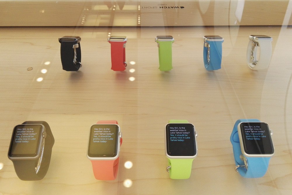
Although it's nice to see how they look in the flesh, it's the functionality that really counts. If you want to get a sense of what it's actually like to use one, you'll have to try out one of the display models, all of which are firmly bolted into a big white block.
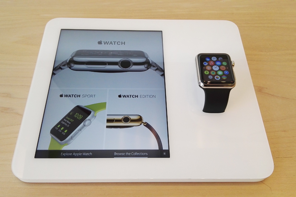
Featuring a touchscreen display that's linked to the watch, the unit gives you more information about whatever app you're currently on, including operating instructions. It also surprise, surprise shows a catalogue of all the different Apple Watches and their respective price.
Although demonstration models of the watches are plentiful, what they can actually do is extremely limited. The apps and interactions are pretty minimal, with the standard suite of stock Apple tools each featuring a few example functions.
The communication software email, SMS and the watch-exclusive quick-messaging app was all semi-useless without the ability to actually talk to anyone. Even so, the watch messaging, with taps, sketches and vaguely creepy heartbeat messages, was a frustrating and finicky exercise in why bother?'
Navigating the photos app was among the highlights, surprisingly. All your pictures are presented as a big grid, with the digital crown used to zoom in for a better look. It's a great system for navigation, especially in conjunction with regular swipes.
It can also be used to launch apps. The home screen has all your watch apps laid out in a honeycomb pattern, with the crown used to zoom in and open them. However, this is offset by the fact that manual touch selection is an absolute nightmare. The app icons are teeny-tiny, and I found myself repeatedly opening the wrong thing by mistake.

I had a little play around with Siri as well, who seemed to be on decent form, along with with the maps. Here I was a little let down; although navigating the map is fairly simple thanks to the digital crown's simple zooming function, the tiny screen meant that trying to actually find anything was akin to an aerial game of blind man's bluff'.
The demonstration models loaded pretty much all data and apps smoothly and swiftly, but I suspect that's because they're embedded in the aforementioned iSlab.
In addition to the touchscreen, it almost certainly contains the iPhone components powering most of the watch's functions, thus negating the long loading times caused by communication delays between watch and phone.
Apple Watch - Taptic Engine and Force Touch
One of the most disappointing things about my visit was that, as the functional watches were bolted down, I couldn't really try out the Taptic Engine'. Much vaunted by Apple, this is the watch's feedback system, which (supposedly) vibrates in a way that's actually like someone tapping you on the wrist.
It seems cool, and does somehow feel a little more right than standard vibration. However, it's not as unique as it's been made out to be, and there's not enough to differentiate it from the other vibration alerts out there, despite the customisable patterns.
The other innovation devised for the Apple Watch is Force Touch. This, by contrast, is pretty neat, and it works fantastically. In addition to run-of-the-mill taps and long-presses, the watch can also register a firm press, allowing a new set of inputs and functions.
This has already been incorporated into the new MacBook to much acclaim, and when it inevitably reaches the iPhone, it could be a serious game-changer. Here, however, it looks sadly underused. Beyond swapping between different app tasks, there's not a lot of functionality on show.
Apple Watch experience - verdict
One of the main problems with the in-store Apple Watch experience is the fact that the staff know roughly as much about the products as any punter can find out from Google. It's not their fault, though the simple fact is that Apple hasn't deigned to release the actual devices to stores yet, so staff are trying to sell you these things, effectively, sight unseen.
Because they haven't actually used them, Apple Store employees' usual level of personal experience and expertise (such as it is) just isn't there. Instead, they're half-heartedly regurgitating the marketing spiel Cupertino's been pushing, and visibly squirm when asked any kind of in-depth questions about the functionality.
They also have less than no idea when they'll be available - one staff member said that she didn't expect pre-order customers to get their watches till mid-summer, with in-store stock potentially arriving as late as next year.
According to my designated Apple Minion, the majority of Apple Watch sales have so far been online pre-orders, who only then came in to actually try out the watch for themselves. While you can place in-store pre-orders, apparently virtually no-one has done so.
Given my experience with it, I'm not hugely surprised either. Other tech, like the iPhone or the MacBook Air, has the immediate wow factor' when you try it in the Apple Store. It's essentially fully-functional, and you instantly get a sense of what it would be like to own one, and how it could improve your day-to-day life.
With the Apple Watch, that's not as present. It's possibly due to the type of device the fact that it has to pair with an iPhone to properly work but it still feels like it isn't an inherently exciting product.
It's also currently suffering from a real lack of apps. When pressed for her favourite upcoming watch apps, my iHelper could only come up with a third-party fitness tracker and a CityMapper port. For the Apple Watch to really justify its ridiculous price, it's going to need something a bit better than that.
By and large, Cupertino's debut wearable is a prime example of technology that's going to pave the way for greatness. As it stands, the Apple Watch is outdone by its Android rivals in most areas, but it has undeniable potential. Whether it realises it before the public lose interest, however, remains to be seen.
Adam Shepherd has been a technology journalist since 2015, covering everything from cloud storage and security, to smartphones and servers. Over the course of his career, he’s seen the spread of 5G, the growing ubiquity of wireless devices, and the start of the connected revolution. He’s also been to more trade shows and technology conferences than he cares to count.
Adam is an avid follower of the latest hardware innovations, and he is never happier than when tinkering with complex network configurations, or exploring a new Linux distro. He was also previously a co-host on the ITPro Podcast, where he was often found ranting about his love of strange gadgets, his disdain for Windows Mobile, and everything in between.
You can find Adam tweeting about enterprise technology (or more often bad jokes) @AdamShepherUK.
-
 Gender diversity improvements could be the key to tackling the UK's AI skills shortage
News Encouraging more women to pursue tech careers could plug huge gaps in the AI workforce
-
 Researchers claim Salt Typhoon masterminds learned their trade at Cisco Network Academy
News The Salt Typhoon hacker group has targeted telecoms operators and US National Guard networks in recent years
-
 FDA approves Apple Watch app that helps people with PTSD sleep better
News The FDA designated NightWare a Breakthrough Device, expediting its development and review
-
 Apple 'has secret team working on diabetes management tech'
News Sensors could monitor blood sugar unobtrusively
-
 Smartwatch security threats: The sky isn’t really falling
Opinion Wearables are too young to pose a real threat to data security, says Davey Winder
-
 Apple appoints Jeff Williams as COO
News Phil Schiller’s responsibilities expand to include management of App Store across platforms
-
 Chinese vendors storm worldwide wearables market
News However, Fitbit and Apple lead the charge with its wrist-mounted devices
-
 Google confirms Android Wear app for iOS
Rumours Google has announced an Android Wear app for iOS, confirming previous rumours
-
 Apple Watch takes on FitBit in wearables chart
News The company is second only to fitness band maker FitBit, according to latest IDC figures
-
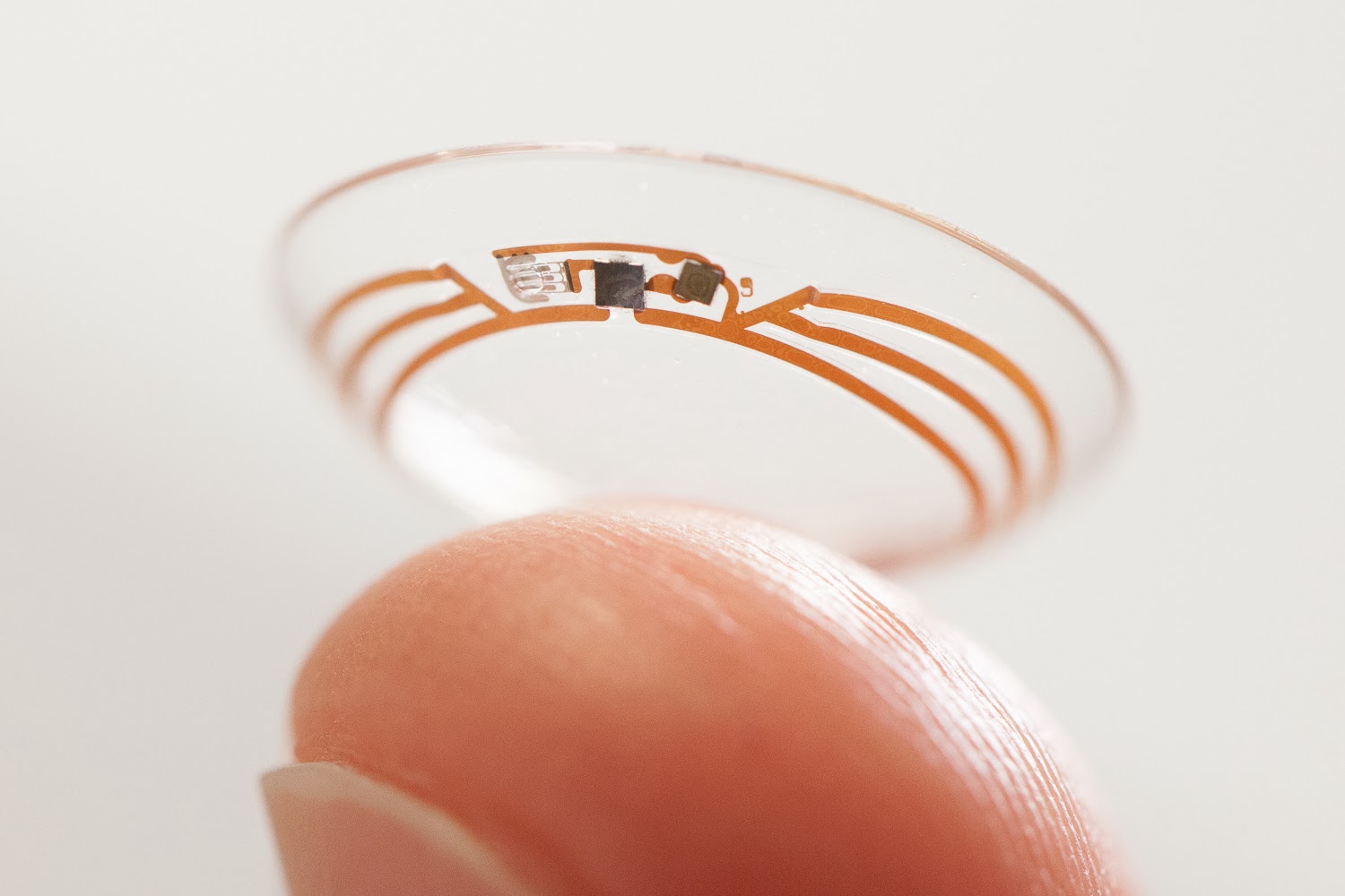 Google developing glucose-monitoring wearable for diabetes sufferers
News Google previously partnered with Swiss pharmaceutical firm Novartis to develop smart contact lenses to be used by diabetes sufferers
