Microsoft Surface Duo review: Progress is a double-edged sword
A stunning achievement that should make us rethink the role of the phone, but it’s far from perfect
-
+
Dual-screen form factor works well
-
+
Well-optimised first-party Microsoft apps
-
+
High-quality screens
-
-
Expensive
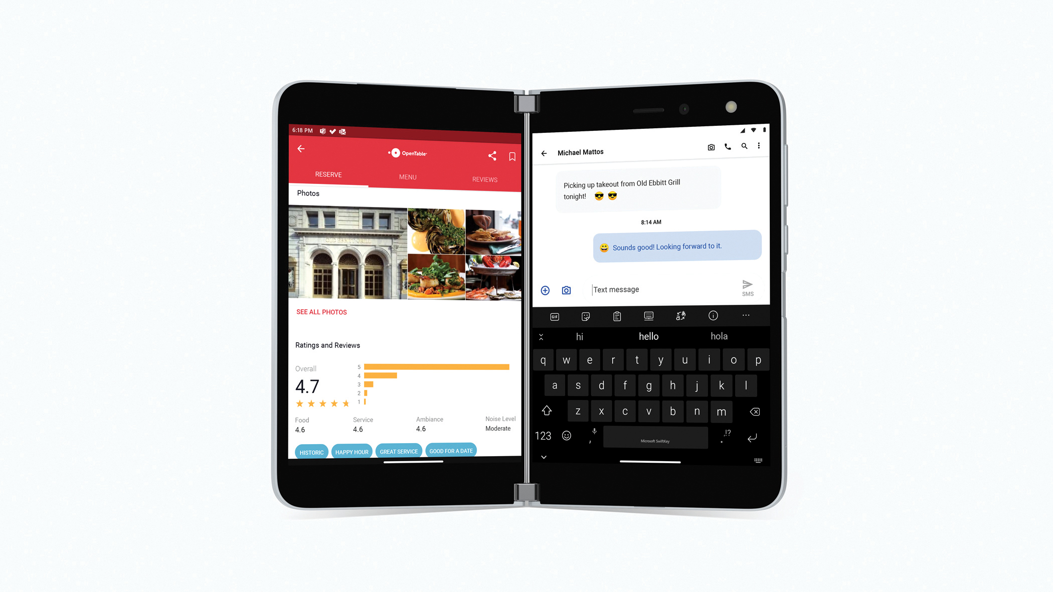
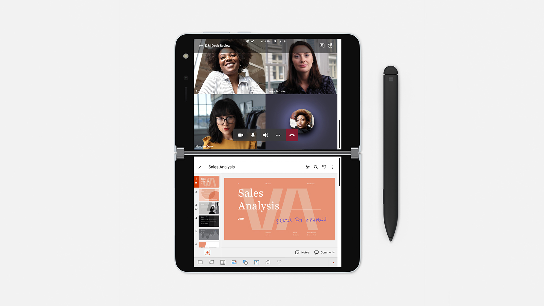
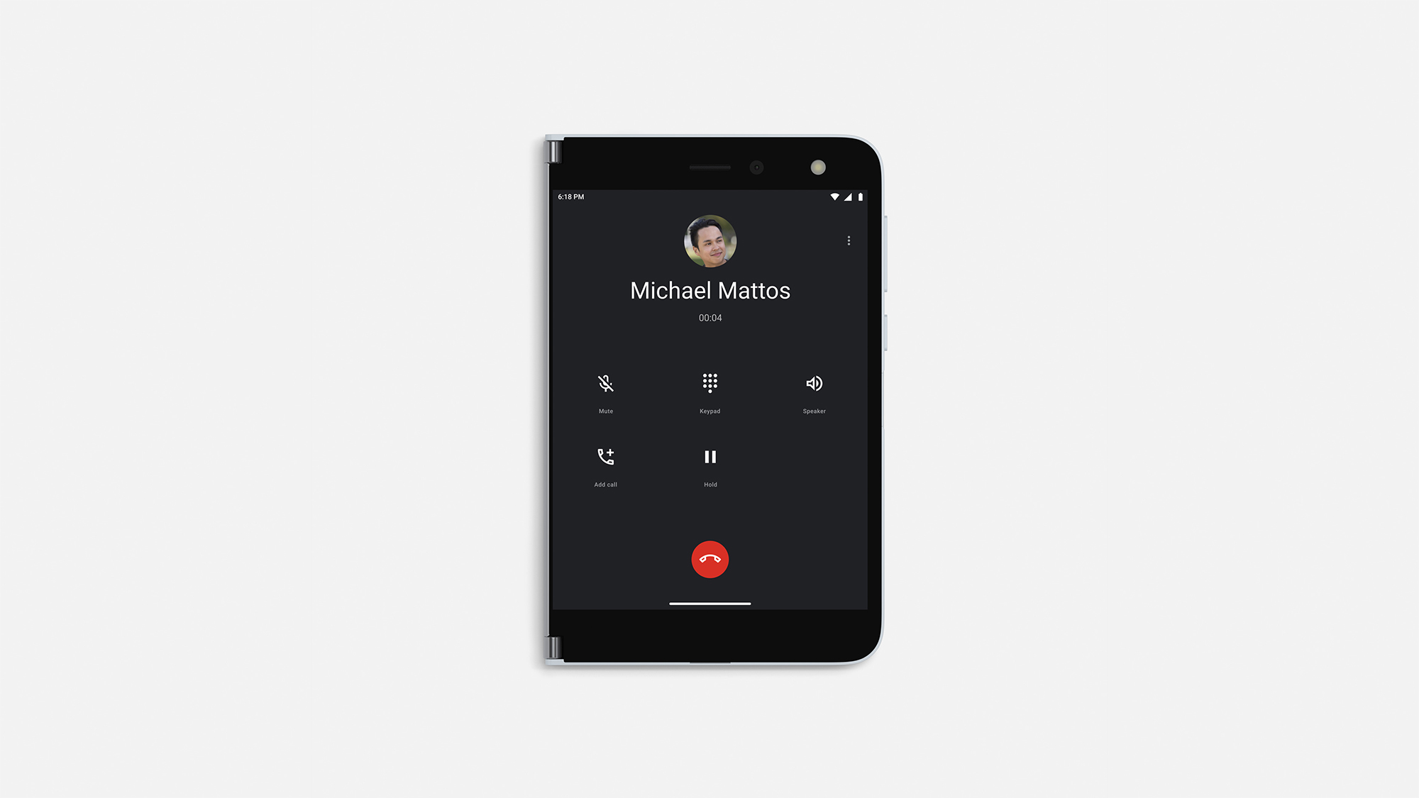
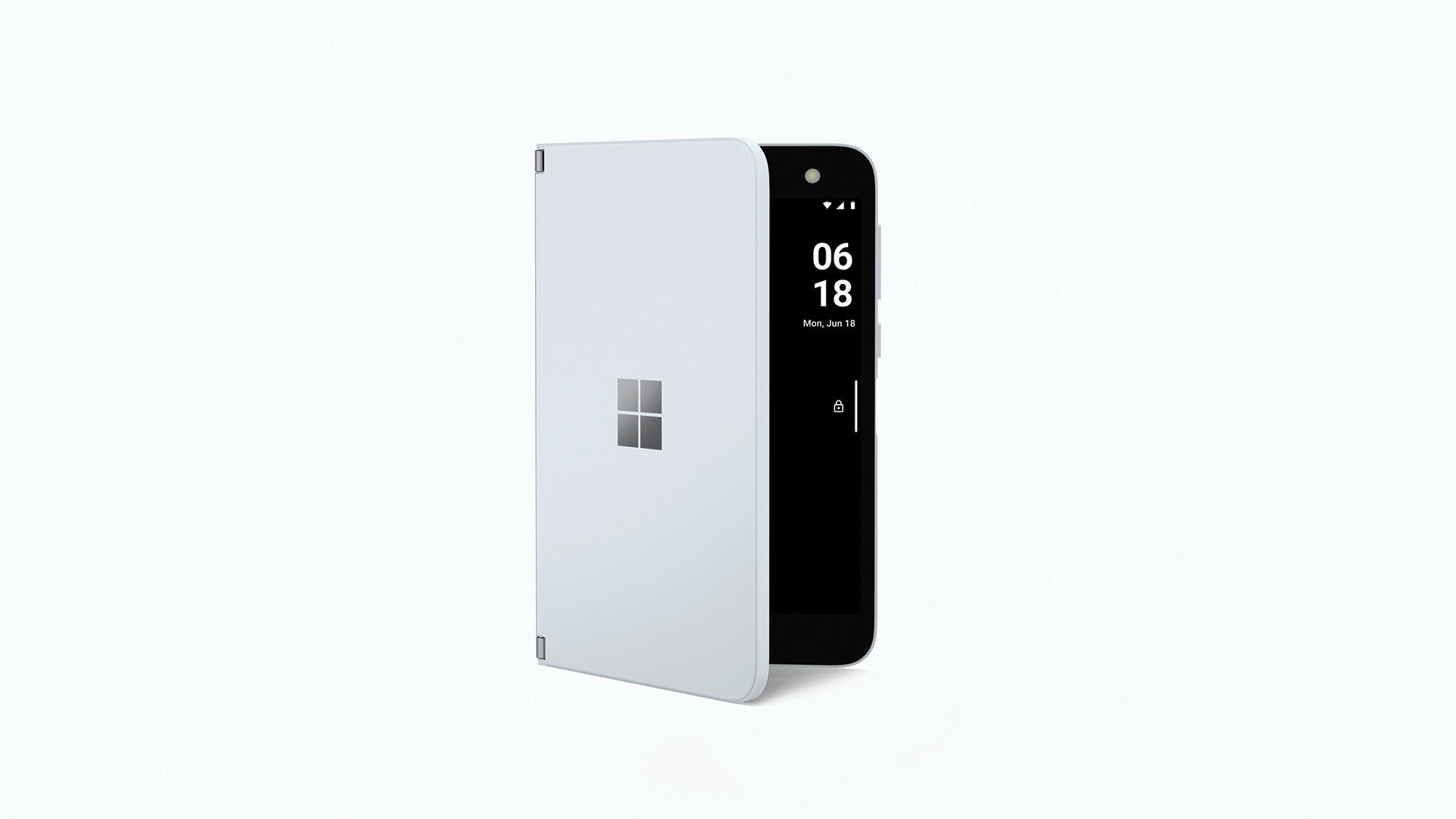
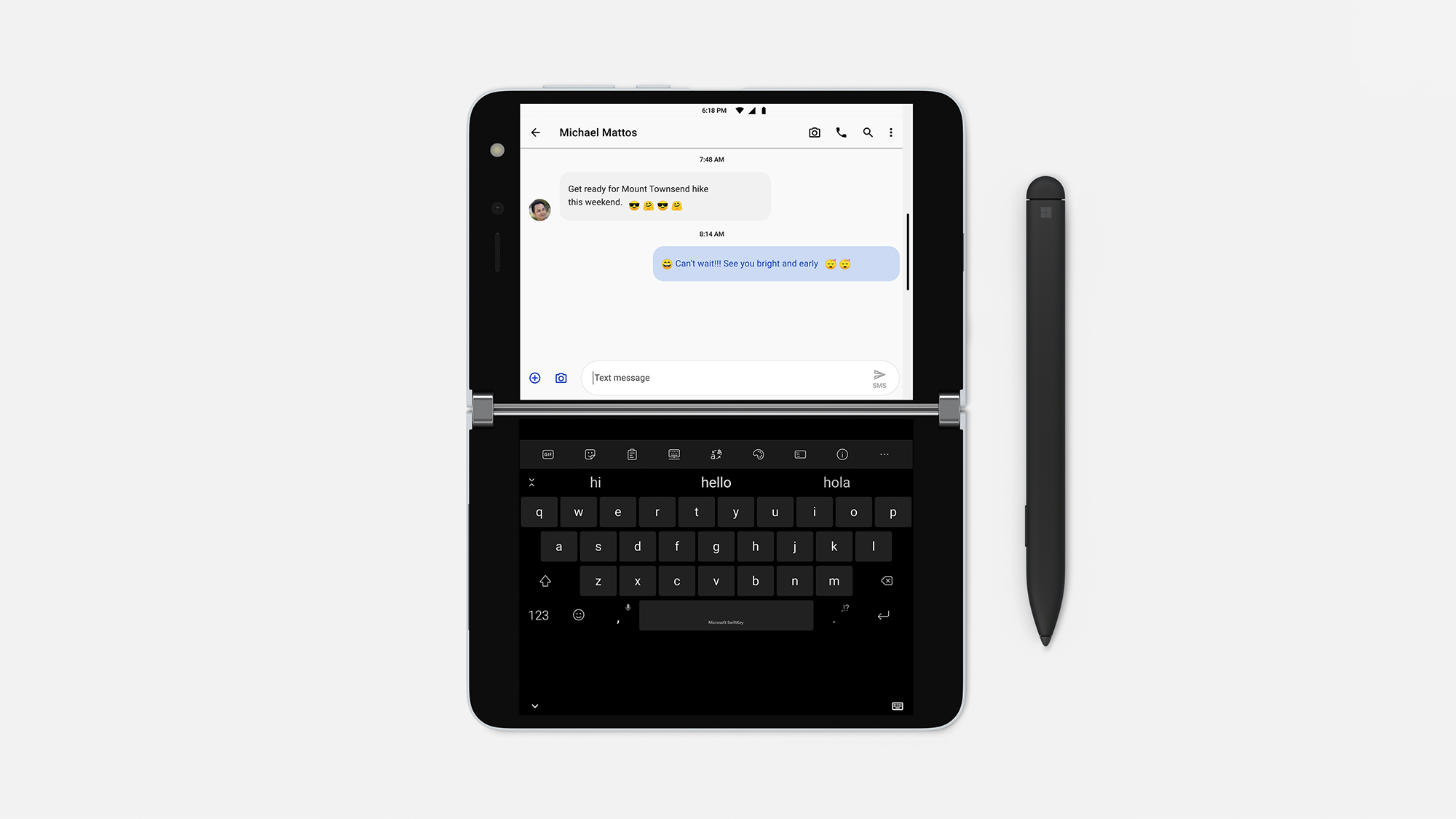
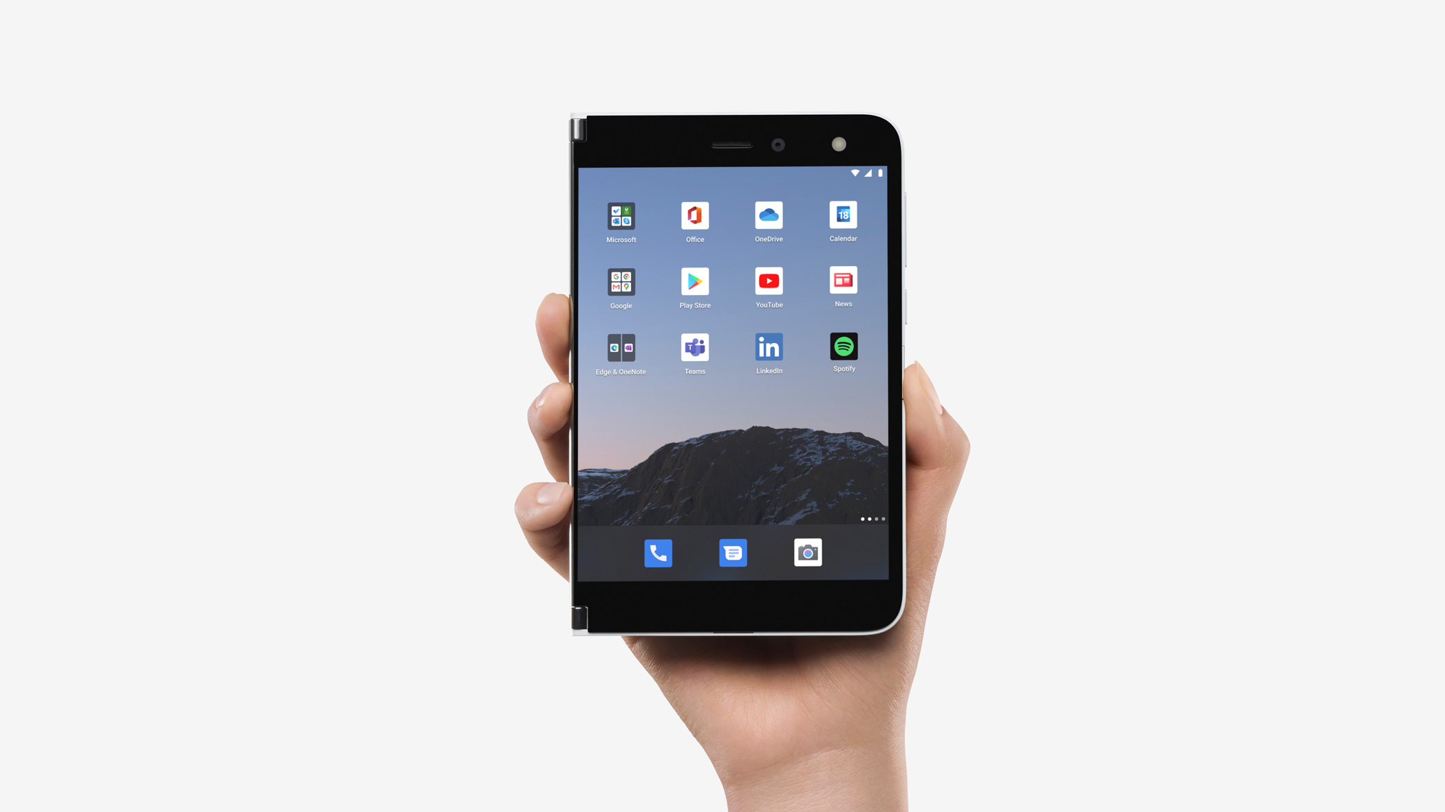
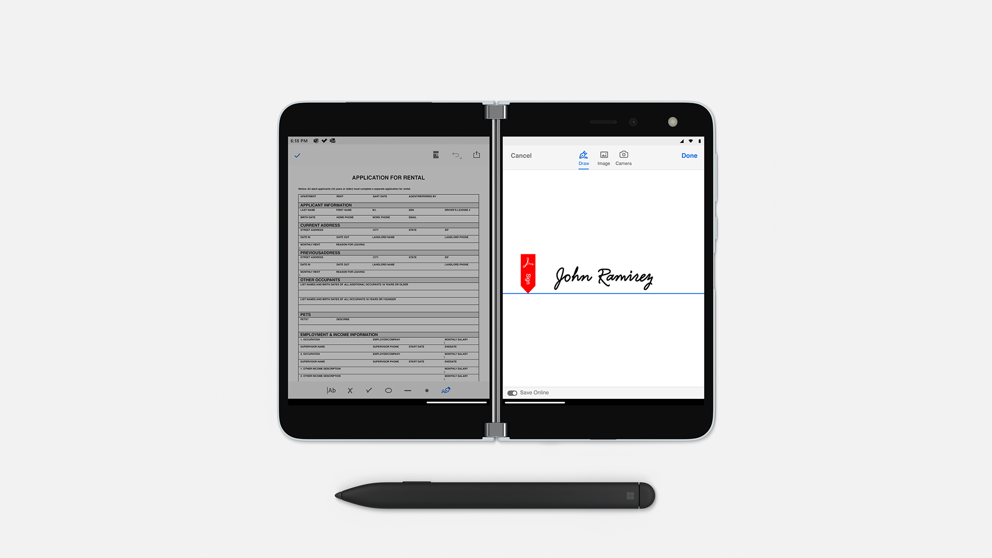
For years, Microsoft fans have been clamouring for a Surface phone - something to bring the style and panache of the company’s flagship hybrid device to the mobile sphere. Those fans have finally got their wish in the form of the Surface Duo, and while Windows Mobile may be dead and gone, this foldable smartphone is unmistakably a Microsoft device - for better and worse.
While manufacturers like Samsung and Huawei have opted to build their foldable devices by achieving the near miracle of bending the screen itself, Microsoft has chosen a simpler path: connecting two screens with a straightforward hinge, trading off the complexity of bending an OLED panel for an intriguing design that actively promotes dual-screen operation.
The intrigue doesn’t stop with the form factor, though. This is a Microsoft device running a Microsoft-badged version of Android 10 - the mere concept of which is enough to make your head spin if you’re old enough to remember the Microsoft of the early 2000s.
But here it is, and applause all round because this is the pragmatic solution to a perennial problem: Microsoft gains a gigantic app base, customers understand what they’re using, and Microsoft can help steer the design of dual-screen devices on Android.
Its efforts are already visible here, with Microsoft adding its own tweaks and user interface controls with the aim of making life easier for us humble users. This, as we shall see, is both a blessing and a curse.
In case you’re already reaching for your credit card, the Duo isn’t for sale in Europe: it’s US-only. We managed to import this one using the help of a friend in Seattle who handled the order and shipping. It isn’t clear when, or even if, the Duo will come to Europe. Rumours suggest that Microsoft views this as a “v1” device, with work underway on next-generation devices; it might be that this Duo never appears for sale on these shores. But that doesn’t diminish its interest or relevance.
Microsoft Surface Duo review: Design
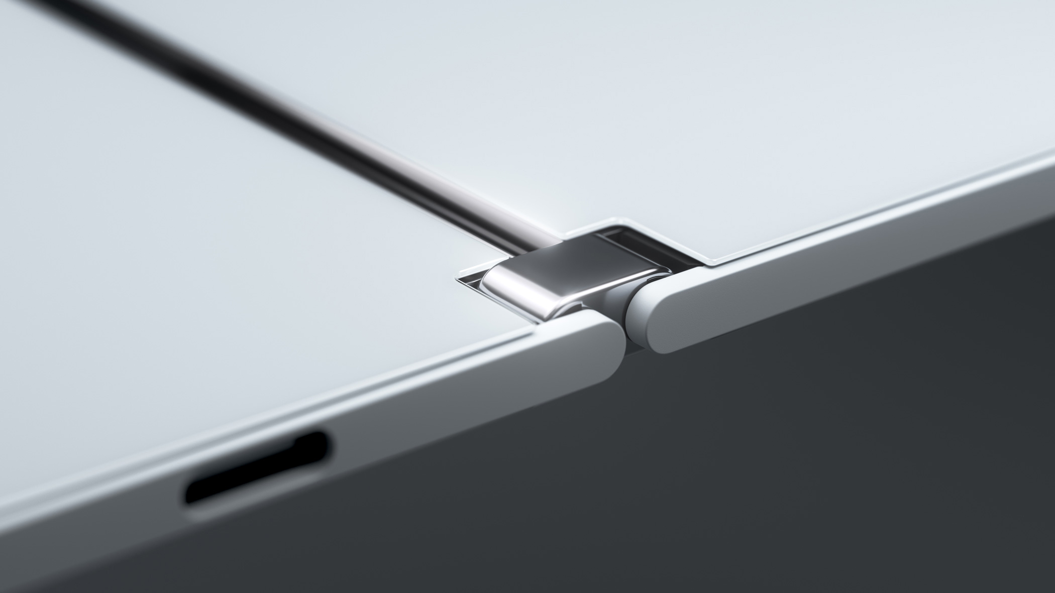
Should you ever lay eyes on this device in the flesh, the first thought that may strike you is how well built it is. The hinge design is a masterstroke, with a fluid and easy action with just the right amount of friction. The screens are essentially “inside only” for most operations: you open the Duo like a book. If the device is closed, there’s no visible screen. However, you can bend the screens back on themselves to create a normal smartphone-style screen, with the second screen paused on the rear. This is how you operate the device up against your head if you want to make a phone call in the “normal” way.

However, we strongly suggest you don’t bother and switch to a hands-free Bluetooth connection, as this isn’t a phone to be held to your head. The only time this orientation makes sense is to take a photo. There’s a single front-facing camera above the right-hand screen, and when you fold the screens back you can point the camera towards the object and view the image on the screen facing you. Which is all lovely, except that the camera performance is so weak compared to rival top-end phones as to be laughable.
After a couple of weeks, we were starting to question if Microsoft had made the right decision in having a full 360° hinge: we would be quite happy if the hinge was only 180°. However, one significant operational change is the sheer delight of closing the screens. Like finishing a book, it allows us to move our focus and attention away from the device. An external-facing screen simply entices you to keep looking, to spot the message and information updates that flow into our devices. The ability to literally close the book on this data stream is a great boon for when you want to switch off from the digital world for a bit.
One decision Microsoft definitely got right is to heavily invest in the screens, which are both excellent examples of their type. A peak brightness of 624cd/m2 is about as good as it gets and they’re tuned to the DCI-P3 colour space, where they cover around 91%. Colour accuracy is good rather than great, with an average Delta E of 3.34. Considering how thin this device is when unfolded, we were pleasantly surprised by the sound quality of the speakers – but headphones over Bluetooth will be essential for serious listening.
Another curious innovation is the rubber stick-on “bumper” you can attach around the outer edges. While this spoils the smooth lines, it’s a wise move because the bumper both protects the device and makes it easier to handle. There’s little else to look at on the outside: a USB-C port for charging, the normal power and volume up/down buttons, and finally a fingerprint reader, which proved reliable and quick in operation.
Microsoft Surface Duo review: Software and apps
But all this serves as an hors d’oeuvre to the main course: what’s the Duo actually like to use? Before tucking in, we need to acknowledge that the Duo is a solution to a set of problems that few others have acknowledged. We all like our big smartphones, but even large single-screen devices make it hard to work on two things at once – consider a mundane task such as looking up a restaurant address and then entering the address into Waze. It’s easier on a tablet, especially one that supports split-screen mode, but one thing you’ll notice about an iPad is that after you fold it in two it doesn’t work so well.
As such, it’s the two-screen, two-task operation mode where the Duo excels. All the Microsoft apps have been updated for the Duo – to genuinely useful effect. For example, Outlook in split-screen is almost like the desktop experience: the inbox sits on one side, the message view on the other. This allows us to plough through a full inbox at a considerably faster speed than we can manage on Outlook’s standard mobile app.

We particularly like having Outlook open on one side with Word or Excel on the other, allowing us to make notes from an email. We even found it productive to simply stretch a larger Excel spreadsheet across both screens for increased working room.
The usefulness isn’t restricted to apps that have been redesigned for twin-screen use, either. We found it just as handy when reading a PDF instruction document, as we could then send instructions over a messenger app. Or a messenger app and a map; you get the gist. It has truly surprised us how often this works well and how different it is when performing such tasks on our iPhone 11 Pro Max: there, we move to a laptop or large tablet when performing such tasks. With the Duo, this isn’t necessary.
Some third parties are getting into the act too, with Kindle on two screens a very lovely arrangement. The screens are a high enough resolution to be easily read, the page turn operation is a delight and we find having two pages open at once useful.
The challenge for Microsoft – and Google – is that apps must be optimised to make best use of the twin screen. The “hole in the middle” can be an issue for an app that isn’t aware of the hinge, and it’s possible to lose a village on a map if it falls down the gap. However, Microsoft is pushing its gestures and twin-screen support back into the Android stack, and Google has committed to working with these tools to enable better developer support.
The gestures themselves aren’t particularly obvious at first use. Whilst this might seem like a criticism, the same comment can be made about Samsung’s split-screen capabilities or those of the iPad Pro: each does things its own way and there’s a learning curve. Once we discovered how the gestures worked, we had no issues. It’s possible to switch the UI away from gesture control to the more standard Android buttons, but we’re convinced this would be a backwards step.
A final use for the second screen is to act as a keyboard for the first, simply by rotating the device 90˚ in a manner reminiscent of certain early 2000s sliders (and devices like the Cosmo Communicator which seek to ape them). This works effectively and it’s an option we’ve used on a number of occasions to great effect. We were far less enamoured when we tried to use the Surface Pen with this device: it’s supported, but the screen size doesn’t lend itself well to stylus operation, especially compared to a larger tablet like its stablemate, the Surface Neo.

Microsoft Surface Duo review: Specs and performance
Given the robust pricing, it’s not unreasonable to expect that the Duo should do everything, and do it to a world-class level. There’s fierce competition in the four-figure phone market, and it’s imperative to get real value from such a device.
A glance at the spec sheet puts the Duo at a significant disadvantage compared with devices such as the folding phones from Samsung and Huawei, or more conventional devices such as the iPhone 12.
The Snapdragon 855 processor that powers it was launched in 2018 and, paired with 6GB of RAM, lags behind rival flagships in testing. While a multi-core score of 2,888 in Geekbench 5 is comparable to devices like the Samsung Galaxy S20 Ultra 5G, it only managed 754 in the all-important single core tests - well behind the 900+ result we’d expect from a phone at this price. With that having been said, however, we found that performance was more than adequate for our day-to-day needs.
The other negative is battery life, with a 3,770mAh battery lower than rival flagships. It only lasted for 12hrs 5mins in our video-rundown test, but note that was with the video running on one screen and a blank screen on the other. You’ll still get through a working day – we found that it lasted for ten hours of active use across a day– but you’ll be reaching for the USB-C cable every night.
It would be easy to write off the product – to argue that it’s too little, too late, or that it’s a curiosity that doesn’t have a future. The Wi-Fi is 802.11ac, rather than Wi-Fi 6 (802.11ax). It supports 4G, but not 5G. There’s neither NFC nor Qi-based wireless charging. Most of this is down to the Surface Duo’s tortuous development journey, with the move to Android only taking place a year ago, after the Windows development effort failed.
Microsoft Surface Duo review: Features
From a tickbox comparison perspective, then, the Duo starts from a position of weakness, but we think this would entirely miss the point. The question is whether you’ll truly miss any of the features not found in the Duo, and if that’s likely to change in the next two to three years (the likely active life of this phone). So let’s go through them, one by one.

Wi-Fi 6 is nice to have, but the standard is not yet widespread enough to make it a necessity. Besides, what will you be doing on this device that requires such a high-bandwidth connection? 5G is a similar story, especially as we’re stuck with sub-6GHz rather than mmWave in Europe. Wireless charging would admittedly be useful but again, the infrastructure needed to make it a must-have feature just isn’t there. Some might argue that the biggest missing feature is NFC, and with it wireless payments, but this can be worked around by pairing the Duo with an NFC-enabled smartwatch for those that need it.
For instance, we’ve been using it alongside an Apple Watch, carrying our usual iPhone alongside the Surface Duo. However, while we like the device enough to put up with the inconvenience of doing this, the fact that we have to in the first place demonstrates that Microsoft doesn’t yet have all the kinks worked out. A truly first-class Android Wear smartwatch from Microsoft (or indeed anyone else) could solve a lot of these issues.
We’re really looking forward to Microsoft providing updates such as Android 11 – it ships with Android 10 and has committed to three years of support with monthly updates – as well as to seeing how the developer community embraces twin-screen operation. If they don’t, it’s not necessarily the end of the world, though; a current standard app works just fine running on one screen, and might work well enough stretched across both.
Microsoft Surface Duo review: Verdict
We ordered the Surface Duo simply to be able to have “Android by Microsoft”, to satisfy that inner, extremely childish urge to say “I told you so!” to the Steve Ballmer-era Microsoft management. We weren’t expecting it to make us sit back and reconsider the smartphone as a device.
For this, we have to applaud Microsoft in its efforts. If you treat it as an unusually-shaped smartphone then the Duo will make absolutely no sense and, by any logical criteria, will fail compared to a leading modern device from Apple, Samsung and the like. But if you get inside the mindset of what Microsoft is trying to accomplish here, there’s much to learn. With the Duo, the company has been brave enough to ask the questions that others are not daring to consider. And to those who say “you would get all this with a tablet”, we come back to the key point: a tablet doesn’t fit into your pocket.
It may lack some of the bells and whistles that have become standard on modern flagships, but the Duo also crams a whole heap more functionality into your pocket than a standard smartphone can hope to deliver. If it ever makes it to Europe, it’s worth a look for that reason alone - although we’d still wait for an updated version in the hope of a better camera. We just hope that Microsoft has the determination to push forward with this concept, and doesn’t abandon it alongside the Zune as another mistake.
Microsoft Surface Duo specifications
| Processor | Eight-core 2.84GHz/2.42GHz/1.8GHz Qualcomm Snapdragon 855 |
| RAM | 6GB RAM |
| Screen | 2 x 5.6in AMOLED screens, 1,350 x 1,800 resolution (8.1in 1,800 x 2,700 screen when unfolded) |
| Rear camera | 11-megapixel camera |
| Dust and water resistance | N/A |
| 3.5mm headphone jack | N/A |
| Wireless charging | N/A |
| USB connection type | USB Type-C |
| Storage options | 128GB/256GB storage |
| Memory card slot (supplied) | N/A |
| Wi-Fi | 802.11ac Wi-Fi |
| Bluetooth | Bluetooth 5 |
| NFC | N/A |
| Cellular data | 4G/LTE |
| Dimensions (WDH) | 93 x 9.9 x 145mm (folded), 187 x 4.8 x 187mm (unfolded) |
| Weight | 250g |
| Operating system | Android 10 |
| Battery size | 3,577mAh |
Get the ITPro daily newsletter
Sign up today and you will receive a free copy of our Future Focus 2025 report - the leading guidance on AI, cybersecurity and other IT challenges as per 700+ senior executives
-
 ‘Phishing kits are a force multiplier': Cheap cyber crime kits can be bought on the dark web for less than $25 – and experts warn it’s lowering the barrier of entry for amateur hackers
News Research from NordVPN shows phishing kits are now widely available on the dark web and via messaging apps like Telegram, and are often selling for less than $25.
By Emma Woollacott Published
-
 Redis unveils new tools for developers working on AI applications
News Redis has announced new tools aimed at making it easier for AI developers to build applications and optimize large language model (LLM) outputs.
By Ross Kelly Published
-
 Google layoffs continue with "hundreds" cut from Chrome, Android, and Pixel teams
News The tech giant's efficiency drive enters a third year with devices teams the latest target
By Bobby Hellard Published