Microsoft Windows 10 review - 'a future to be embraced, not feared'
Wiping away the stain of Windows 8 with great new features but time is running out to upgrade for free

It's better than Windows 8 and it's free
-
+
Useful new features; Improved tablet mode; Free for consumers
-
-
Search is broken; Some features dependent on hardware drivers; Some enterprise features of little immediate practical use
Update 11/04/2016:Time is running out if you want to upgrade to Windows 10 from Windows7/8.1 for free. At present, the free offer runs out on 29 June 2016. Microsoft hasn't said whether it intends to extend the offer.The free upgrade offer isn't available for devices running WindowsXP, WindowsVista or Enterprise editions of Windows.
Update:we've put Windows 10's new Edge web browser through a few rendering performance and HTML5-compliance tests and the results are in. It's a noticeable improvement over Internet Explorer 11, which is still included with Windows 10 for legacy purposes, although it's something of a mixed bag compared to Chrome and Firefox.
Windows 8 has been the most divisive version of Microsoft's operating system in years. To this day, the IT Pro office is divided between those who love it and those who can't stand it - a division widely seen amongst the wider public.
These Vista levels of disdain were fuelled by Windows 8's revamped touchscreen-oriented interface which is supposed to work well not only on tablets and hybrids but on traditional desktops and laptops too. Except it doesn't.
Windows 8 feels far too clunky on desktops and laptops and while it works reasonably well on tablets and hybrids, we've yet to see a Windows tablet to match the best that iOS and Android have to offer.
Meanwhile, almost all of the hybrids we've seen have had such mediocre or badly designed hardware that using them is often more trouble than they're worth. This is nothing short of disastrous as Windows 8 in general, and hybrids, in particular, were Microsoft's answer to the immense popularity of the iPad and similar Android tablets.
All of this puts a huge burden on Windows 10. With it, Microsoft has to persuade Windows 7 holdouts to upgrade, while retaining and improving the tablet and hybrid experience enough to tempt would-be iPad buyers. As if to emphasise just how important Windows 10 is, Redmond is making the operating system free to anyone with a consumer licence for Windows 7 or 8. It's a tall challenge.
Windows 10: system requirements and what about Windows Phone and Windows RT?
Windows 10 has the same system requirements as Windows 8/8.1, so if your computer can run Windows 8 well enough, then it'll be able to cope with 10. Microsoft's official system requirements are rather optimistic, though, claiming that you'll only need a 1GHz processor and 1GB of RAM for the 32-bit version and 2GB of memory for the 64-bit version.
Based on our experiences with Windows 7 and 8, you'll need at least twice as much memory and at minimum a dual-core processor (besides the lowly Intel Atom and AMD E-series chips) made in the past few years to be seriously productive.
For the small number of people who bought Windows RT devices, such as Redmond's own Surface and Surface 2, Microsoft has confirmed that Windows 10 will not be available for those ARM-based hybrids and tablets.
Instead Windows 8.1 RT Update 3' has been promised for September, bringing a select few Windows 10 features to Windows RT. We suspect it'll be a comparable to Windows Phone 7.8 which brought the Windows Phone 8-style home screen to Windows Phone 7 devices, but little else.
Speaking of Windows Phone, the next version of Microsoft's smartphone operating system will be named Windows 10 Mobile and will also take over from the defunct Windows RT as Microsoft's operating system of choice for mini tablets.
Windows 10 and 10 Mobile will be more tightly linked than their predecessors. Developers can code their apps so that they'll run on both operating systems, with the user interface adapting as needed for the different screen sizes and input devices.
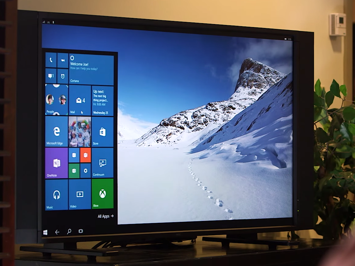
Microsoft calls these programs Universal Apps and such flexible interfaces are known as Adaptive UX. This is no doubt intended to boost the currently thin selection of apps for Windows smartphones. As Windows 10 Mobile is still very much in beta, we've yet to see and use such apps but Microsoft has given a tantalising glimpse of how it could work with demonstrations of Windows 10 Mobile itself. Phones running the beta OS morph from the Live Tile interface to the traditional desktop when connected to an external display, keyboard and mouse turning the phone into a mini PC.
Windows 10: user interface
The Windows 10 interface is noticeably different, whether you're used to Windows 7 or 8. Microsoft has brought back an old favourite from Windows 7, refined and reworked some of the touchscreen elements from 8 and introduced several new features, some of which have clearly been inspired by Windows Phone as well as desktop rival Mac OS X.
The changes to the Windows user interface are so numerous that we can only cover the biggest and most important ones here. It's worth noting some general overall trends, though.
Microsoft's war on traditional menus continues. While some parts of Windows 10 still have traditional menus, most have Office Ribbon-style tabbed toolbars or a mobile app-style hamburger menu in their place.
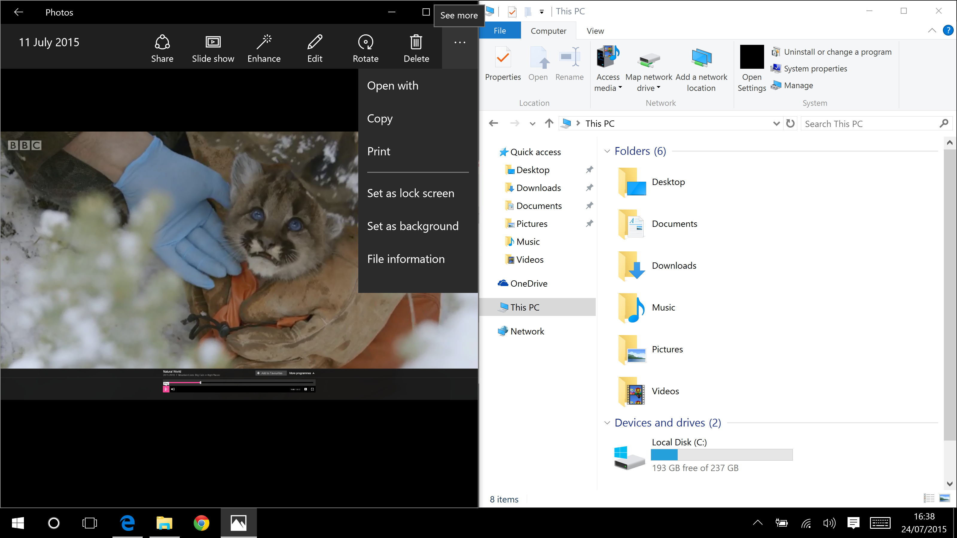
Two of the distinct menu styles in Windows 10: a hamburger menu on the left, a Ribbon toolbar on the right
While Ribbon toolbars were widely adopted after they were first introduced in Office 2007, we suspect third-party software makers will be more measured in taking up the hamburger menu, especially in complex programs where it can quickly become even more crowded and confusing than a traditional menu bar.
One stylistic change we hope will be more adopted widely is the starkness of the white text on black background motif seen throughout Windows 10. This high-contrast typography greatly aids legibility and, on the odd occasion where it's missing, its absence is keenly felt. The new Settings app, for instance, has a harder to read dark grey on light grey appearance.
Windows 10: Start menu
Windows 7 holdouts will be ecstatic at the return of the Start menu although it's very different from the way it was in 7, XP and before. You can see a list of your most recently used apps, pin your Home folder or its pre-set subfolders (such as Pictures, Documents etc) to the Start menu and see an alphabetical list of all your installed apps. The latter looks almost identical to the one in Windows Phone, except it also displays program folders such as Windows Accessories.
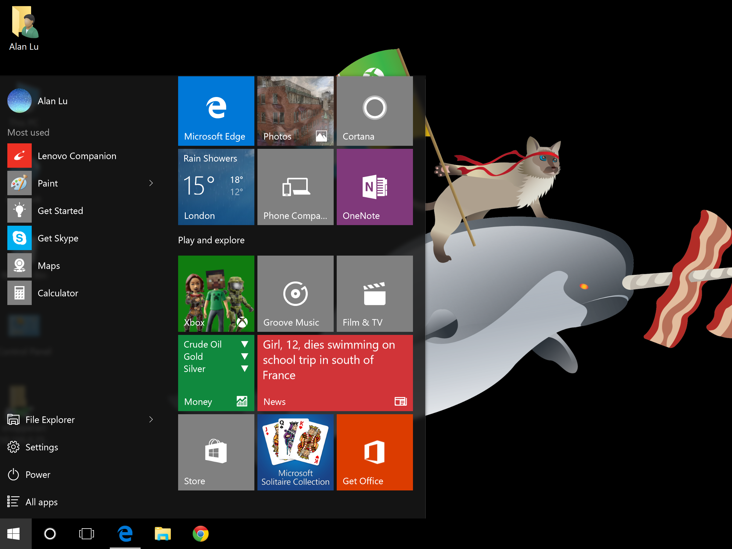
But you can't create a simple list of your favourite apps as you could in Windows 7; instead there's a selection of Start screen-style Live Tiles on the right-hand side of the Start menu. You can choose which apps are displayed here or you can choose to have none at all. Fans of keyboard shortcuts can easily navigate the Start menu using the trusty tab key or just search for an app by typing its name.
A small divider allows you to widen the width of the Start menu - as you do so the panel of Live Tiles moves from vertically scrolling to horizontally scrolling. Although a Start menu full of constantly updating Live Tiles along with all the other options can look very cluttered, it's still more organised than scattering dozens of icons across your desktop. We think it strikes just about the right balance between ease-of-use for novices and lots of options and lists for more advanced users.
Windows 10: Start screen and Continuum
The Start screen first introduced in Windows 8 is still present, albeit in an altered form. If you only ever use a keyboard and mouse/touchpad, then you'll never see it. If you use a hybrid, however, then switching between laptop and tablet mode will automatically cause the Start menu to expand full-screen - effectively becoming the touch-friendly Start screen.
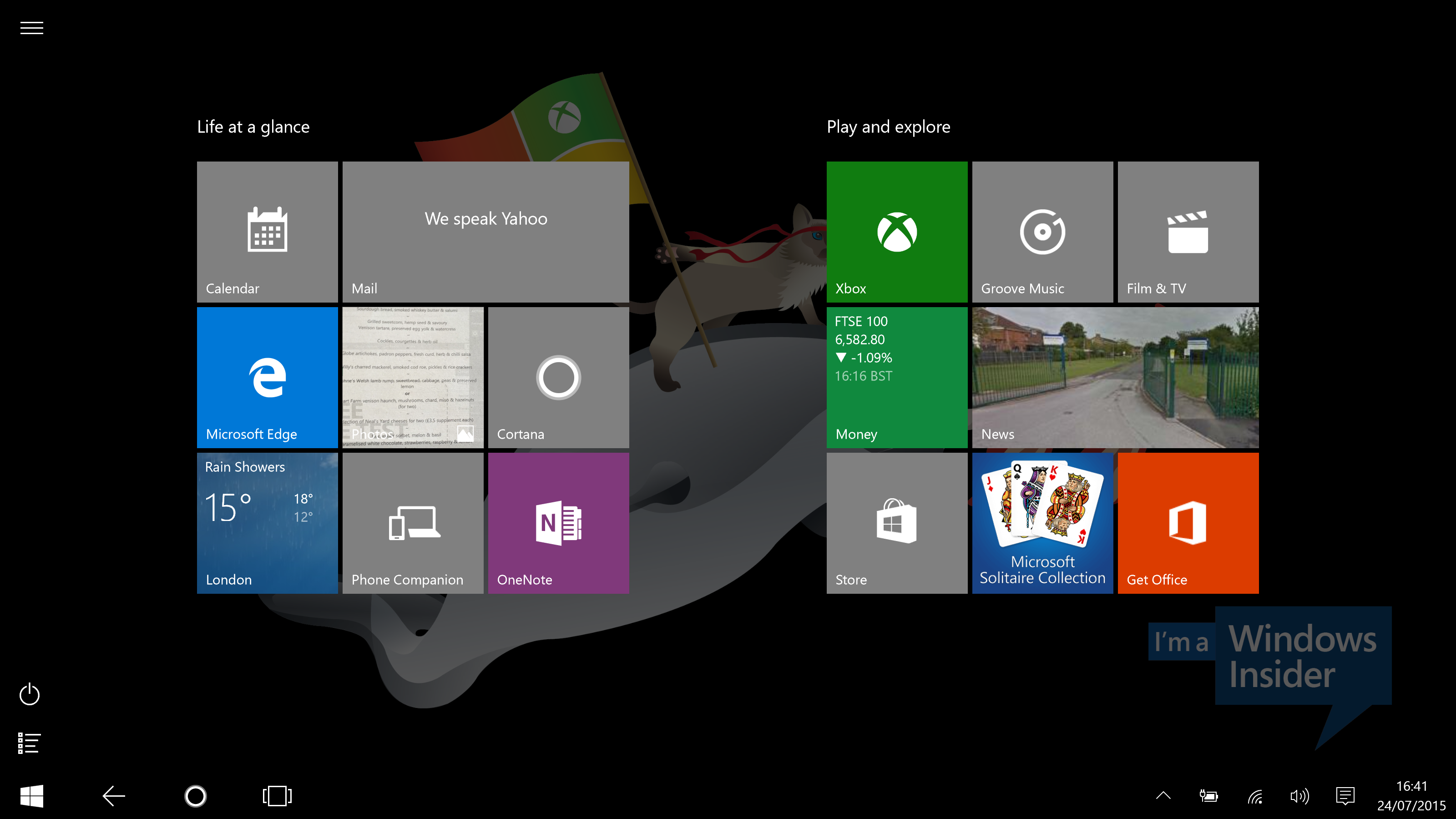
This automatic Continuum feature, as Microsoft's marketing calls it, does depend on Windows 10 drivers being available for all the sensors built into your hybrid, though. At the time of writing when using the RTM build of Windows 10, such drivers weren't available for either our HP Split x2 detachable or our Lenovo Yoga 2 Pro convertible. Drivers were available for our Microsoft Surface 3, so when detaching the keyboard cover we were given the option of automatically switching to Tablet mode, automatically staying in Desktop mode or to always be given the choice of which mode to use.
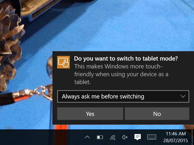
If you use Windows 10 on a tablet then you will only ever see the full-screen version of the Start menu unless you manually switch from Tablet to Desktop mode using the control in the new Notifications drawer (more on this below). Indeed, you can use this control to manually switch between Tablet and Desktop mode on any computer running Windows 10.
Tablet mode is more than just the Start screen. All apps will automatically become full-screen while the taskbar will be simplified with all the app icons hidden. The split-screen view which allows you to use two apps onscreen simultaneously remains and helps set Windows tablets apart from the competition (at least until similar features arrive in iOS 9 for the iPad Air 2).
The Charms bar, which was fiddly to activate with a keyboard and mouse, has been removed entirely with most of its features moved to the taskbar, the new Notifications drawer or to menus of individual apps.
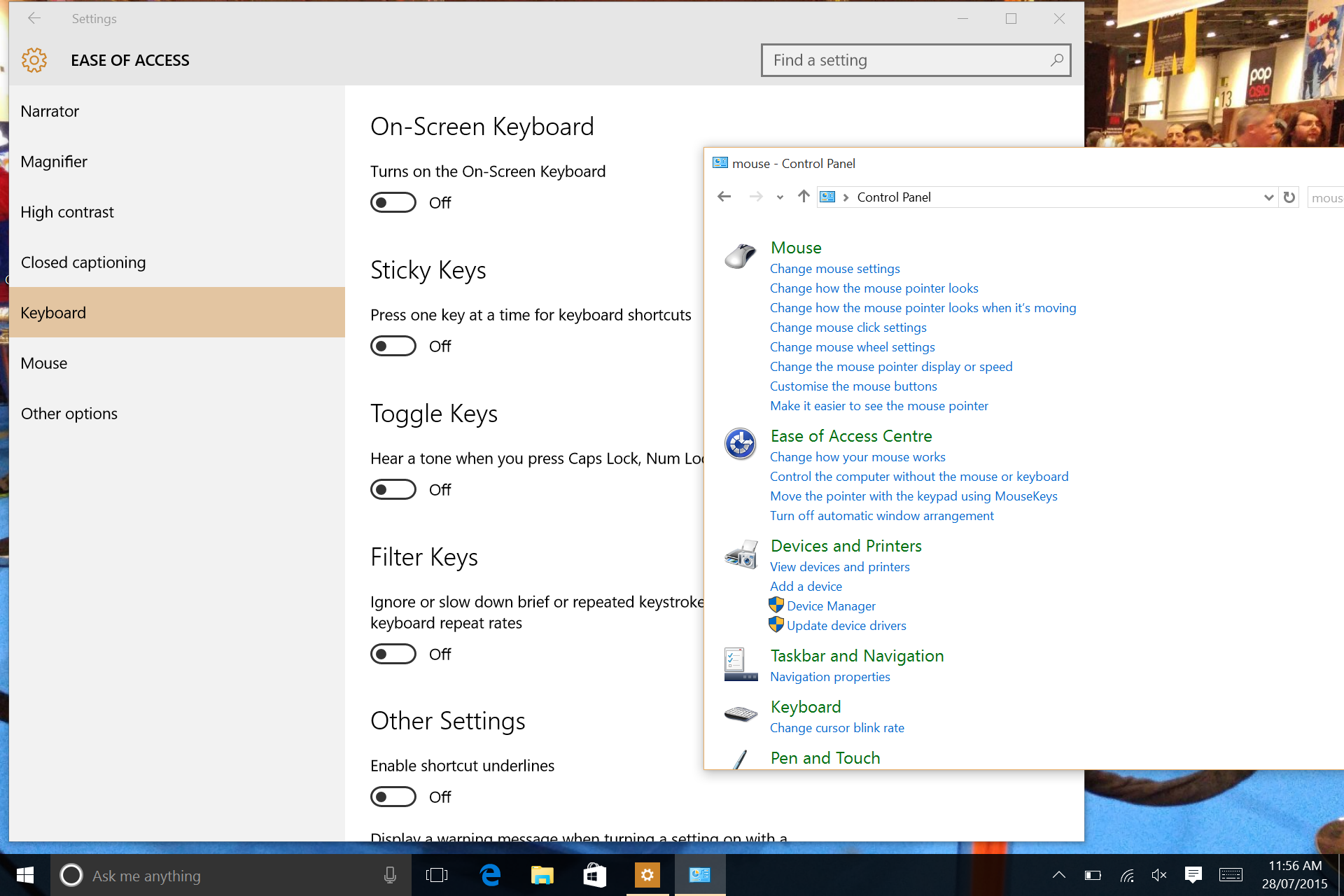
The touch-friendly Settings app is now more comprehensive than before, but some settings can still only be found in the older, mouse-centric Control Panel. Although large parts of Windows have been Modernised, the Control Panel is but one part where scratching beneath the surface reveals cramped windows full of fiddly menus and controls that seemingly haven't changed since Windows 98.
To switch between open apps in Tablet mode, swipe in from the left edge of the screen. Doing this in Windows 8 would take you back to your most recently used app. But in Windows 10, it instead shows you Task View. Similar to Mac OS X's Mission Control, this shows you large thumbnails of all your open programs and windows - just tap the one you want.
The Windows 10 tablet mode isn't dramatically different from the one in Windows 8, merely more refined, but its potential on hybrids is greatly dependent on hardware manufacturer updating their drivers which can't come soon enough. That aside, the less jarring transition between desktop and tablet modes addresses one of the most obvious frustrations that most people had with Windows 8.
Windows 10: Task View and virtual desktops
Task View isn't just for tablets - it's also available in Desktop mode where it's even more useful. Accessible either by clicking the dedicated button in the taskbar or by using the Windows-Tab keyboard shortcut, it allows you to create virtual desktops.
Virtual desktops are a long-standing feature in Mac OS X and Linux and has been available for older versions of Windows using third-party utilities, but the latter could often be buggy. It's inclusion here in Windows 10 is therefore very welcome - especially for laptop users on the road with lots of windows and tasks to juggle and only one physical screen available.
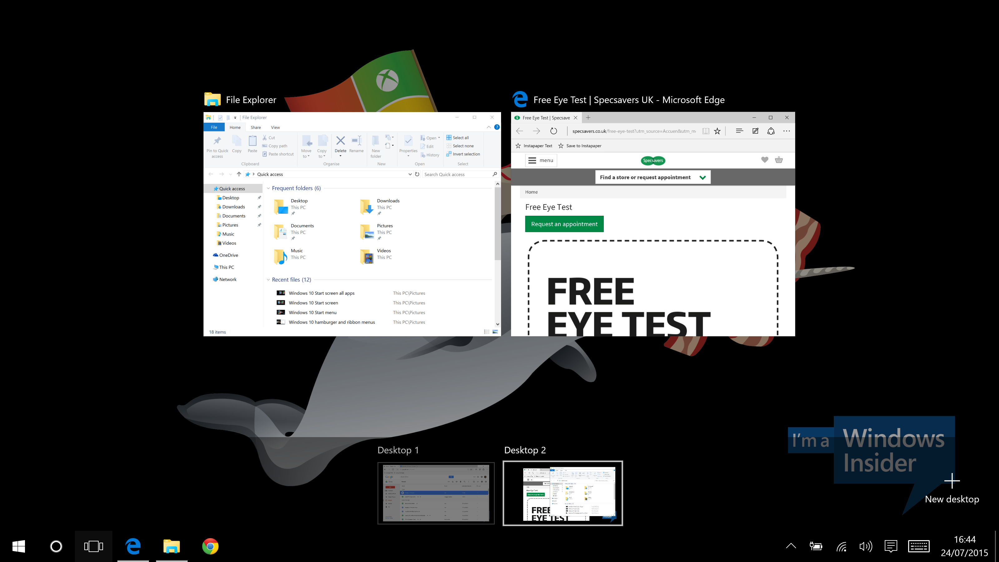
The smaller row of thumbnails at the bottom are your virtual desktops.
By default, the taskbar and the Windows-Tab keyboard shortcut will only show you the windows in your current virtual desktop. You change this setting, though, so using either one of those control methods will show you all your windows now matter which virtual desktop they reside in.
You can quickly switch between virtual desktops using the Ctrl-Windows-cursor key shortcut. There's also the Mac OS X-style ability to show Task View by swiping up on your touchpad with three fingers, but this feature is greatly dependent on updated touchpad drivers. In the case of our Lenovo Yoga 2 Pro, an updated driver from touchpad manufacturer Synaptics was (eventually) downloaded and installed automatically by Windows Update.
Although the range of gestures are limited compared to what's available in Mac OS X and weren't quite as smooth either, the basic swipe up with three fingers gesture to see Task View and swiping up and down with two fingers to scroll worked well enough. We hope Microsoft and the various touchpad manufacturers continue to refine and improve touchpad gestures and responsiveness, as this is one of the best features of Mac OS X.
Windows 10: Snap and high DPI support
Microsoft's re-embracing of the desktop and traditional keyboard and mouse control also extends to the refinement of existing features as well as introducing new ones. Snap, one of our favourite features introduced in Windows 7, has been updated.
You can now quickly resize a window so that it takes up a quarter of the available screen size by simply dragging the window to a corner of the screen. The animated window outline signalling that you've dragged the window into the correct place could be more obvious, but quarter resizing is still very welcome - especially if you a very high-resolution 4K or 2560 pixel wide screen.
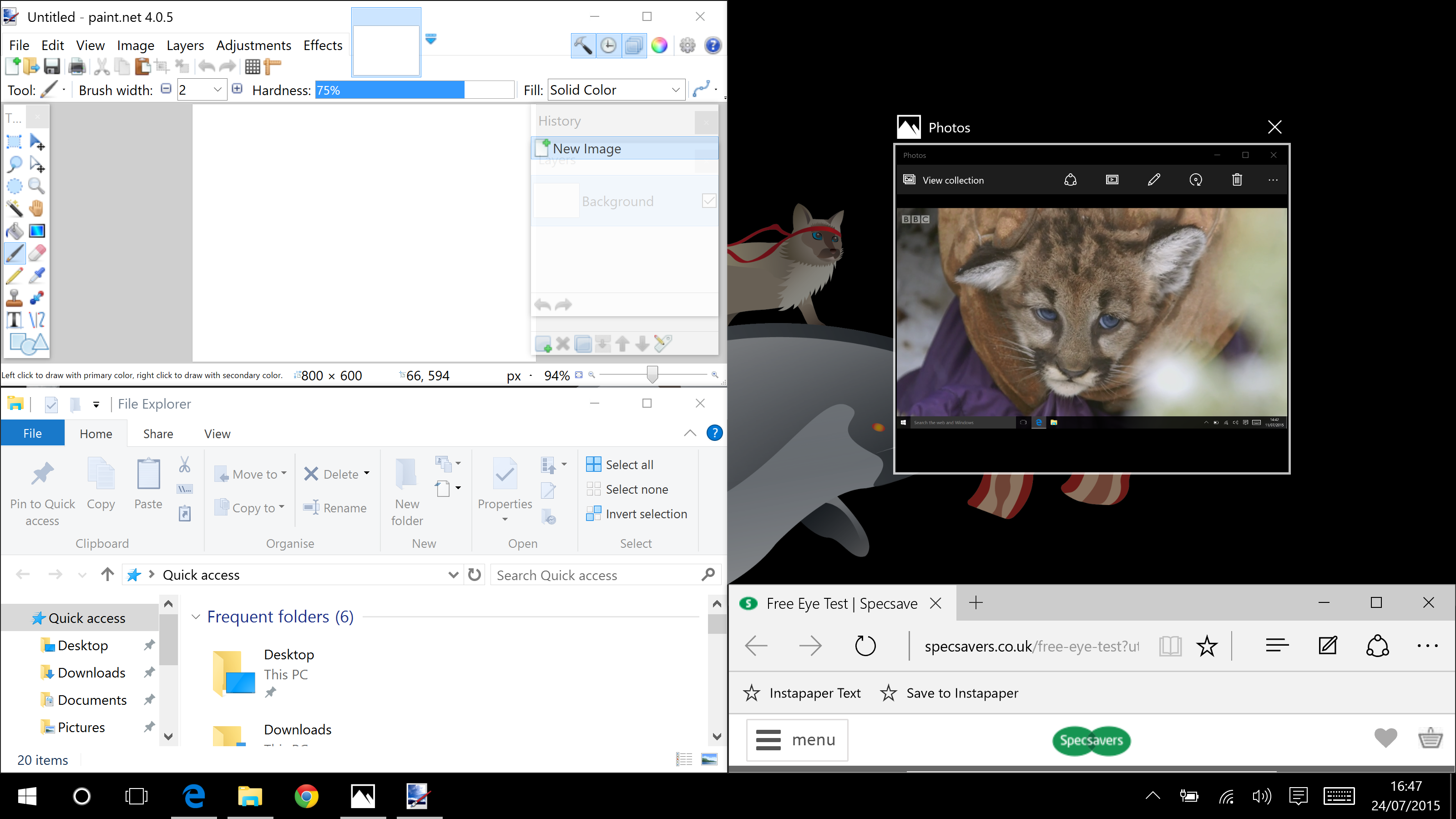
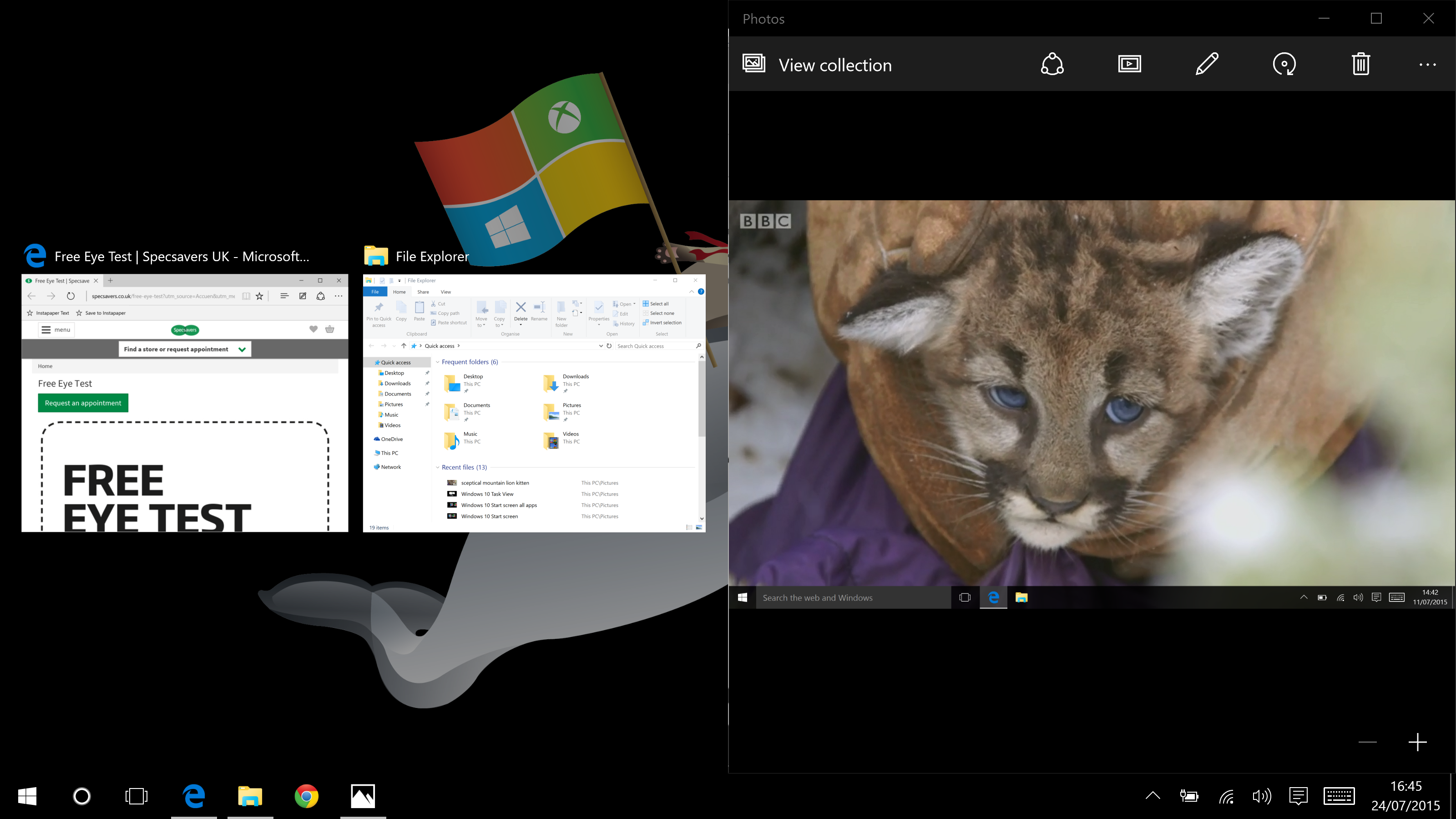
Whether you use the new quarter-screen resizing gesture, or the older half-screen resizing option, as soon as you release the windows Task View will show you thumbnails of all your other windows. Click or tap one and it will be resized to half- or quarter-screen size. It's a small touch but makes Snap even more useful.
While Windows 8.1 had better support for high pixel density screens than older versions of Windows, it was still far from perfect. To be fair, this was often due to unoptimised third-party software resulting in coarse graphics and/or unreadably small text.
Windows 10 fared better on our Yoga 2 Pro with its 13in 3200x1800 pixel screen, both because scaling text up by 250% in optimised apps works better than ever resulting in smoother, easy-to-read characters and because unoptimised software is slowly on the decline.
Windows 10: Notifications and Action Centre
Notifications provided via Live Tiles were supposed to be an eventual replacement for the increasingly cluttered, hard to read and even harder to manage System Tray post-Windows 8. That never really came to pass, if only because of the divisive nature of the Start screen and the paucity of Modern apps making good use of Live Tiles.
Windows 10, therefore, introduces yet another notifications system, one that will be familiar to anyone with a modern smartphone or tablet - a notifications drawer that slides out from the right-hand side of the screen. The reverse chronological list works as expected, although Android and iOS-style interactive notifications, such as quickly replying to a Tweet without having to jump into a Twitter app, would've been a nice touch.
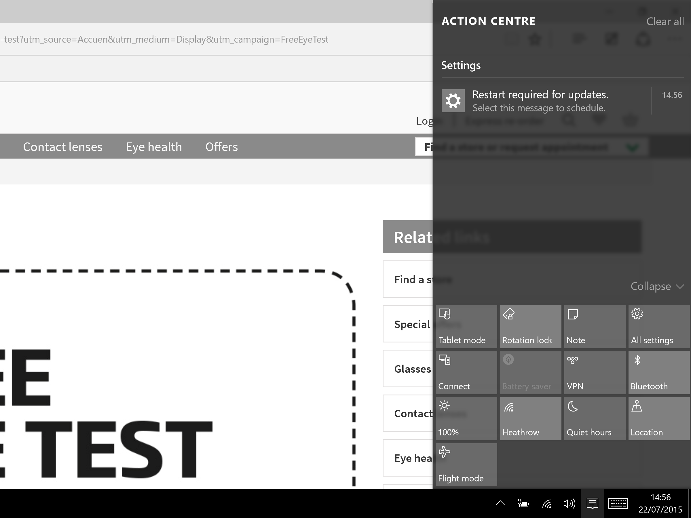
On a touchscreen, you can swipe in from the right-hand side of the screen to quickly open the drawer. Apps will need to be modified to have their notifications show up in the drawer - until then, the notifications drawer will be sparsely populated.
A related feature that's more immediately useful and, frankly, more interesting is the Action Centre which sits at the bottom of the Notifications drawer. Greatly resembling the similar feature in Windows Phone 8.1, this row of four buttons allows you to quickly toggle settings such as Airplane Mode, your VPN, the Do Not Disturb mode for silencing notifications and screen brightness.
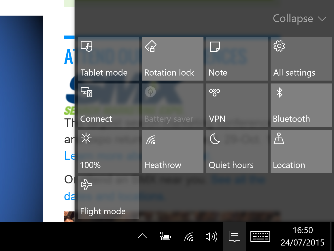
Click or tap the Expand button to see more Action Centre toggles. From here, you can customise which four settings you see in its collapsed view. Although of greatest use to laptop, tablet and hybrid owners, it will still be useful even for desktop PC users. We wish the colour scheme was more obvious, though. An Action Centre toggle is light grey when active and a darker shade of grey when off - hardly intuitive, especially if you have poor eyesight.
Windows 10: Search and Cortana
Another Windows Phone feature that's made its way to Windows 10 is Cortana. The cloud-based voice recognition of this voice-activated personal assistant was excellent in our experience. If you feel self-conscious speaking to your computer, you can simply type your queries and requests instead.
As with Cortana on Windows Phone, the personal assistant is supposed to learn your preferences and proactively show you useful information from suggesting that you should leave early for your next meeting due to heavy traffic to highlighting new restaurants near you that you might enjoy.
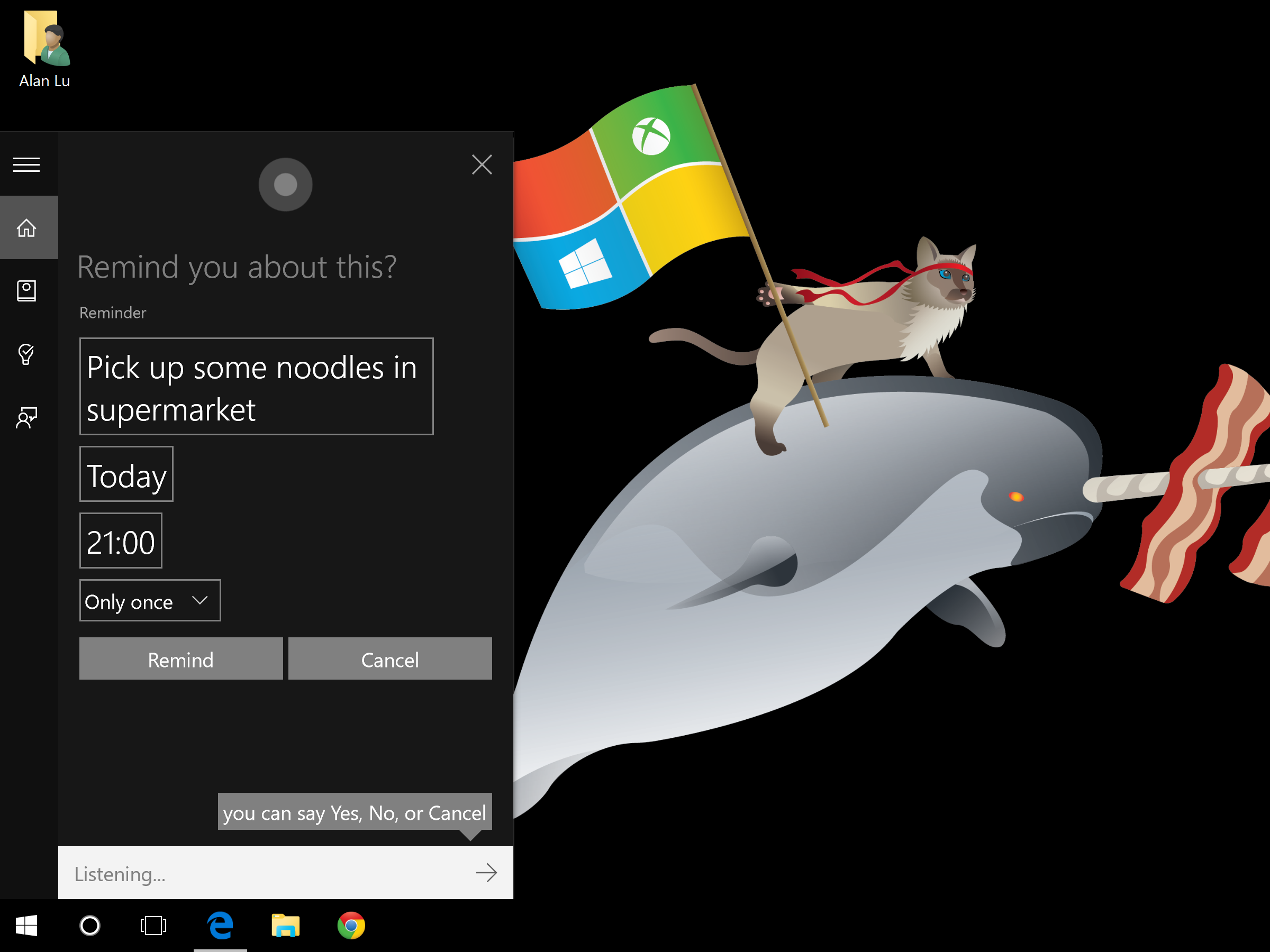
As with its mobile counterpart, Cortana on Windows 10 was slow on the uptake and at suggesting new information - even after several weeks use. Adding personal details addresses to Cortana's notebook' of information about you, such as your home and work, helped improve and speed up its usefulness somewhat. You'll have to stick with Cortana for a while before it becomes truly useful.
Disappointingly, we couldn't get Cortana on Windows 10 to synchronise with the Windows Phone 8.1 version of Cortana running on our Nokia Lumia 830. Reminders set on our desktop, for example, didn't show up on our phone which greatly limited Cortana's usefulness. We suspect this won't work until Windows 10 Mobile is released.
Cortana is accessed using a dedicated icon in the Start menu and on the taskbar. Even if you have no interest in Cortana's personal assistant capabilities, Cortana is also used for search. As with Windows 8, Windows 10's Search feature is universal so a search query brings back results from Bing and the Windows Store as well as from your locally store files and already installed apps.
Although some will find this Bing-focussed search useful, we disliked it - and not just because Google's search results are still more relevant. The order of search results can't be changed, so Bing and app store results are always at the top of the list even when you're actually trying to find a file on your computer.
Plus, unlike Windows 7, searching from the Start menu doesn't search any connected servers or NAS devices. You can still search each individual server or NAS using the search box in File Explorer - this is also the only way to apply any sort of advanced search criteria and to sort the list of results. Even then, we couldn't find a way to easily search through all of our networked storage devices as we could back in Windows 7.
In short, search in Windows 10 is a mess and that is very disappointing.
Windows 10: Edge web browser
Using the web is a crucial activity so it's no surprise that Microsoft has introduced a completely new web browser with Windows 10. The simply-named Edge, also known by its code name of Project Spartan, is based on a so far unnamed offshoot of the Trident rendering engine used in Internet Explorer 11.
Aside from having a variation of the familiar blue E icon, Edge couldn't be more different from Internet Explorer, though. Its starkly minimalist black-text-on-white interface is reminiscent of Chrome, but it sets itself apart from Google's browser in a few ways.
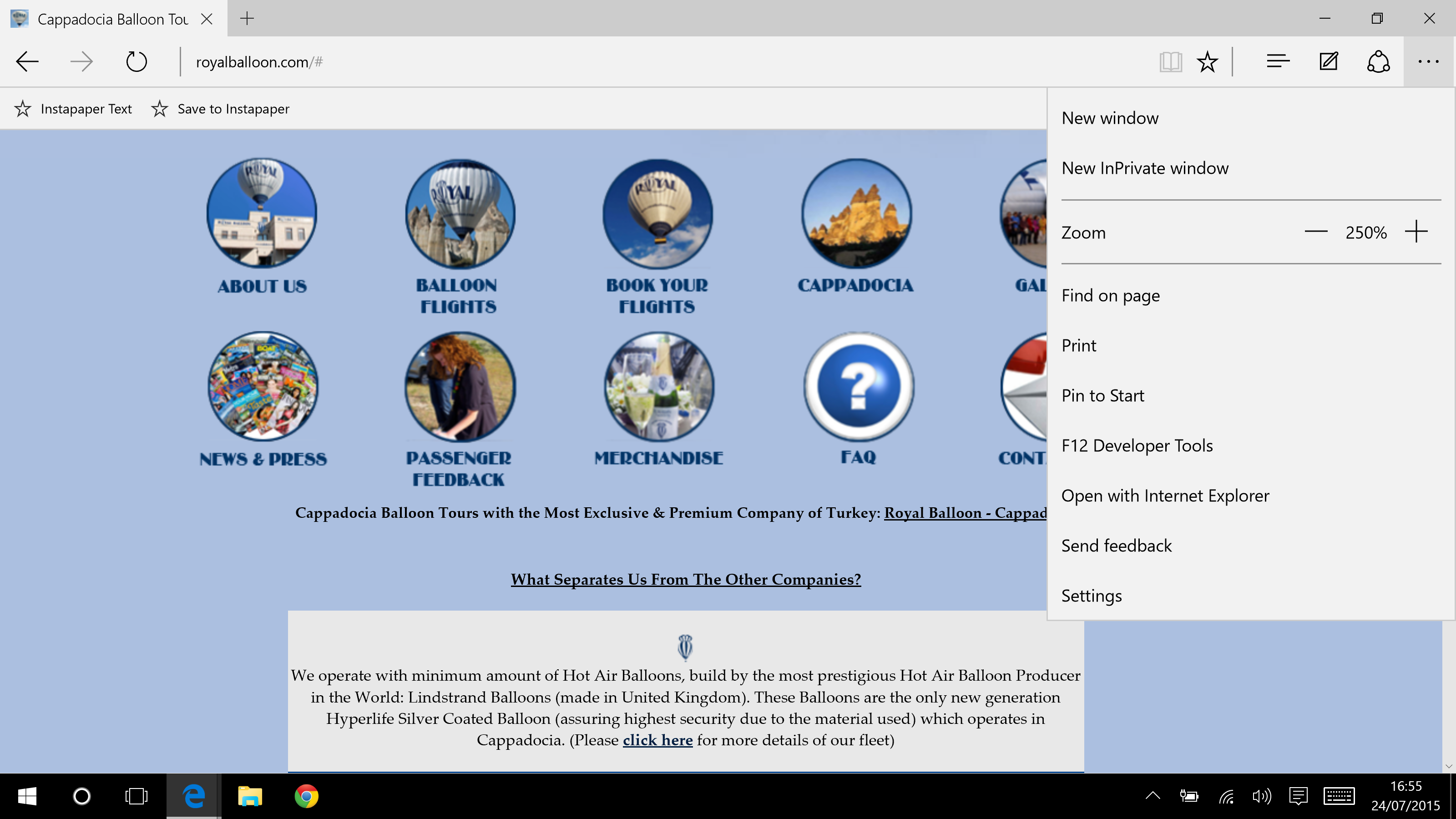
There's an inverse white-text-on-black night' mode which we found to be less distracting, no matter the time of day. Surprisingly, the toolbars are taller than those in Chrome, taking up a little more vertical screen space which is annoying on laptops with lowly screen resolutions such as 1366x768.
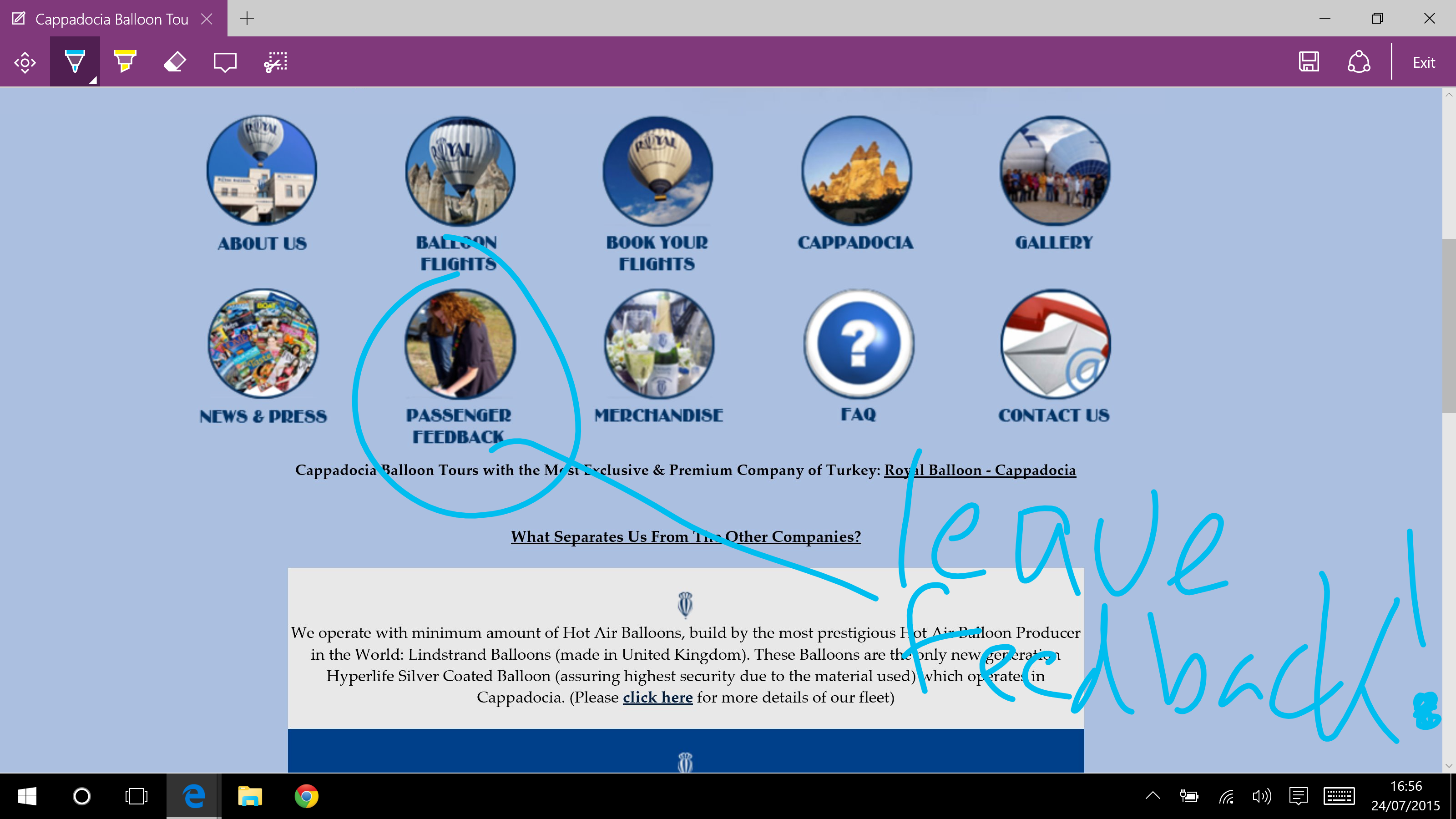
Given that Microsoft has a long-standing love affair for pen-based computing, it's no surprise to see annotation support in Edge. Tap the annotate button in the toolbar and you can add notes, diagrams and other scribbles to a static screenshot of your current web page. You can then save it locally, share it to OneNote or to other apps that work with the share system introduced in Windows 8.
We found that we only rarely used this annotations feature, but it was invaluable on those odd occasions. The interface for saving annotations could be clearer though and, unsurprisingly, while you can use a mouse to draw and scribble, it's much easier to do so on a touchscreen with a finger or stylus.
Most of the IT Pro office have long stopped using Internet Explorer in favour of Chrome or Firefox due to IE's lacklustre rendering performance. While recent versions of IE have improved, it still lagged behind the competition. Edge is a different story with rendering performance as fast or faster than its more well-known competitors. While running our Yoga Pro 2, it scored 174.93 in the JetStream JavaScript benchmark which is faster than Chrome 43's 151.68, Firefox 39's 114.14 and IE11's lowly 115.
In a more real world, everyday test, Edge rendered 14 tabs loaded with popular websites such as MSN, Flickr and BBC News in 17.1 seconds. IE11 was second at 21.2 seconds, followed by Chrome 43 not far behind at 23.2 seconds, with Firefox 39 lagging at the back with 27.4 seconds. These results are the average of three separate runs of the test on each browser with the caches cleared after each run.
HTML5 compliance is better too, with Edge scoring 402 out of 555 on HTML5Test compared to Chrome's 526, Firefox's 467 and IE11's 348. Other browsers are thus still ahead of Edge here, so Microsoft's new browser might, therefore, have compatibility issues with some particularly advanced HTML5 web apps.
There were some rendering quirks on web apps such as Google Docs and Instapaper with toolbar buttons mangled and unrecognisable. Edge's interface needs a few nips and tucks too - for example, if you have more open tabs than can fit on a screen there's no overflow menu nor does the tab bar scroll so you can see your excess tabs.
Internet Explorer 11 is still included with Windows 10 for companies still reliant on web apps that use deprecated legacy features deliberately omitted from Edge, such as ActiveX. Extensions are absent too, although these will be reintroduced at a later date according to Microsoft.
We're still running our performance benchmarks on Edge, but even at this early stage, it's safe to say that it's a big improvement over Internet Explorer 11 and a worthy alternative to Google Chrome.
Windows 10: updates, security and enterprise-related features
Although there are fewer new enterprise-only features in Windows 10 compared to those aimed solely at consumers and those which are useful to both, the ones present are significant.
As with Windows 8, Windows 10 will be available in Home and Pro versions with bulk licensed Enterprise and Education editions too. If you want features such as BitLocker, Hyper-V, group policy management, domain support and the ability to act as either an RDC server or client then you'll need the Pro version or above.
Windows 10 introduces a critically important new difference between enterprise-licensed copies and all other versions. Windows updates are now mandatory you can't skip or postpone their installation, only choose when your computer is restarted to complete installation.
The only exception is if you're using the Enterprise version. You can then choose to only receive critical security updates and defer other updates for up to 90 days if you're on the Current Business Branch for updates. If you're on the Long Term Servicing Branch then this period is lengthened to five years.
If you're managing a whole fleet of Enterprise-licensed computers, then you can divide them into circles and choose which ones get updated first and even set specific times for when updates shouldn't occur so as not to disrupt your working day.
These enterprise exemptions to Microsoft's mandatory updates policy is especially important given Microsoft's statement that Windows will now receive major new features on an ad-hoc, as soon as they're ready basis in updates rather than through service packs or milestone releases such as this one.
An eye-catching feature that's actually of limited use for the present is Windows Hello and Passport. These two complementary security systems, the first is for Windows itself while the latter is for apps and websites, allows you to deploy two-factor authentication. One of the factors can be biometric, such as a fingerprint, iris or face scan.
Microsoft claims existing fingerprint scanners, such as those built into some current Windows laptops, should be compatible, but we weren't able to test this at the time of writing. Iris scanning hardware is allegedly coming soon. Face recognition can be used now, but only with the dozen or so computers that come with an Intel Real3D webcam built in.
Less sexy, but more immediately useful security features include Enterprise Data Protection which allows IT managers to remotely wipe just company data from a managed computer, leaving an employee's personal data untouched. MDM will obviously be required for this to work, whether it's Microsoft's own InTune, Configuration Manager or a third-party product.
Surprisingly, Windows 10 is the first version to support Azure IDs for log-in and binding to Azure Active Directory resources. It's also the first version to support private app stores accessible only by your company staff, but these custom app stores can only be stocked with Universal Apps. This ties in with Device Guard, a feature that lets you prevent unauthorised software from running on a Windows 10 computer, but only on those machines that have a UEFI that supports Secure Boot and you must be solely running Universal Apps - two criteria that most business computers currently in use won't be able to meet.
Windows 10: pricing
Contrary to popular misconception, Windows 10 isn't being sold on a subscription basis like Adobe Creative Cloud. The source of this mistaken belief is Microsoft's stated goal of releasing new features in the future as soon as they're ready, rather than in big milestone releases, and the fact that Windows 10 is a free upgrade to consumers currently using Windows 7 or 8, but only until July 29th, 2016.
After that date, anyone who hasn't upgraded to Windows 10 will have to pay to do so. Unfortunately, this fee hasn't yet been set and it's possible, but we should emphasise by no means guaranteed, that Microsoft could extend the free upgrade period indefinitely.
If you use Windows under an Enterprise licence, then upgrade pricing will be dependent on the terms of your bulk licence. In the unlikely situation that you're an entirely new Windows customer, Windows 10 will be available on disc and USB sticks but pricing hasn't been set for this either.
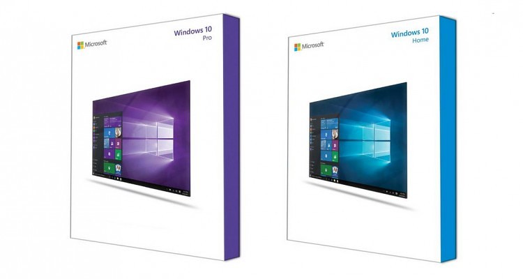
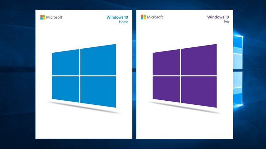
Microsoft's retail packaging for Windows 10 - DVD versions on the left, USB stick versions on the right
Windows 10: conclusions
Windows 10 is the best version of Microsoft's ubiquitous operating system in a very long time. It's easy to forget that Windows 7 was a very modest update that mostly corrected Vista's failings while Windows 8 was of little use to anyone not using a touchscreen computer.
Almost all of the new interface changes make Windows genuinely better to use, whether you're home or business user and Edge is not the second-rate browser that is Internet Explorer. There are still some rough edges, especially in search, but we're confident Microsoft will smooth them out sooner or later. The new enterprise-specific features are a little more hit or miss and we remain sceptical about Windows Hello and Passport, at least until the necessary hardware is more widely available and can be tested.
Most desktop operating systems are now very mature, making meaningful new features and changes harder and harder, but Microsoft has managed it here. Sooner or later your PCs will be running Windows 10 and that's a future to be embraced, not feared.
This review was first published on 29/7/2015 and has since been updated, most recently on 30/7/2015.
For an alternative perspective on what Windows 10 has to offer business users and consumers alike, head over to our sister title's Alphr and Expert Reviews to see what they think of the new OS.
Verdict
It's better than Windows 8 and it's free
System Requirements Windows 7 SP1 or Windows 8.1 Processor: 1GHz or faster processor RAM: 1GB for 32-bit or 2GB for 64-bit Storage space: 16GB for 32-bit OS, 20GB for 64-bit OS Graphics card: DirectX 9 or later with WDDM 1.0 driver Display: 1024x600 pixel resolution
Get the ITPro daily newsletter
Sign up today and you will receive a free copy of our Future Focus 2025 report - the leading guidance on AI, cybersecurity and other IT challenges as per 700+ senior executives
-
 ‘Phishing kits are a force multiplier': Cheap cyber crime kits can be bought on the dark web for less than $25 – and experts warn it’s lowering the barrier of entry for amateur hackers
News Research from NordVPN shows phishing kits are now widely available on the dark web and via messaging apps like Telegram, and are often selling for less than $25.
By Emma Woollacott Published
-
 Redis unveils new tools for developers working on AI applications
News Redis has announced new tools aimed at making it easier for AI developers to build applications and optimize large language model (LLM) outputs.
By Ross Kelly Published
-
 Google layoffs continue with "hundreds" cut from Chrome, Android, and Pixel teams
News The tech giant's efficiency drive enters a third year with devices teams the latest target
By Bobby Hellard Published