Best Linux file managers 2023: Customise your workflows
Using a dedicated file manager will make working with Linux a whole lot easier

The file manager is the direct interface between the user and what’s stored on the computer. Most average users will be familiar with either Windows File Explorer or macOS Finder, which represent the preinstalled default options for the world’s two most popular desktop operating systems. The Linux ecosystem, however, offers considerably more flexibility in this regard, allowing users to pick from a range of options to find the perfect file manager.
Your needs in this department will depend on what your file management workflow actually is. If you’re an advanced user with a wide range of file management duties, you might appreciate a Linux file manager with some customisation along with specialised features.
On the other hand, if you’re setting it up for someone else, such as a non-technical user, you might prefer something with conventional looks and a stripped down interface. All this is before we even get into personal preferences for functionality and layout.
These are the issues that we’ve taken into consideration. The selection we present below are all good file managers for Linux users, but they all have their strengths and weaknesses.
Dolphin
Best for general users who want a full feature set
| Pros | Cons |
| Reasonably fully-featured | A bit heavy on resources |
| Approachable in its default state | Default config is stripped down |
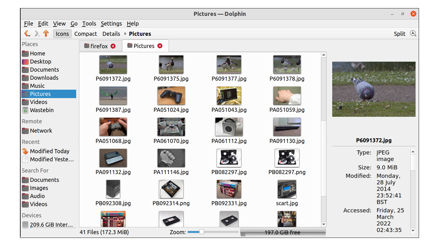
It’s a cliche, but ‘Swiss Army Knife’ aptly describes this file manager, and yet, it still manages to strike the right balance by being easy to use. The compromise is that a lot of the user interface features are disabled by default, and you’ll have to traverse a labyrinth of configuration menus to get the full experience of everything Dolphin has to offer.
We consider ourselves to be power users, so our first order of business was to enable the toolbar and the menu bar, but it’s a shame that the default toolbar is so sparse once it’s switched on. It can be populated with icons manually, and that takes time. However, at this point, Dolphin starts to look a bit more suitable for a technically-minded user.
You can even add a terminal window panel that follows the current directory in the main panel - very handy when using Linux. At the flip of a toolbar button, Dolphin can be used as a basic dual panel file manager, with an optional side window which gets you the intimate details of a particular file. All of these features can be assigned to toolbar icons so that you can whip them out when you need them.
Typifying the hidden depths of Dolphin, the detail view has the option of adding quite a lot of extra fields such as the dimensions of an image or the artist name in the case of audio files. A click on the location bar switches to showing the directory path, and you can pop a network URL such as an FTP site or a shared folder directly into this, broadening the roles that Dolphin can fulfil.
Dolphin is our top choice for the technical user who isn’t ready to make the leap to the dedicated dual panel file managers.
Midnight Commander
Best for command line users who need a file manager
| Pros | Cons |
| Fast and to the point, once you’re used to it | Incomplete network browsing |
| Usable over a network | Text mode interface won’t suit everyone |
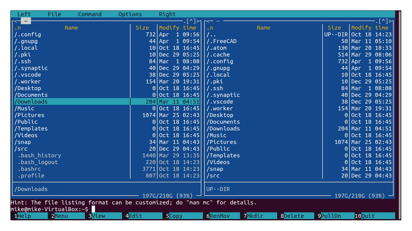
To some, a completely text based interface might seem intimidating, but Midnight Commander is actually pretty easy to use. The cursor keys move up and down the list of files, return executes the file under the cursor and spacebar selects. The standard file management commands are attached to function keys, and these are summarised at the bottom of the screen.
The display stretches to fit the current terminal, but obviously, you miss out on a few niceties that come with a GUI file manager such as mouse control and in-place image previews. Midnight Commander comes into its own when you’re working in text mode, and you can jump back and forth into the command line. Sure enough, we ran it over SSH on a Raspberry Pi and performance in this setting was excellent, making it our go-to tool on a text-only connection. It’s just a shame that the built-in network browser is rather limited.
Nemo
Best for users who need the standard features without extra clutter
| Pros | Cons |
| Intuitive | A bit light on features |
| Clutter-free | Less resource-intensive options exist |
| Drop in replacement for Files | Row 3 - Cell 1 |
Over the years, the Gnome project has stripped down the official file manager, Files, and as a result, we prefer Nemo, a fork that retains the features and user interface of the older generation. Don’t worry - although this is a fork, it’s well-supported as it’s part of the Linux Mint distro’s Cinnamon desktop. You’ll find it in the repository of most distributions.
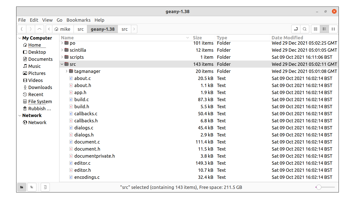
Having said all of this, Nemo still is fairly minimalist, favouring a clutter-free, flat-panelled look. Giving it the first-glance test, most users will understand the layout, and the default user interface configuration is good, placing most of its features on display from the outset.
At the bottom, we have a status bar area, showing things like the free space on the drive and the size of selected files. There’s also an icon size slider here. In the main toolbar, we can switch between icon view, list view or compact views and access file search. This is also where we select between a ‘breadcrumbs’ or a traditional directory pathname for the location bar. Middle-clicking on a directory opens it in a new tab, but there is no split view at all.
Of the file managers we’re looking at, Nemo might offer the best balance of features with simplicity and ease of use. On the downside, although Nemo does everything most people will expect of it, it’s not exactly bristling with features. What you see on the outside is pretty much everything you get. As it’s derived from the Gnome desktop, it also drags in a fair few resources during installation.
PCManFM
Best for those who need file management in a constrained environment
| Pros | Cons |
| Lightweight | Missing advanced features |
| Fast to launch | Row 2 - Cell 1 |
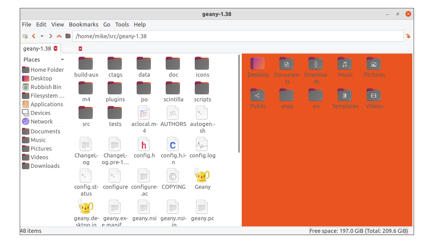
Unsurprisingly, given its connection to the lightweight LXDE desktop environment, PCManFM features a clean layout while being light on resource usage. This means that it's snappy in terms of initial launching and in use, even on older hardware. It also means that it doesn’t drag a huge number of libraries through when it’s being installed.
Pretty much every area of normal file management is covered, even though some of the features aren’t readily apparent. For example, at first, we lamented the fact that it didn’t seem to have a network browser, but it’s in one of the menus and it can be added to the sidebar. Similarly, there was some scope for customisation but it was limited to things like enabling toolbar icons.
We were pleasantly surprised to find it supports full image previews within directories - although zooming in is done via a keyboard combo rather than a slider. Middle selecting a directory opens a new tab, and there is a split view mode.
What this adds up to is a file manager that’s worth considering when resources are tight or advanced customisation isn’t required. It’s not one for the power users who require every feature imaginable, but general users probably won’t feel blocked due to lack of features.
Krusader
Best for power users
| Pros | Cons |
| Highly customisable | Unfamiliar interface for many |
| Less mistake prone | Some learning curve |
| Fast for complex jobs | Row 3 - Cell 1 |
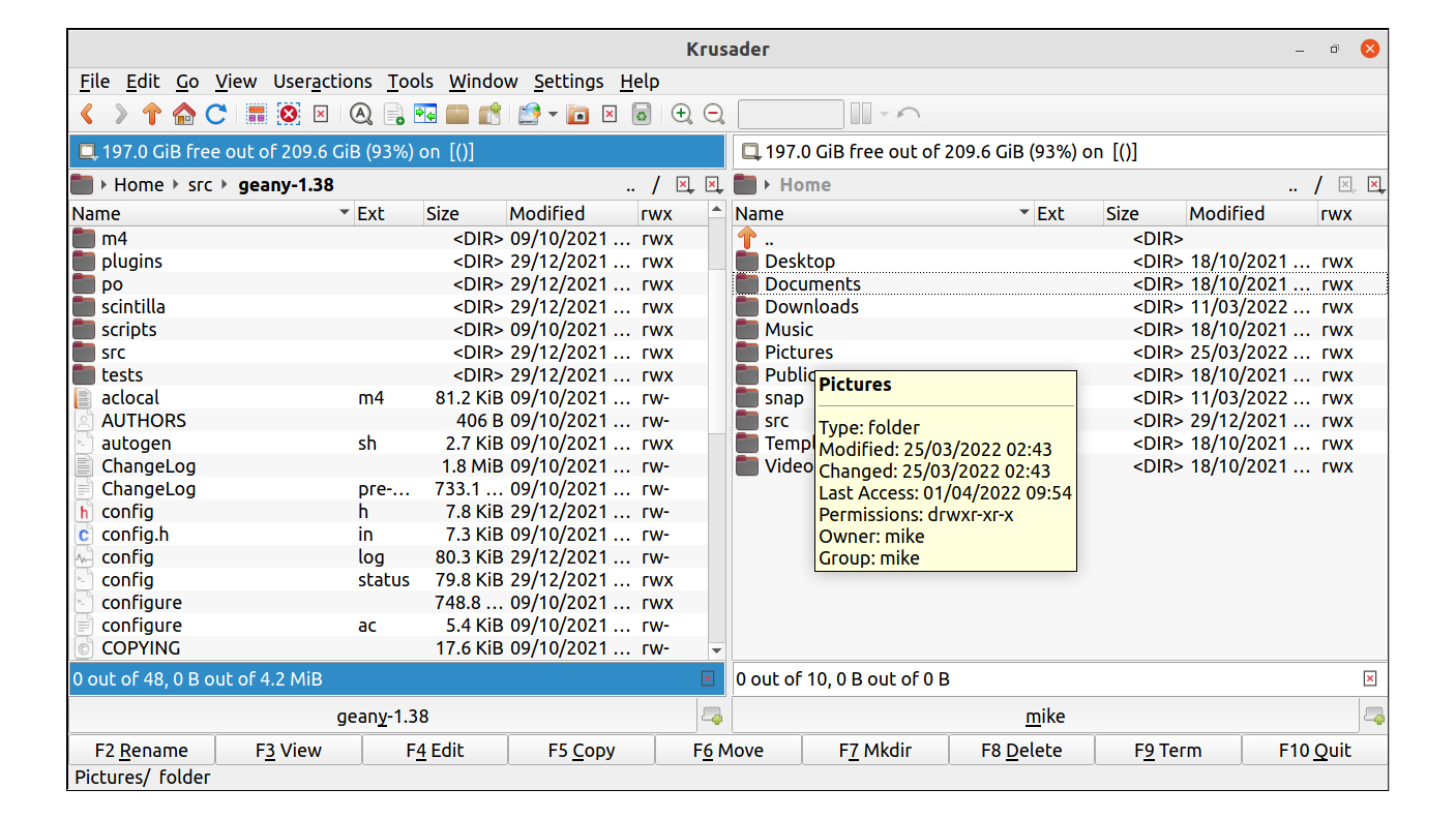
Krusader is a dual panel file manager aimed at the power user while retaining the many of the niceties of a mouse-operated GUI. The snag with the more common, accessible style of single-window file manager is that mistakes can start to creep in when you hit a certain level of complexity and repetitiveness of workload.
Almost every area of the Krusader user interface is customisable and there is an emphasis on creating your own scripts and macros to automate jobs. One hundred percent keyboard control is also perfectly viable, which tends to add to accuracy for repetitive jobs.
As is usually the case with dual panel managers, the function key shortcuts are displayed at the bottom of the window, and this is customisable too. It also has good facilities for plugging in external tools and scripts, and the first time you run it, checks are carried out to see what tools have been detected.
Although it’s in its element when handling complicated file management jobs, we don’t want to make it sound like the learning curve is overly steep. However, it’s not a file manager aimed at the casual computer user. If you spend a lot of your time navigating through complicated collections of files and directories or you find yourself sighing every time you begin a regular file management job, taking the time to learn how to use Krusader could well be worth it.
Alternative options
There are some other Linux file managers that are worth looking at, even if the options above are better choices overall. Nemo is forked from what would become Gnome Files, but we explained our reasons for preferring Nemo. Caja is yet another fork that aims to remain featureful, and it’s the official file manager of the Mate desktop.
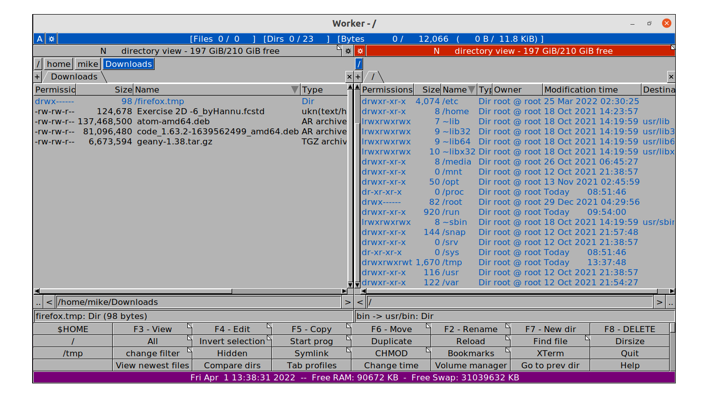
A common sight on low resource Linux distributions, Thunar is a lightweight file manager in the same vein as PCManFM, but we felt that its feature list is a bit slim for general use. Double Commander is a nice looking dual pane file manager, but we prefer the UI of Krusader. Worker is another solid and currently-maintained dual panel choice, and it’s inspired by Amiga software of yesteryear in terms of looks. If you’re feeling experimental, nnn has a slightly wacky take on how a text mode dual panel file manager should look and work.
Verdict
We’ve chosen Dolphin as the best overall file manager. While it's a little bit resource heavy, Dolphin is attractive and intuitive in use, and we’d struggle to find a file management situation that it couldn’t handle. It’s also a perfectly reasonable choice for beginners and casual users. The Gnome derived file manager that we looked at, Nemo, is easy-to-use but can’t match Dolphin’s feature-set and potential for expansion.
Krusader, meanwhile, carries the torch of the traditional, two-panelled file manager successfully. It has the depth if you want it, but it’s not too difficult to use for the two-panel newbie. Midnight Commander’s a handy utility if you find yourself on the command line, and PCManFM is a good choice as a front-end to the filing system on a low powered system that maintains a conventional approach.
All of the file managers we’ve looked at are worth considering depending on the niche that you’re working in. Our advice: check them out and see which one you prefer - after all, they’re all free.
Get the ITPro daily newsletter
Sign up today and you will receive a free copy of our Future Focus 2025 report - the leading guidance on AI, cybersecurity and other IT challenges as per 700+ senior executives
-
 Bigger salaries, more burnout: Is the CISO role in crisis?
In-depth CISOs are more stressed than ever before – but why is this and what can be done?
By Kate O'Flaherty Published
-
 Cheap cyber crime kits can be bought on the dark web for less than $25
News Research from NordVPN shows phishing kits are now widely available on the dark web and via messaging apps like Telegram, and are often selling for less than $25.
By Emma Woollacott Published