iOS 8 vs iOS 9: What's new, what's changed and what's important
A feature-by-feature breakdown of what to expect from iOS 9 and how it contrasts with iOS 8
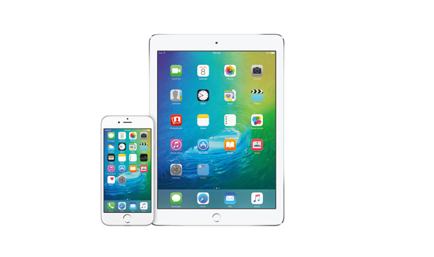
Update:iOS 9.2 is now available to download with enhancements and bug fixes to the OS and a host of apps. For more details head over this article here. It brings improvements toApple Music, iBooks and iOS Mail apps as well as a number of bug fixes.
iOS 9 is unquestionably a great piece of software, but don't go hurrying to update your devices just yet.
As with any operating system, the more iOS is updated to accommodate new devices, the more troublesome it is on older technology, and iOS 9 is no different.
In our tests, we found that the benefits and features introduced by the update were generally outweighed by the negative impact.
For starters, the vast majority of new features were incompatible with the older hardware. The new twin-column notification centre for the iPad Mini and Low Power Mode for the iPhone 4s are among the only headline additions that are actually available to earlier devices.
On top of this, iOS 9 actually introduces noticeable performance hits, with a measurable decrease in app response times.
As such, iPhone 4s and iPad Mini users would be advised to stick to iOS 8, and avoid iOS 9 altogether.
Sign up today and you will receive a free copy of our Future Focus 2025 report - the leading guidance on AI, cybersecurity and other IT challenges as per 700+ senior executives
The big reveal
Apple revealed iOS 9 at WWDC earlier this year, well ahead of a public release, so developers could start getting their apps ready. iOS 9 might arguably be more of an iterative update compared to iOS 8, but it still brings big revisions to many default apps, upgrades to Siri and Search, and finally, iPad-specific multitasking features that have the potential to make the tablet an even more invaluable business tool than it is today.
Side-by-side
We've put iOS 9 side-by-side with iOS 8 to see what features are being introduced, what changes have been made, and what quirks you can expect when your update finally completes its arduous download.
Built-in apps and interface
Almost every new version of iOS has introduced or redesigned an important of the overall interface and a built-in app, giving upgraders something new and fresh to try out as soon as their iPhone or iPad has rebooted from the install.
For iOS 8, this included Reachability, Apple's one-handed mode that brings the top half of the screen closer to your thumb. Double-tapping the home button without actually pressing it in fully activates the mode, and tapping it twice a second time restores the app to full-screen.
A series of new gestures were introduced in iOS 8, letting you swipe down from anywhere on the middle of the homescreen to display Spotlight search. You could also swipe left or right on an email message to mark it as unread, flag it, file it or trash it. Interactive notifications finally arrived too, letting you quickly reply to a text message directly from the notification, for example, rather than forcing you to open the Messages app.
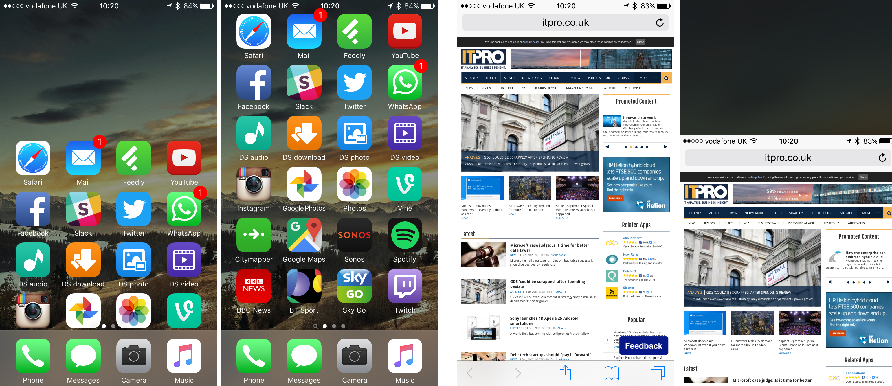
Apple's larger iPhones are only usable for small hands thanks to features like Reachability
It was the redesigned Photos app that marked the biggest change, however. The new-look gallery app was divided into three sections; Collections, Albums and Shared. In Collections view, photos are sorted by location, but you can also alternately see them organised by years. Albums view is self-explanatory. Sharing lets you see exactly which photos you've shared with other iCloud users, or which are currently synced to your iCloud account.
With the latest build of iOS, several more apps get complete makeovers. Passbook has been renamed to Wallet, and now contains both credit and debit cards registered with Apple Pay, plus boarding passes, coupons and reward cards. It can be accessed with a double-tap of the home button when your iPhone is locked, making it very quick for accessing boarding passes when you're queuing at the airport.
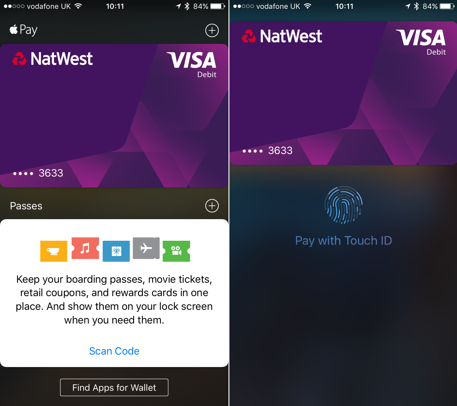
Passbook has been overhauled into Wallet, mostly to make Apple Pay easier to use
Apple's homegrown Maps app finally gets public transport directions for the first time, helping it better compete with Google Maps. With Siri integration you can now ask for a route, rather than typing in a location, and as long as your locality supports online travel disruption information, you'll get warned about delays when planning your route.
You can also change the preferred mode of transport, limiting yourself to buses rather than swapping onto a train, for example, and change the leave by or arrive by times to suit your schedule. Unfortunately the only British city currently supported by Apple Maps' transit directions is London and there's still no option for cycle directions yet either.
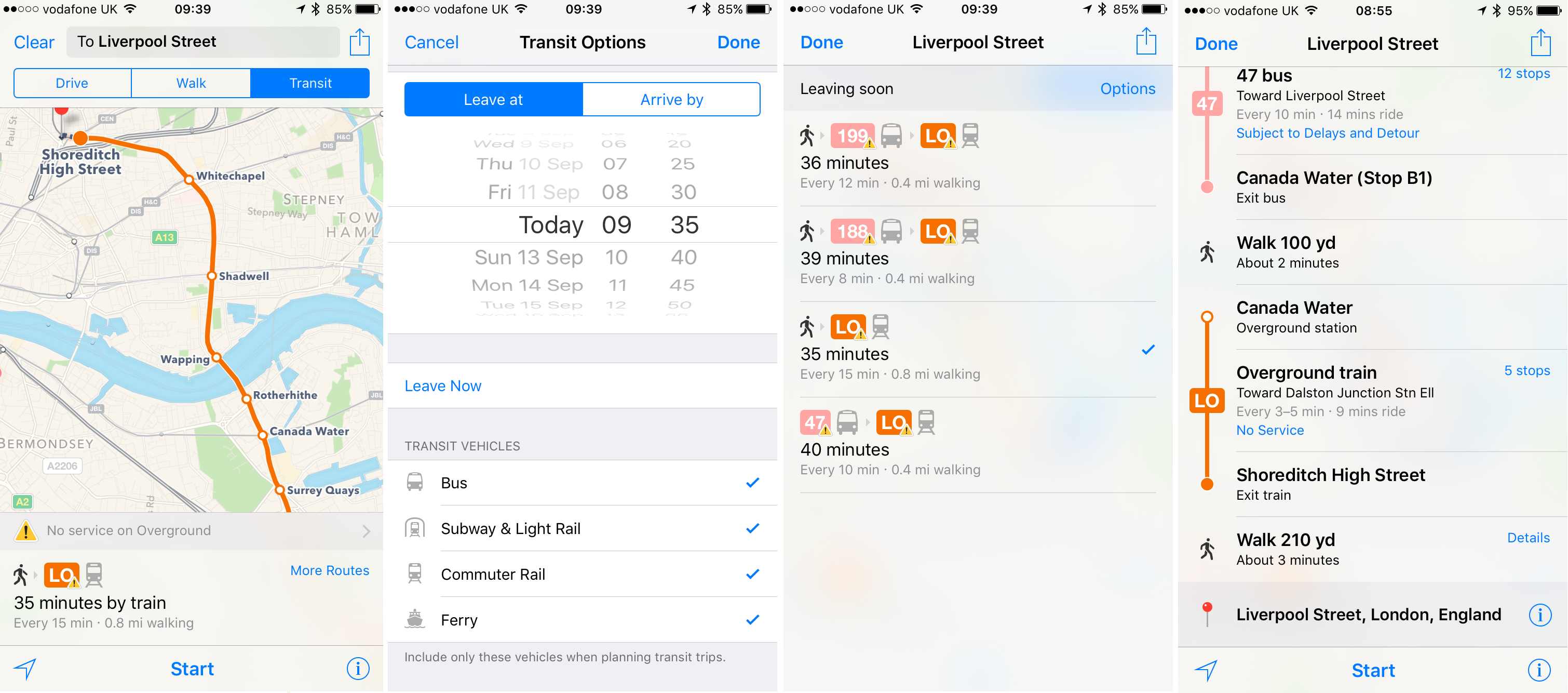
Transit directions fill a gap in the Apple Maps feature set, although it's still limited
The big new addition is the News app, a curated destination for articles and content from a wide range of publications, displayed in an easy-to-read format. It's a lot like existing third party app Flipboard, except Apple is in charge of what content appears
Currently, big name news providers like the New York Times, CNN, the Telegraph and Bloomberg are all featured heavily, but so are more independent titles such as Vice and Buzzfeed. During setup you can choose some of your favourite publications and topics, which will be pushed to the front page when you open the app.
Some articles open in a full-page layout, with carefully laid-out and designed in-line images and flowing text that let you read the whole thing within News, but others simply show a preview and force you into a web browser to read the full story. In this way News is similar to a RSS reader, so it remains to be seen what Apple will do to make it stand out from the competition.

News doesn't really do anything new, with third party apps already nailing curated content
It's the Notes app which has seen the biggest upgrades. A toolbar above the keyboard finally adds formatting options, letting you choose between bold, italicised and underlined text as well as different font sizes. You can also add bulleted, dashed, numbered or check lists for the first time.
Rich content additions make Notes far more useful, especially now that you can add photos or video from the camera roll or take cuttings from websites. You can also add links to notes that, when tapped, open another app to display a specific bit of content although this depends on third-party apps supporting this.
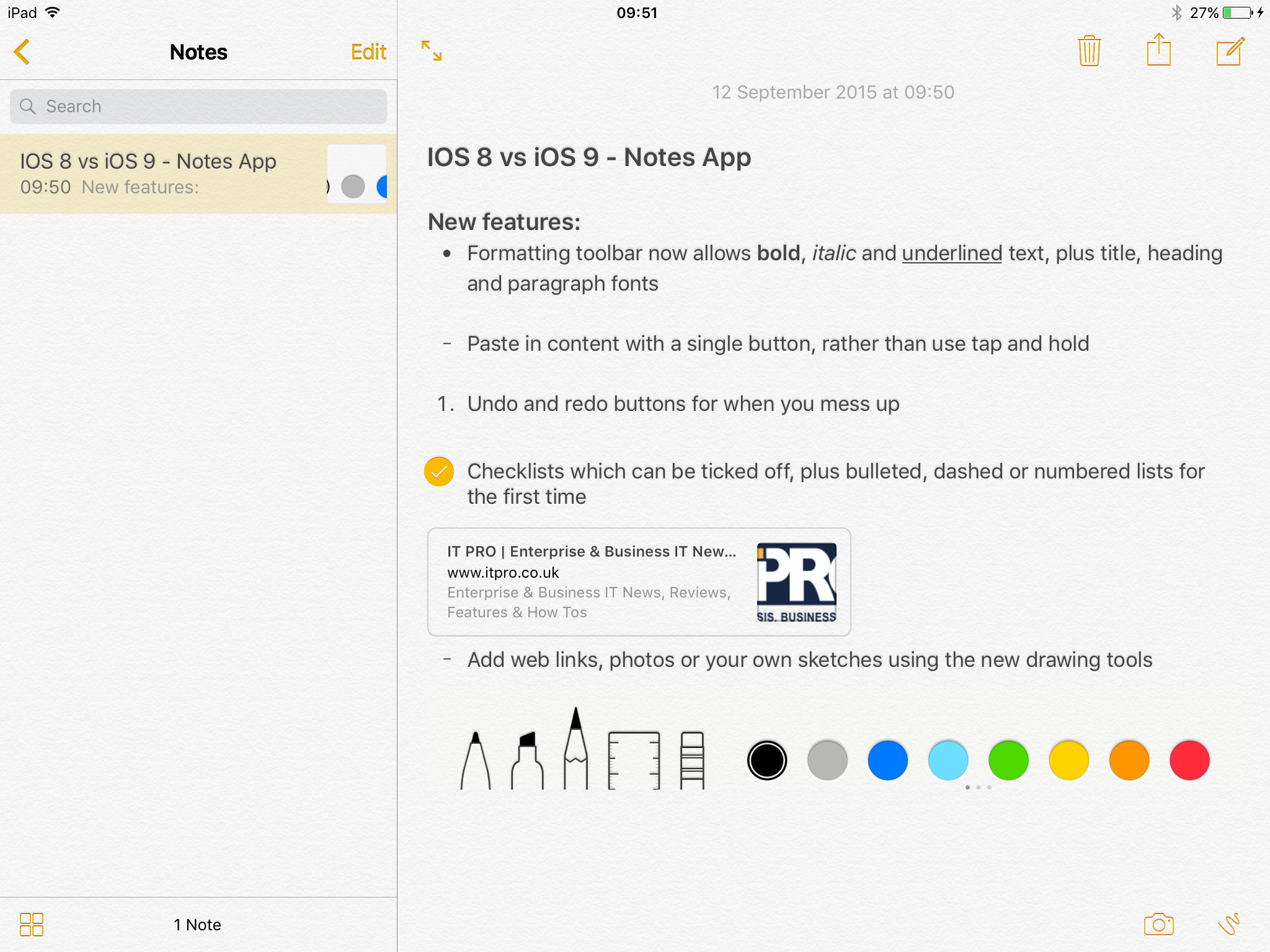
Notes is now much more useful, especially once you start adding photos and links
You can also add sketches using the new drawing tools. These sketches are added to your notes as images, though, so you can't annotate around your text. Oddly, you can only use these sketching features if you're signed in with your iCloud account.
Keyboards
Apple is famously restrictive when it comes to customisation on iOS, refusing to allow the wild kinds of tweaks and modifications available on Android [node/24620] in favour of a consistent design and familiar features across all devices. This changed with iOS 8, when custom keyboards were allowed in the App Store for the first time.
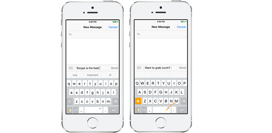
Swipe to type and intelligent suggested type finally arrived with iOS 8, thanks to third party apps
If you did go down the custom keyboard route in iOS 8, iOS 9's new default keyboard could tempt you back. For starters, the entire keyboard now changes to show whether or not Caps Lock is engaged - a godsend for anyone that struggled to remember whether the illuminated shift key on Apple's iOS 8 default keyboard meant you would be typing in caps or not. Now the entire keyboard changes to lower case until you press the shift key.
Two iPad-specific additions are the shortcut bar and easy text selection. The shortcut bar places an extra row of icons above the keyboard, alongside the improved autocorrect suggestions that arrived in iOS 8. It's the buttons either side of this that make all the difference, however; undo, redo and cut/copy/paste, bold/italic/underline, photo and attachment buttons make it much more convenient to work on text documents. The bar can also be customised by third party app developers, putting important shortcuts within easy reach.
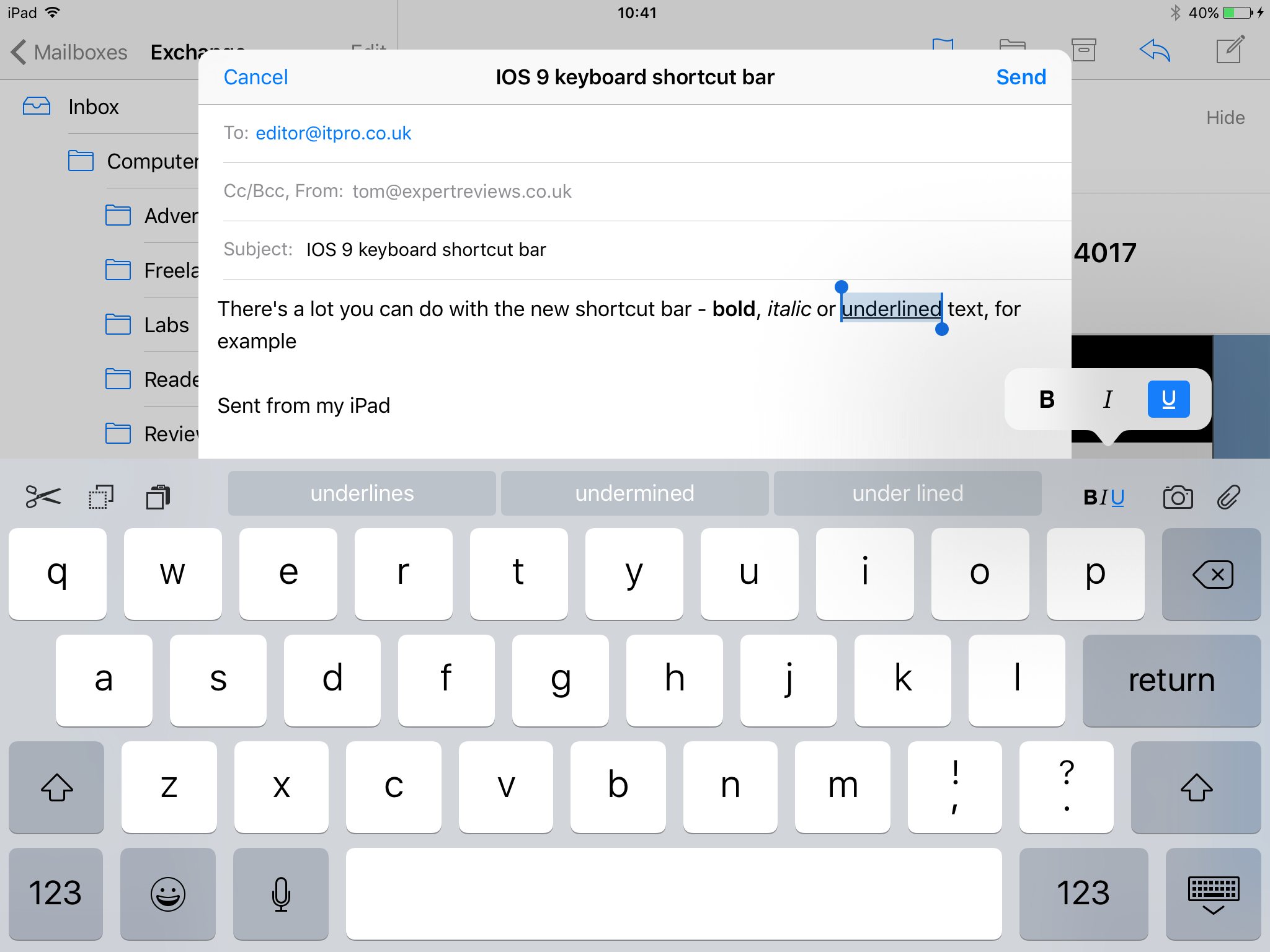
Certain shortcuts only appear in certain apps - text formatting doesn't appear in Safari, for instance
Easy text selection is a major improvement over the old magnifying glass text selection method, letting you swipe anywhere onscreen, including on the keyboard, with two fingers to move the text cursor. A tap will highlight the currently selected word, and dragging will move the selection. You can then use the shortcut bar icons to cut or copy text.
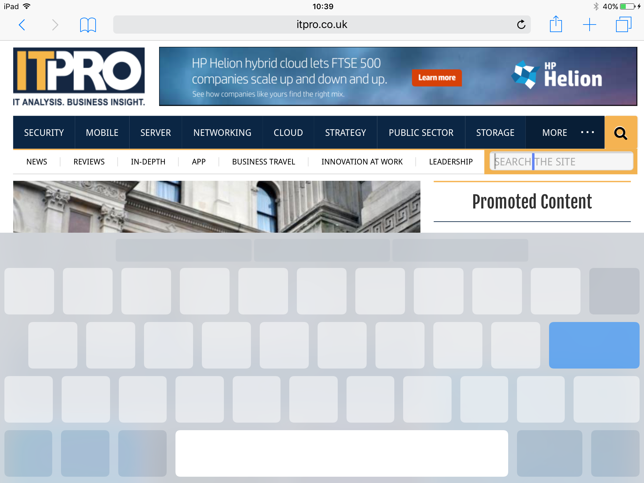
The entire keyboard turns transparent when using easy text selection
It's not just the onscreen keyboard that got tweaks; you can finally use keyboard shortcuts with external, physical keyboards. There are shortcuts for switching between apps, bringing up search, and custom shortcuts designed for individual apps and will be very familiar to Mac OS X users.
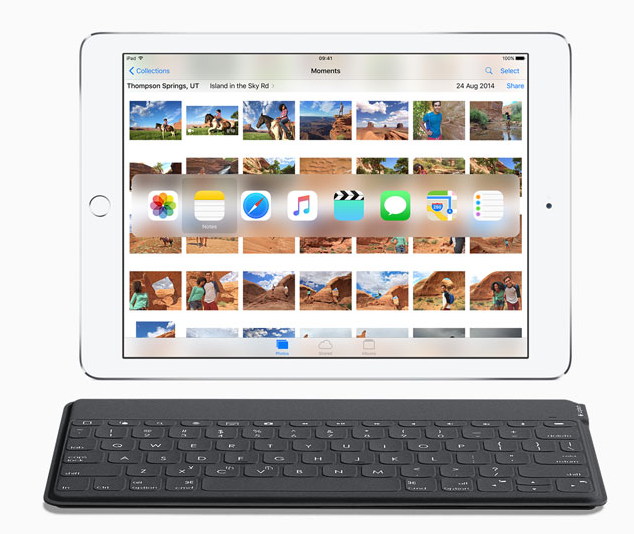
Multi-tasking on iPad
Ever since the first iPhone, iOS devices have concentrated on one task at a time, but as screens have got bigger (and some Android tablets started letting you run multiple apps at once) it has made more and more sense for Apple to add multi-tasking to iOS.
The company started sowing these seeds way back in iOS 4 which allowed a limited, very specific selection of tasks to run in the background. iOS 5 added multi-finger app switching. Rather than double-tapping the home button to see the list of currently running apps, you could now swipe up with four fingers. Swiping left or right with four fingers would jump directly from one app to another, which made things a little faster when working across multiple apps at once. Pinching inwards with all five fingers would also take you straight back to the home screen.
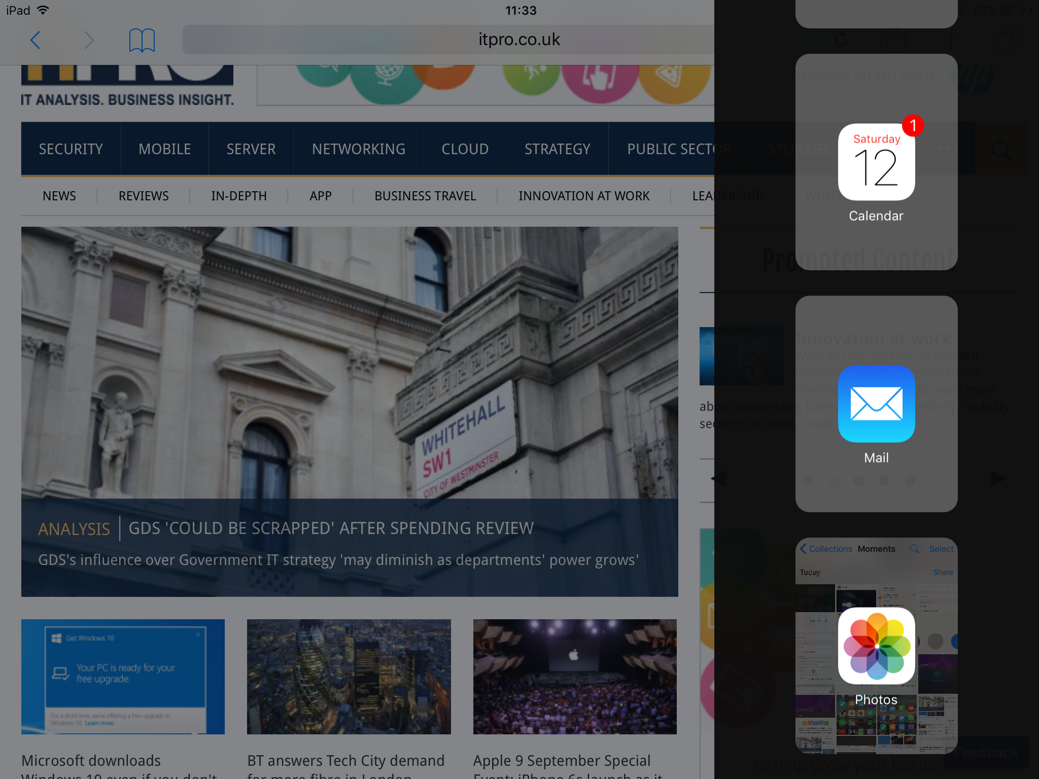
A lot of apps don't yet support Slide Over view, but most of Apple's default apps do
iOS 9 takes multi-tasking to the next level, making it possible to use two apps simultaneously on an iPad for the first time. There are three different multitasking modes, although to use all three you'll need an iPad Mini 4, iPad Air 2 or iPad Pro. When using any app in landscape mode, a swipe from the right edge of the screen will pop out a new menu filled with a list of other available apps. Choose one and it will open to fill a third of the screen, leaving the original app running in the background. Apple calls this Slide Over and it's the only mode available on older iPads going back to the iPad Mini 2.
The Slide Over version of the app automatically adjusts to fill the smaller space and works and feels much like an iPhone app. Tapping anywhere else onscreen will return you to your original app. If you want to change which app appears in Slide Over view, swiping down from the top of the screen will bring back the app selection menu, and swiping to the right will hide the Slide Over app altogether.
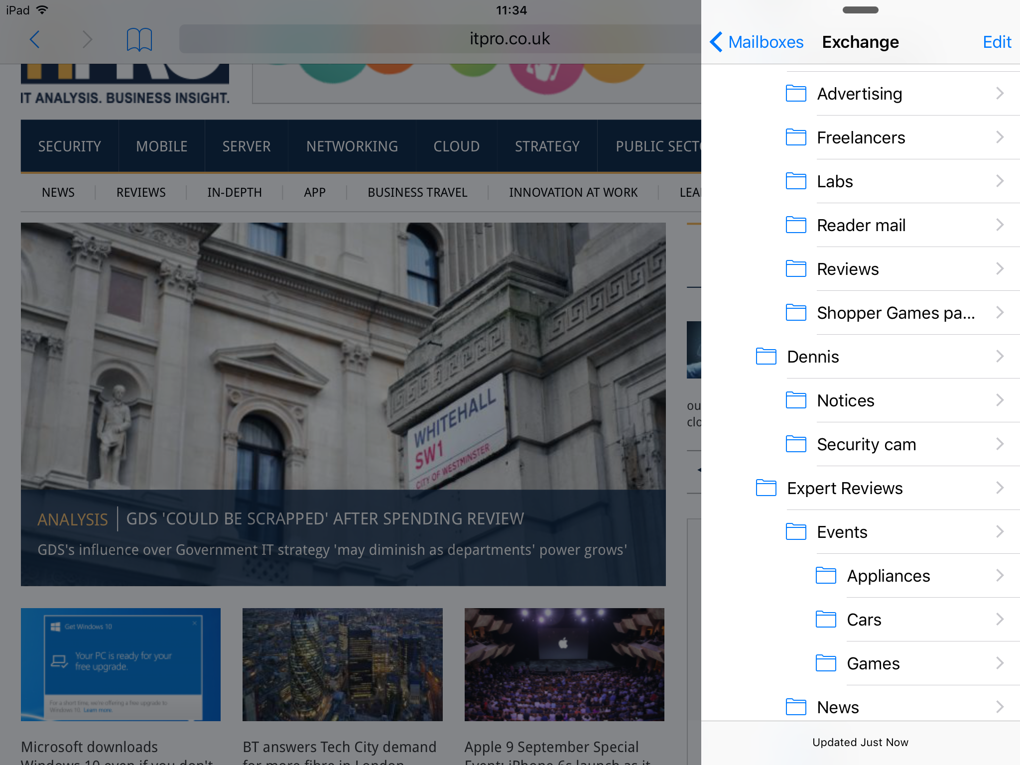
Slide Over is great for quickly replying to mails or messages, or making notes without losing your place in a webpage or document
Split View goes a step further, letting you run two apps on-screen simultaneously. It works as an extension of Slide Over, adding a small slider to the edge of the window that you can drag to fill half the screen. The two apps then work side-by-side, letting you reference something while writing a document, for example. There are several different split possibilities, depending on the app, with 50/50 and 70/30 being the most common; dragging the dividing line will let you reposition the split, with both apps redrawing to correctly fill the space.
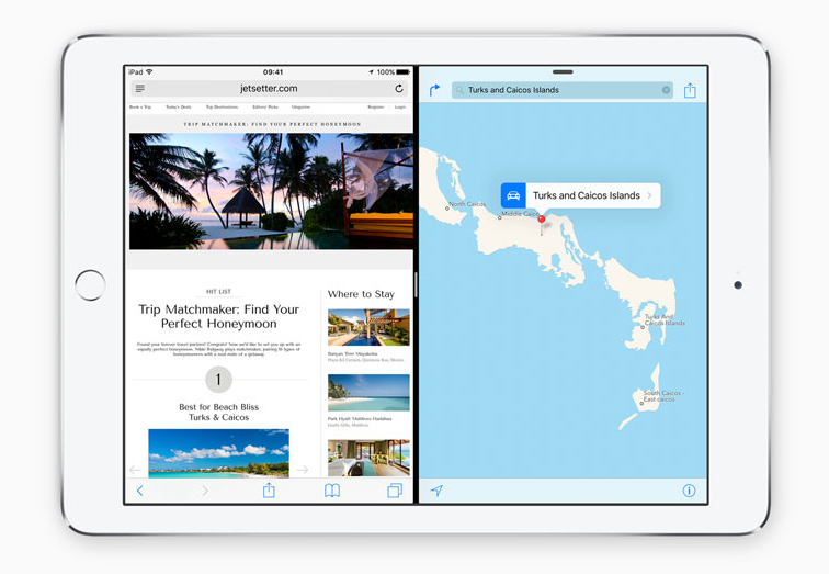
Working in two apps simultaneously could be a major boon for iPad productivity
Finally, Picture-in-Picture (PiP) lets you take a full-screen video or Facetime call and shrink it down, making it possible to work on other apps while the video keeps playing. You can then move the PiP video to any of the four corners of the screen, and expand or shrink it so it takes up more or less space, providing a better view of the app underneath. Tapping the video window will display playback controls.
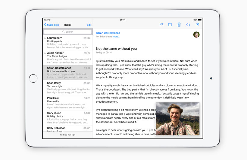
Working on a document during a Facetime call is finally possible in iOS 9
Search and Siri
Apple also redesigned search in iOS 8, replacing it with Spotlight. Swiping down from the middle of the screen would then display a full screen search window, which could look up things on the web, the iTunes Store and the App Store, as well as what's saved locally on your device.
Spotlight Search gets a big makeover in iOS 9 with a more detailed screen pre-populated with your most frequently opened apps, top contacts and nearby amenities, as well as local news based on your location.
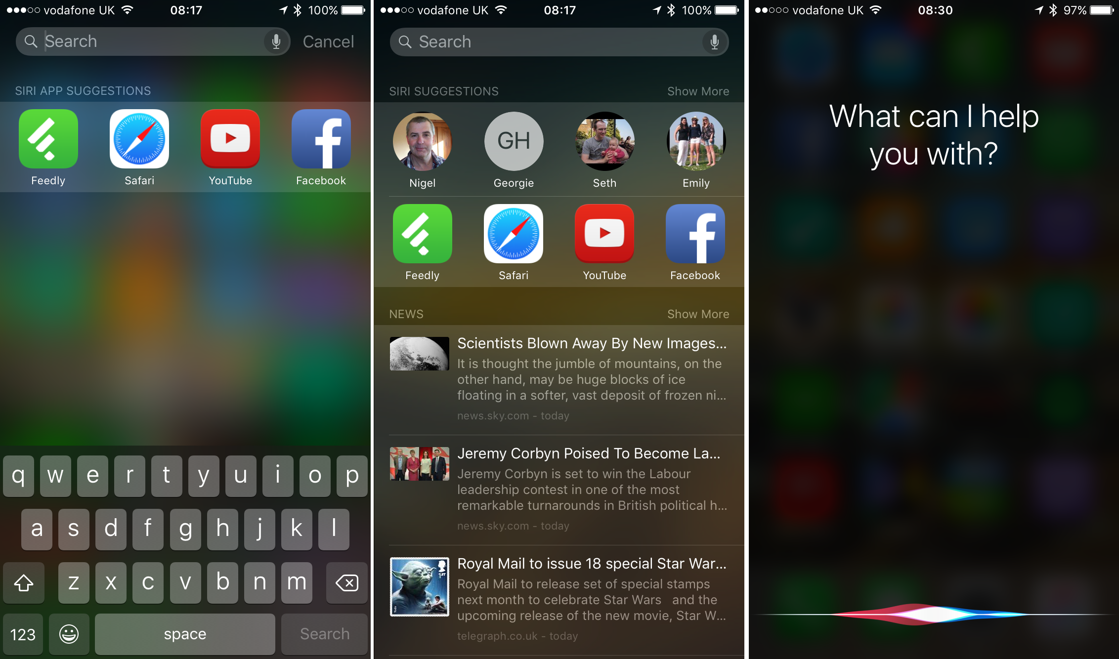
Quick access to frequently-opened apps makes Spotlight Search potentially useful if your homescreen is packed with apps and folders
Siri, Apple's virtual assistant, has been getting progressively more useful in every new version of iOS with better app integration, improved voice recognition and new search abilities.
Siri is now far more contextual, and works with photos and videos for the first time. You can say "show me photos from last year" and Siri will jump straight into the relevant part of the Photos app. Search within the Photos app has been made contextual as well, displaying a list of previous searches and using your location to show photos taken from the nearby area. As you use Photos, the number of suggestions increases, including One Year Ago flashbacks and Favourites.
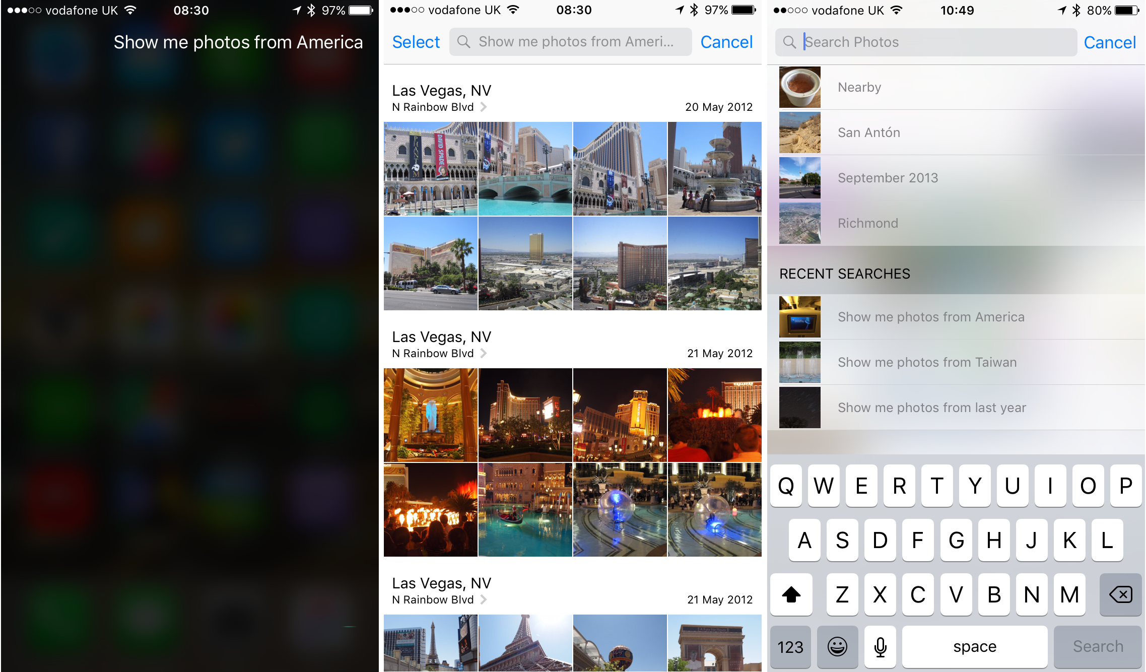
Contextual search and Siri integration makes it much easier to find specific photos
Contextual reminders can now be set, meaning you'll get a notification to close the garage door when you get in your car, for example. If you're half-way through an email, saying "remind me to finish this tonight" will create a reminder with a shortcut straight into that specific email.
iOS 9's Siri is now proactive too, meaning it can create reminders, calendar appointments and warn you of traffic delays ahead of meetings automatically. It scans emails for dates, events and flight times, then offers to add them to your calendar. When creating group emails or calendar invites, you'll now get suggestions for the people you usually include.
You'll get a notification letting you know when it's time to leave for the next appointment in your calendar if you also included a location in the entry, and directions will be ready when you walk out the door. Finally, calls from unknown numbers will be cross-referenced with your emails, and if there's a match the most likely name will be displayed underneath the number.
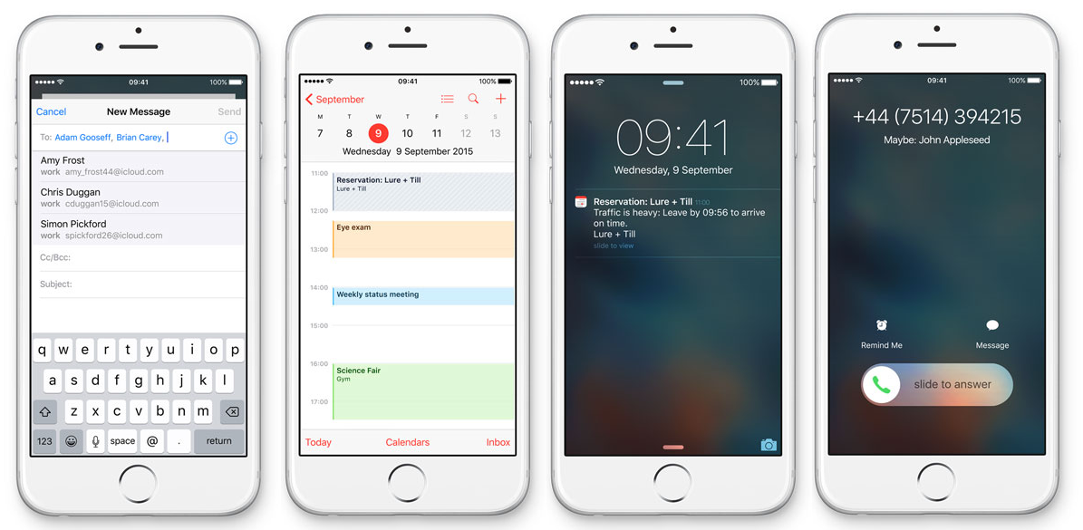
iOS 9 Proactive should take out a lot of the hassle typically associated with calendar invites and group emails
Security and enterprise features
iOS 8 was more business-friendly in a number of ways, most notably through S/MIME encryption for individual emails and giving administrators wider ranging MDM tools. For example, companies could restrict files downloaded from corporate domains using Safari, remotely set device names, and block the device wipe feature. Password locks for mail, third-party apps, calendar, contacts, reminders, notes, messages and all user credentials after a reboot were another welcome addition.
The Mail app also gained tabbed messages and new VIP contacts, which sends you an alert when a specific contact sent you an email. This meant you could disable general email alerts but still get notified when important messages come through - ideal for anyone who gets hundreds or thousands of emails a day.
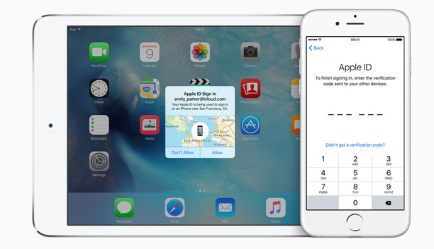
iOS 9 devices should be more secure thanks to stronger passcodes and two-factor authentication
With all the major enterprise features now in place, iOS 9 instead focuses on device security, enabling six-digit passcodes, rather than just four-digits, for Touch ID-enabled iPhones and iPads for the first time. With one million combinations instead of 10,000, passcodes should be a lot tougher for thieves to crack with brute force. Six digits is now the default, rather than four, so if you disable Touch ID on an older device then re-enable it later after upgrading to iOS 9, you'll need to come up with a six digit combination.
iOS 9 also gets support for two-factor authentication. This works similarly to the existing two-step verification process, but according to Apple uses "different methods" to trust devices and deliver verification codes. You have to enable the feature on Apple's websiteusing an Apple ID, but once enrolled, you'll get a prompt when signing in from a new device or web browser. This code is automatically displayed on your other Apple devices, or sent as an SMS message to your phone. The notification even shows you where in the world the new device is trying to sign in from.
-
 Trump's AI executive order could leave US in a 'regulatory vacuum'
News Citing a "patchwork of 50 different regulatory regimes" and "ideological bias", President Trump wants rules to be set at a federal level
-
 TPUs: Google's home advantage
ITPro Podcast How does TPU v7 stack up against Nvidia's latest chips – and can Google scale AI using only its own supply?
-
 Apple iPad Pro 12.9in (2021) review: A giant leap for Apple silicon
Reviews Paired with a 120Hz display with incredible colour accuracy, the iPad Pro is more deserving of its name than ever
-
 Apple iPad (2021) review: The best entry-level iPad
Reviews Although pointing more to the past than the future, this iPad succeeds where it matters
-
 Apple iPad Pro 12.9in (Apple M1, 2021) review: Falls just short of greatness
Reviews More of a laptop alternative than ever with a stupendous display but iOS still has flaws
-
 Microsoft Office for iPad gets mouse and trackpad support
News The iOS app update also brings a new start screen and a ribbon of feature menus
-
 The 8th-generation iPad debuts with the A12 Bionic chip
News Apple claims it's latest entry-level iPad is three times faster than the top Android tablet
-
 Apple iPad Pro 12.9in (2020) review: Believe the hype
Reviews The most expensive and most ambitious iPad yet
-
 Apple confirms serious bugs in iOS 13.5
News No fix is available yet for the heavy battery drain and log-in issues
-
 Best business smartphones: The top handsets from Apple, Samsung, Google and more
Best The best business smartphones on the market today packed with work-focused features you need

